
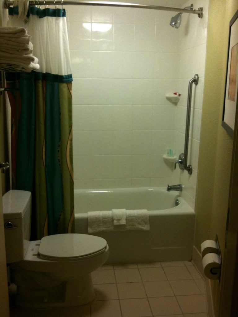
This is a hotel bathroom:

To take a shower, you must:
- either sit on the toilet, squeeze between the toilet and the tub (you have about 4 inches of clearance) or stand in the tub
- Stretch up and over to turn on the shower, possibly with the help of the grab bar
- Wait for the water to reach suitable temperatures
- Climb in the tub to shower, possibly with the help of the grab bar. In this case, the tub has a significantly curved bottom, making slipping slightly more likely.
Due to the placement of the grab bar, you will likely walk into it two or three times while showering. The irony of this is that the grab bar is supposed to help prevent a fall, but because it juts into the tub, maneuvering around it makes a fall more likely.
This is also a hotel bathroom, at a different hotel roughly 1500 miles away:
To take a shower, you must:
- Walk up to the controls
- Bend over slightly to turn on the shower, possibly with the help of the grab bar
- Wait for the water to reach suitable temperatures
- Climb in the tub to shower, possibly with the help of the grab bar. In this case, the tub has an almost flat bottom, making your footing more secure.
They both seem reasonable, when written out. In fact, they could have both been generated by the same list of business requirements:
- The room shall have a shower tub with suitable controls
- The room shall have a toilet
- The room shall have a sink
- The user shall have the opportunity to turn on the shower and use it
- ACCESSIBILITY REQUIREMENT: The shower shall have a grab bar.
Both the installers and the users would likely complain about the addition of the grab bar in the top bathroom.
It does make people safer, and it makes the shower more accessible.
On the other hand, it’s inconvenient to install. It’s inconvenient to use. It doesn’t really add to the experience. It’s ugly.
An almost identical grab bar is being used in the second bathroom, but it’s likely to generate significantly fewer complaints from either developers or users.
It’s easy to install. It’s easy to access. When you’re showering, it’s not in your way. It’s not what I’d call aesthetically pleasing, but it’s not in-your-face breaking up a tile surface and making the shower feel smaller.
The first bathroom’s grab bar feels like a major inconvenience, and the second bathroom’s grab bar feels like just another element of the room. The first bathroom’s accessibility is actually hampered by its grab bar (while also still making the act of turning on the shower safer). The second bathroom’s accessibility is only improved by its grab bar.
Why?
You probably already know it has nothing to do with the grab bar and everything to do with the toilet.
In the first picture the accessibility of the entire bathtub is hampered by the fact that some architect somewhere thought it was more convenient to only run pipes to the inside wall — and so the shower controls, toilet, and sink are all next to each other. (The room next door’s design is flipped so that all its pipes face these pipes, making plumbing even easier.)
The fact that this makes the plumber’s job easier and the job of every other user more difficult was apparently summarily rejected.
The grab bar must be where it is in that shower because it’s the only place where someone stretching over a toilet to turn on a shower would be able to access it. And it’s desperately needed in that location because the rest of the architecture automatically makes the user less safe. Even if the user is an average-height 21-year-old healthy human being. Especially if the user is five foot tall, 85 years old, and has osteoporosis.
In the second bathroom, the plumbing is run on both walls. No one has to lean over a toilet to turn on a tub. It’s automatically safer and more convenient for every single user. In this case, the grab bar becomes what it was intended to be: an additional handhold available to everyone, and required by a few. The 21-year-old user may never use it (or may never consciously use it). The 85-year-old user will still use it, but also find the tub safer and easier to use overall.
Let’s talk about the quality of your website for a second.
Your information architecture is the plumbing and the walls. If someone put constraints on that IA that regularly cause people to trip over bad navigation or weird structures or disruptive advertisements, that’s going to have an impact on your accessibility project.
Your HTML and CSS are the toilet and the tub. If your code is unwieldy, if it has a curved bottom where users are expecting a flat surface, if it gets in its own way, then it gets in the way of your users.
If the HTML is not semantic, it’s likely that inherent accessibility is being lost — you’re being forced to implement accessibility workarounds and ARIA roles and scripts — because of that lack of semantics. (If it’s not being written syntactically there’s a decent chance that there’s a hole in the tub big enough to eat a person.)
If you’re using CSS to do things that you should be using HTML to do, it’s a lot like putting a toilet in front of the controls. You might be fine as long as you only want to use the toilet, but as soon as you decide to shower it’s in the way.
And both the bathrooms and our code result in the same conclusion: to make the accessibility, someone’s got to gut that room at the top, move the pipes, remodel it, and then rebuild it.
But that’s not the grab bar’s fault. That’s not the screen reader’s fault. That’s not the alt tag’s fault. The business requirements didn’t say “stick this handle in the most inconvenient place possible”.
If the only way to make your design accessible is to put the accessibility controls and features somewhere that they get in everyone’s way or force a major redesign, that’s not because accessibility is bad. It’s because the current design is inconvenient, unsafe, or both. And if those things are true for the 85-year-old who can only use Dragon Naturally Speaking to navigate your site, they’re also true for that 21-year-old who likes to use Dragon to read a webpage while their eyes are occupied knitting a sweater or watching a kid or playing with a dog.
In other words, folks, keep the blueprints handy and the sledgehammer near by.