As tenacious as a coyote – is that a thing? It should be a thing.

Once upon a time a client came to me and said, “We want to build a new capability on the website that does Magic Thing Here.” The client had a concept, some business goals, even a good idea of what the users wanted, and all we had to do was get started.

And I said sure, let’s get to work.

We sat down, had some meetings to bring me up to speed on the project, made some super-high-level sketches, brought some more people with technical acumen in, talked through it all, got to the point where it was time to bring the vision down about 10,000 feet so we could figure out what to build, and the project team hit a wall.

Hard.
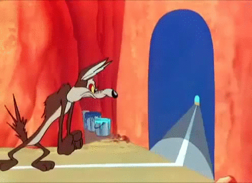
Wile E Coyote attempts to run through the tunnel he just painted on the wall, bounces off, and vibrates for a while
Like Wile E. Coyote hard.

And this was a frustrating experience for everyone – not just the people on the team, but also their managers, stakeholders, etc., because nobody’s happy and nothing’s moving and at least one person had a massive headache.

***

Its worth pointing out now that this wasn’t a one-time situation. It happens on almost every project team I’ve worked on that *wasn’t* a remodel-existing-capability project. If it’s new, jumping the gap from “high level idea” to “think we can actually build” has been a challenge.

On a good day you know when you're not reaching the other side

***

So I sat down and I wrote down everything I knew about the project and then I started modeling what I knew.

There are lots of different ways to model an idea.

Maybe I created a SIPOC and some process maps to figure out what the difference between what we had as a product offering today and what we wanted to have as a product offering tomorrow would be.

Maybe I created a Capability Strategy Sheet to capture our users’ needs and business goals and then figure out how we’d measure them and move the dial.

Maybe I created a storyboard or, embarrassingly, acted out the actions the users in our personas were doing mid-meeting, based on our research.

Maybe I created a journey map of one individual external client’s perspective, so that we could identify pain points and eliminate them.

I may have even formed my fair share of Lean Startup hypotheses so that we could trim down to one specific problem to chase, and chase only it.

(Probably along the way I created a dozen really bad metaphors. Ask me about the chocolate bridge sometime.)

***

Teams get stuck. It’s not unusual, it’s not wrong, it’s not failure, it’s just part of the process.

We’re people, after all. We get just as stuck in decision fatigue and paradox-of-choice situations as our users do. In some cases, it’s because we have not-enough information, but in many, it’s that we haven’t found the right angle to apply to the information we have to make a decision.

When a team is stuck, the same analysis tools that we’d use with an unstuck team to validate a decision or argue for a specific approach will help us make a decision or choose an approach.

It may take multiple attempts and different angles, but it will eventually get things moving again.
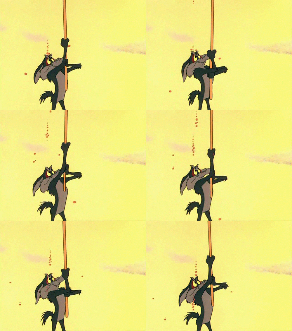
Wile E Coyote using a stick to poke an out-of-camera pile of stuck rocks, from below, which the audience knows is going to fall on his head.
Don’t worry, it works out better for us than for him.

And despite the fact that as we plan and plot we might feel like Wile E Coyote hatching plan after plan to take down the Roadrunner, we have one  advantage he does not: we learn from our missteps, adjust, and get closer to the right course.

***

During one of these attempts to lasso the moon, we succeeded. To the team it felt like soaring into the air crossed with pulling our legs out of calf-deep molasses, but it’s forward movement. Suddenly things started making sense, a direction took shape, and we knew what to do next.

And we all lived happier ever after.

Until the next project, anyway.

Animated "That's all folks" graphic from the end of a looney toons cartoon


Should X do Y?

I’ve been around these parts just long enough to have seen “should designers code?” and all the variations come up about 500 times. And it always feels like people answer that question at a level of abstraction or theoretical purity.

Should a spherical cow do research?

There is no spherical cow. There is no single way that design, development, devops, writing, strategy happen. Everywhere is context.

I spent the first 2 years of my web career with the web as about a third of my job. The rest of it was administrative support, print design, IT support, and event management. (It was a weird job.)

The next decade I was a webmaster. The last five years, I’ve been on a small team. There’s no luxury of “leaving code to the coders” or “leaving design to the designers.” There’s only work that needs doing, and by god you’d better figure out how to do it.

On the other side, I know people who’ve worked in Fortune-whatever companies where they have literal researchers in actual white coats. So yeah, maybe there you don’t need to know how to do the thing, only how to incorporate it effectively.

But you do have to know how to use what’s around you. You have to know your context: both the resources at hand, and how your work fits into the whole. I worked with a couple of print designers, years ago, where one kept giving me design ideas that just weren’t possible (this is circa 2003, so, like, anything with a curve), but the other helped me get better at the design I needed to be doing.

He gave me tools to understand the concepts, so I could apply them to the raw materials available. I got better — “good enough” — at design so that I could make something that worked with the brand while being true to what the web could do then.

When I got here, as I got settled, as I figured out what it meant to be on a team with other web people, I could still see gaps in what needed to be done. I got us doing usability studies and content strategy, even as my job was developer, because those things were important and I was willing to learn.

Should X do Y?

First of all, if Y is “writing”, then the answer is always yes. Everybody should learn how to write clearly so you can express what the hell you think you’re doing and why.

Otherwise, does Y need to be done? And is there a Y-master on hand?

If not, are you kinda interested in Y? Then just do the thing. Learn as much as you can, do what you can to make your Y not suck.

If you have a Y-master: is Y adjacent to your X? Do you like being a responsible team member? Then at least know enough about Y that the Y-master doesn’t hate you.

Telling your story

When I talk to junior designers starting out in their careers, I find they struggle with “story.” They can’t walk from problem to solution and explain how they got there. They’ll get caught up in the little details but miss the big picture. They’ll focus on their individual work while not talking about the team (or vice versa).

Why is that? My theory is that it’s the UX/UI conundrum. UIs are supposed to tell our stories. But they’re also both finality and affordance. They are the final “rendering of intent,” but we’re leaving the story to be completed by the user. So we’re used to “our design,” but we’re not used to the mutual-ness of the story conversation.

And that’s the important part: the conversation, between design and user, between product owner and designer, between organization and customer. Every design is a conversation. But how do those conversations work? As a company, are you in dialogue, or are you lecturing? As a designer, are you engaging in the conversation, or are you frustrated the user can’t finish your sentences?

If design is communication, then it’s natural that the idea of story should be central to all our design work. Story is what binds the scenario to the vision. It’s what binds the design to the code. Without a story, we can overemphasize the tiny details and underemphasize the role those details have in the product.

Here’s a story: I was trying to design a 13-period calendar picker in a product driven by quarters and months. When you get into 13-period calendars, you need to throw away everything you know about divisions of time. (You’d be surprised how ingrained 12 months and 4 quarters are in analytics design.) We needed to give our customers a way to configure a plethora of financial calendar systems that didn’t conform to the standard 4 quarter, January to December systems.

After banging at a lot of different and messy ideas and using the whole team, I was out running out of useful ideas. And then I thought of Mad Libs, and I remembered the Huffduffer signup form.

Huffduffer is an application that let you manage podcasts. Its sign up form is… well, different.

“I would like to use Huffduffer. I want my username to be ___ and I want my password to be ___.”

The signup isn’t a bunch of input boxes. It’s a conversation, constructed like Mad Libs, a childhood game where you fill in the blanks of a story (“I need a noun! A verb! A city!”) and make strange, dadaist tales. And that led me to rethink the setup form as the answer to a question rather than a series of input fields.

I imagined myself in a room with our customers, and I asked them all a question: “How would you describe your organization’s financial calendar?”

“Well, we have a 13-period calendar. Our first day is always the first Monday in January.”

“We’re different. We have a traditional 12-month calendar. But our first month is November.”

“Interesting. We don’t do quarters. We do half-years. But we track our performance weekly.”

With that, I created a mockup that looked like Huffduffer, like Mad Libs:
“Our calendar is (12-month/13-period/4-4-5/4-5-4), and we use (months/quarters/half years) to measure our ongoing performance. The first day of our fiscal year is (July 1/First Tuesday in January/our founder’s birthday).”

Ultimately, after a few iterations with the developers and product managers we fell back towards a form that wasn’t about “completing a sentence” but about “filling in the blanks.” However, the spirit remained. The form phrasing and order followed the original Mad Lib idea, and it’s still a core part of the product setup.

And that’s a story, to me. We had a problem, we worked on a solution, we got results. We had happy customers and we dealt with a very messy piece of configuration in an elegant way. Most of all, we never shyed away from the problem — “I want a system that I can configure to use our financial calendar” — and also never lost sight of the values we had in design — simple, human, understandable.

I tell that story in job interviews. It’s a perfect nugget for explaining how I design — focus on the problem, look broad for inspiration, iterate to a solution, never lose sight of your values.

As a designer, can you tell a similar story, one with a beginning, a middle, and an end? One whether you can explain the problem, lay out the objectives, explain what you did (and what the team you were part of did), and illustrate the results (good and bad)?

Every design is a story, a story you’re telling in partnership with your organization and with the user. How are you enabling every person involved to tell their story? How are you hindering them? And most of all, how are you allowing the user to tell their own stories with the tools of the story you give them?

Design is story. Communication is story. Rendering intent, in the end, is nothing more than another expression of the oral-aural tradition our ancestors first used to communicate their ideas.

Tell your story. And help your users tell theirs.