Hello! I am traveling again.
Let’s take a tour of the eight (!!) light sources in my hotel room.
First, there are two paddle switches in the main entranceway. They light the ceiling lights above the kitchenette. Note that the one on the right has a tiny green light on it, so that when you enter your pitch-black hotel room you theoretically can find the light switch (since it is not next to the door, but rather past the bathroom door).

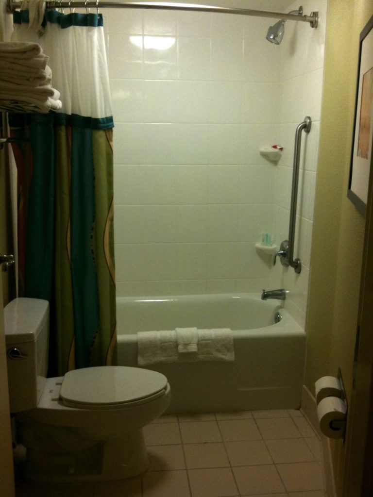
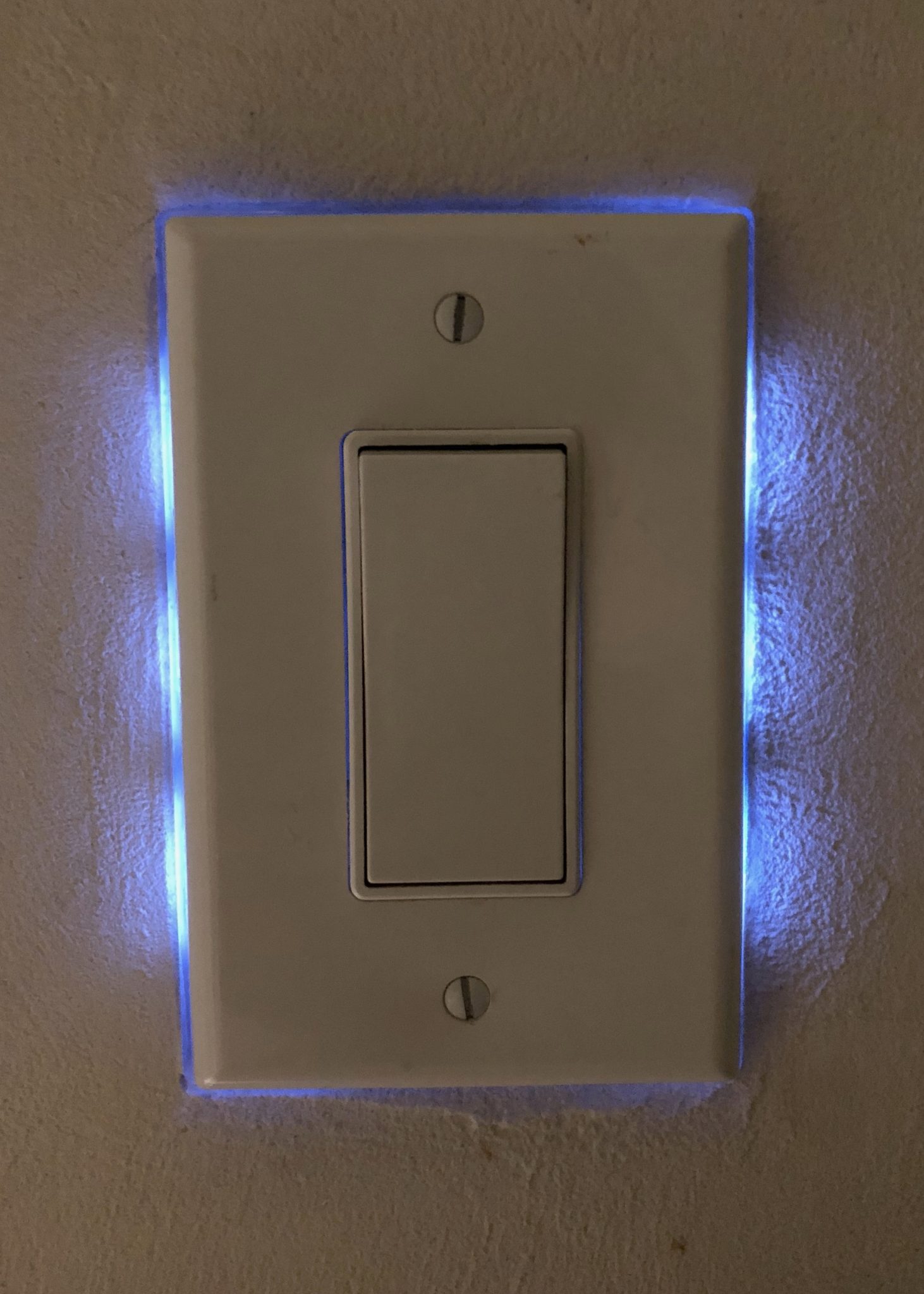
Then, while we’re near there, there’s a paddle switch in the bathroom for its ceiling light. Like the entryway switch, it’s got a light to help find it. Unlike the entryway switch, in this case the light is a series of blueish LEDs that glow from behind the switch.
On the desk there’s a stylish brushed steel desk lamp with a rocker switch on the flat base.

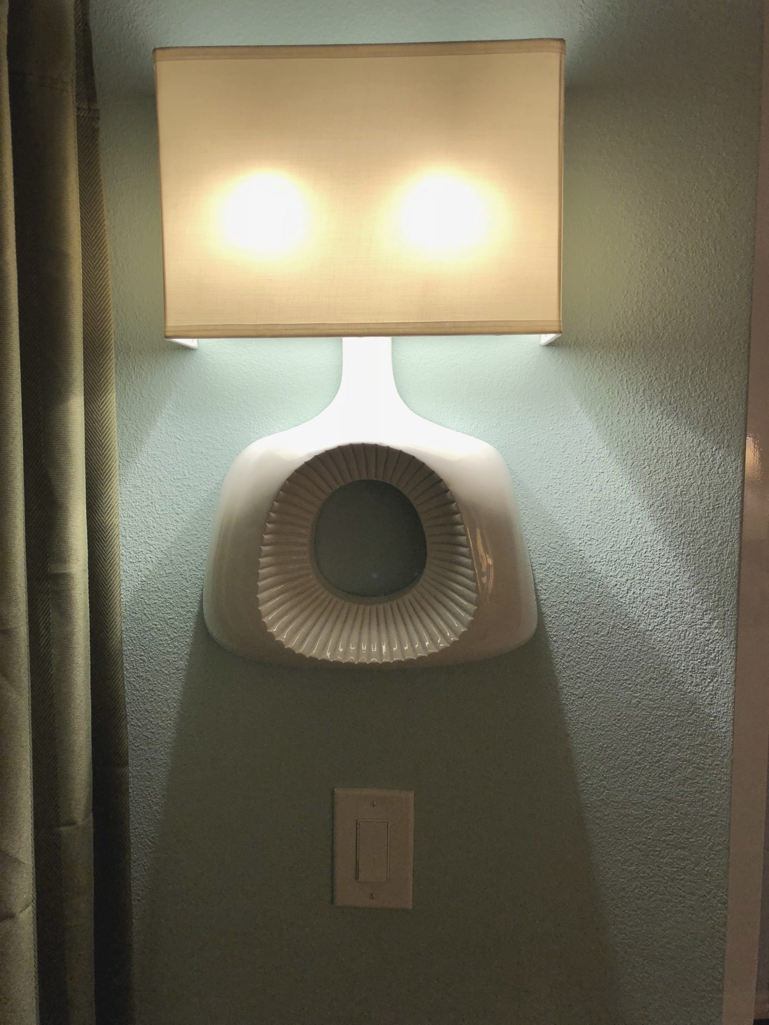
As we move to the end of the room, we find a wall lamp to light the closet. It’s powered by a paddle wall switch directly below it. Unlike most of the other wall switches, this one has no light to help you find it.
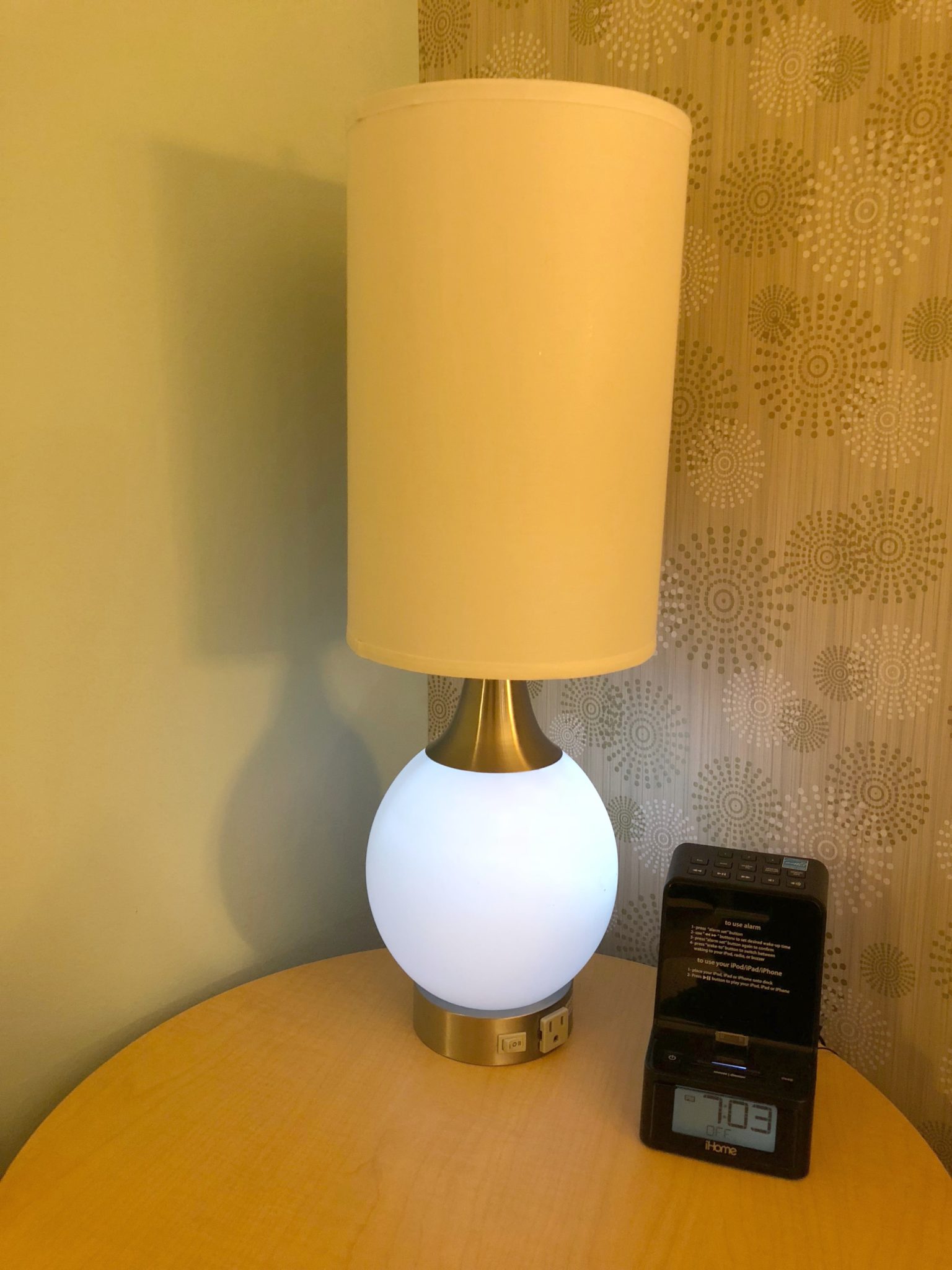
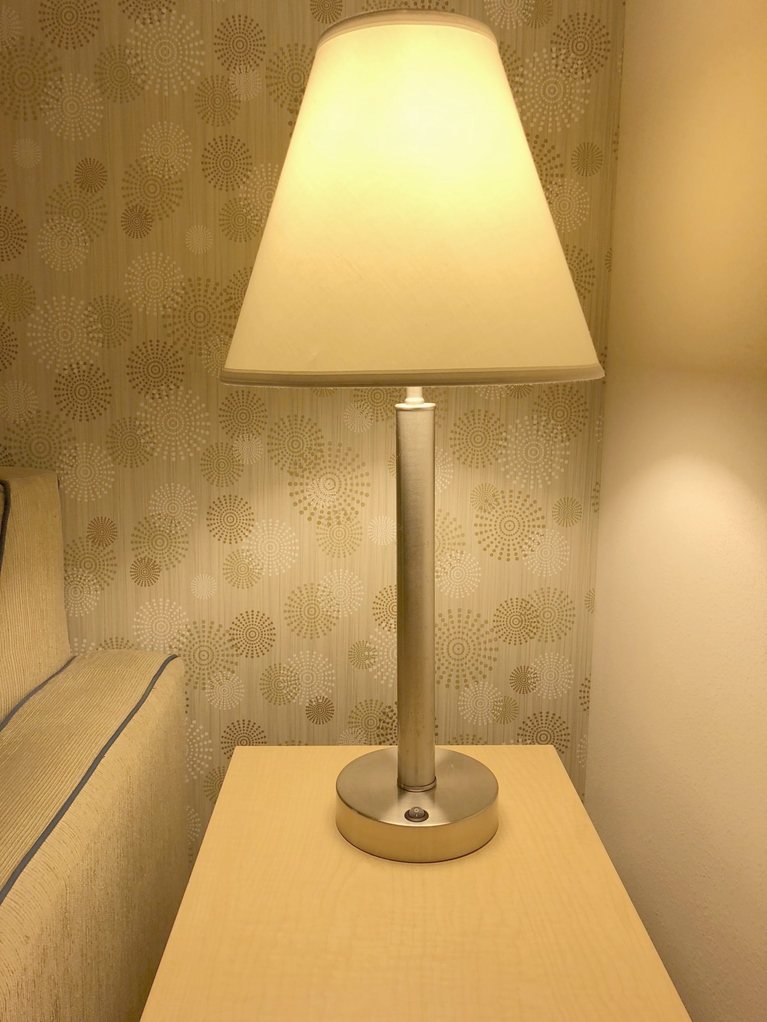
Opposite the closet is the first table lamp. It is powered by a three-position rocker switch, where “center” is off, “left” turns on the light bulb under the shade, and “right” lights a very soft moonlight-like light in the round base.
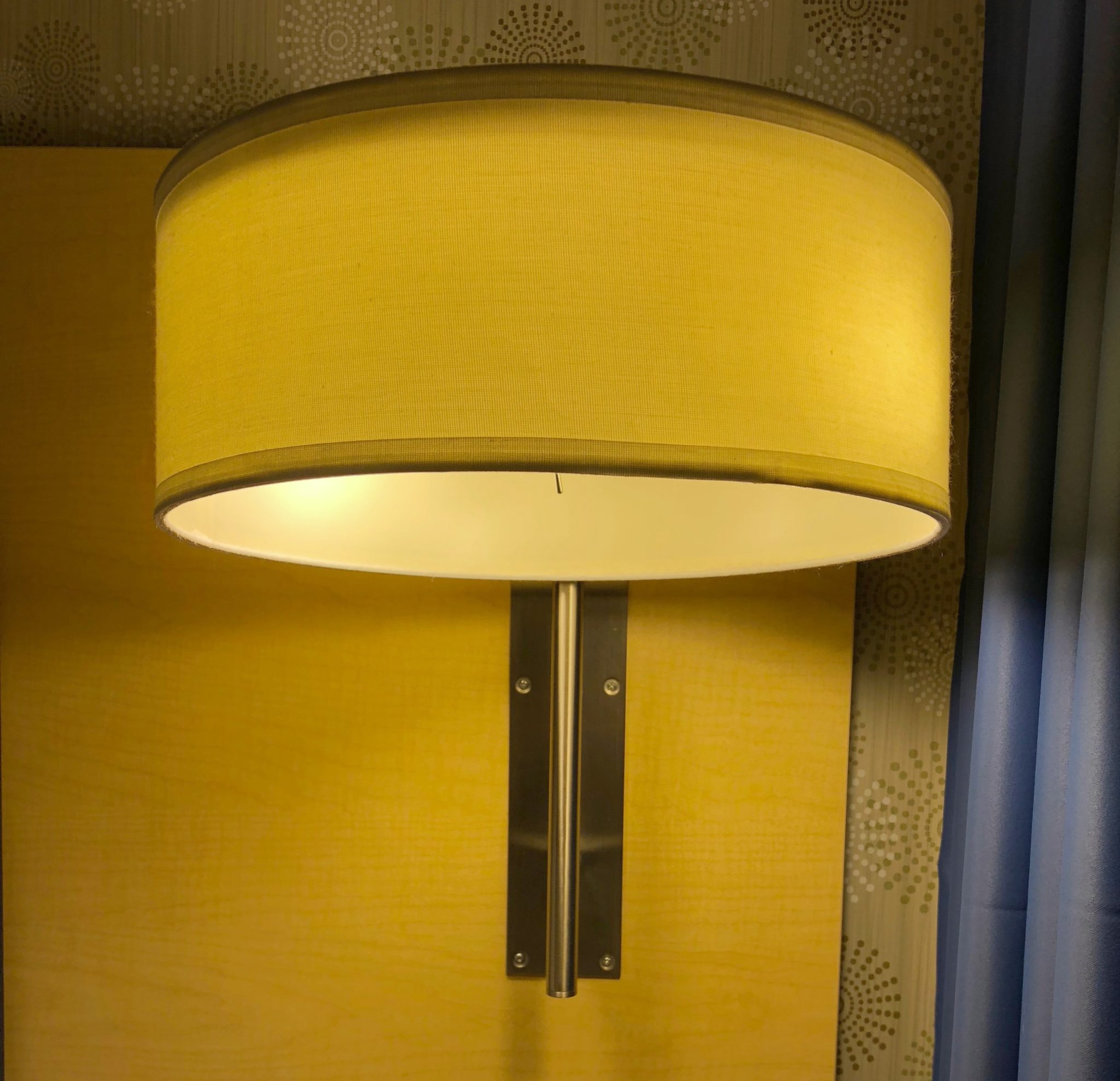
On the other side of the bed is this monstrosity: a cylindrical wall lamp over the end table that is only about seven inches in height, but probably 15 inches around. Its light switch is a tiny old-fashioned steel toggle switch that is mounted to the underside of the lamp, so you can’t see it, you have to reach under the shade and hope you find it.
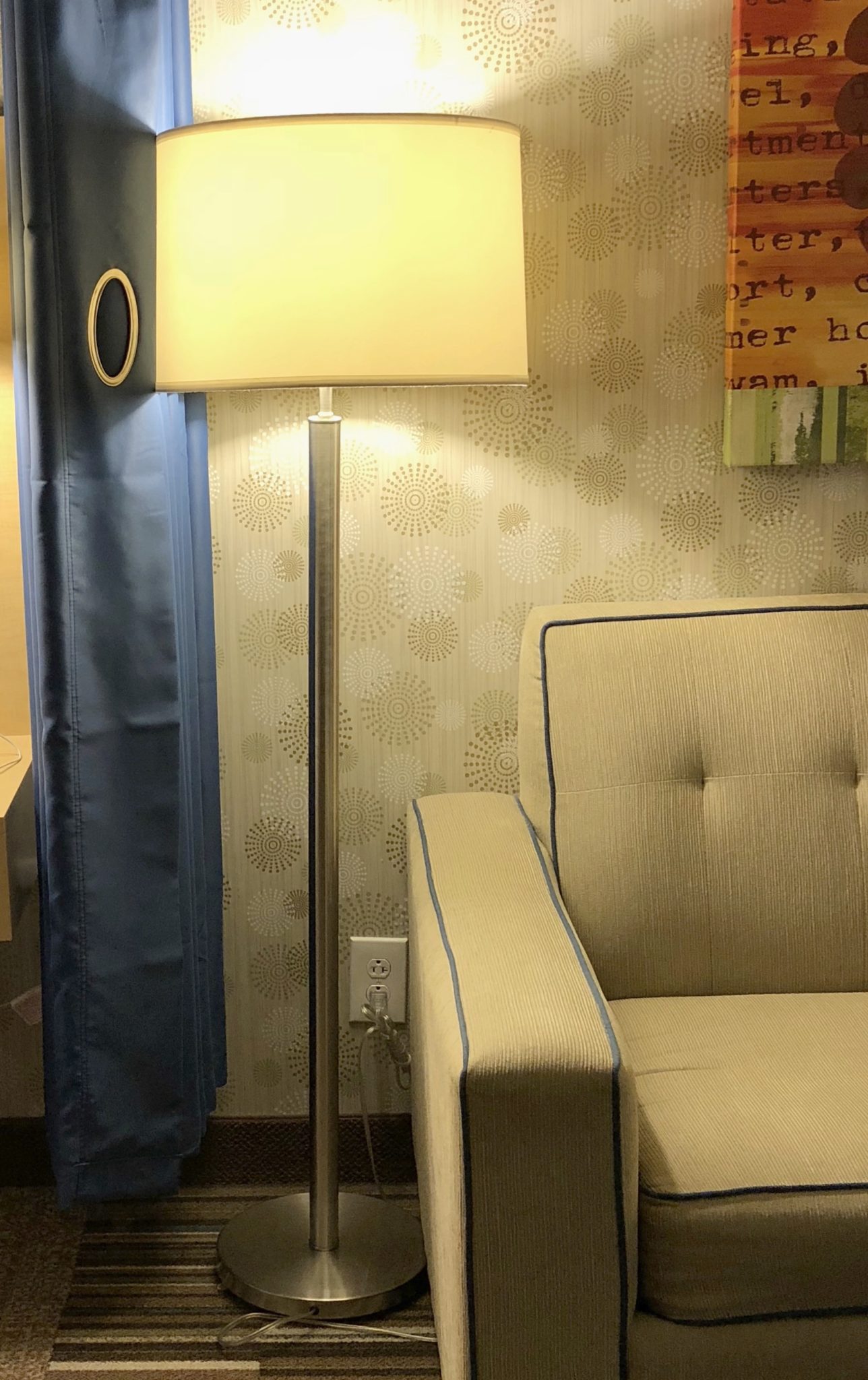
Then there’s a floor lamp. It’s got a push-through switch under the shade near the top of the lamp. This is notable because floor lamps can literally put their switches anywhere from the base as a foot switch to anywhere on the pole, up under the shade, so it’s always a guessing game to find the switch.
Finally, our last lamp: a table lamp on the far side of the sofa. Like the other table lamps, it has a rocker switch on the base.
What does this have to do with web design?
When we talk about consistency, we generally divide it into two kinds: internal consistency and external consistency.
Internal consistency means that an interaction looks and behaves the same way inside a given system regardless of how many times it appears, whether that system is a webpage or (preferably) a section of the website, or even the whole website.
External consistency means that an interaction looks and behaves the same way inside a given system and outside that system. Or to put it differently, that people can recognize the way that the interaction works because they’ve seen it somewhere else. You didn’t invent it.
When we design an interaction such as “choosing a radio button” or “turning on a light”, we want the interactive element to be:
- recognizable as interactive, whether that means it looks clickable, tappable, tabbable, or in the case of light switches, twistable, pushable, rockable, pullable, etc. It has affordances that tell us we can interact with it.
- recognizable as changing state in a specific way. In the case of radio buttons and checkboxes that’s “deselected” to “selected”, for select menus it’s a change from one selectable value to another, and for lamps it’s “off” to “on”, or back. The same affordances that said “you can do something with this” generally hint at what you can do and what will result.
- memorable, so if I’ve never seen this before I’ll remember how it works the next time
Ideally, all the radio buttons on a website will look and behave the same way, with the same affordances, so that the user only needs to learn to recognize our specific radio buttons as radio buttons and they will understand how they’re used.
Context is, as always, king
But there may be reasons why we’d have radio buttons look or behave slightly differently in two different areas of the site, and that difference is about context.
When we talk about the context changes that would force us to design two different radio buttons the differences can be pretty subtle. (Also I am in a hotel room at 11pm and can’t find any obvious examples.) So let’s look back at the light switches.
The desk lamp isn’t being used to light the entire space, only the desk, so (speaking as an experienced desk user) we can be confident that the user is very close when operating it. The user probably has empty hands when switching on the light, or if not, can easily empty their contents onto the desk. This light isn’t generally being used for safety purposes.
In the “using a desk” context, a big ivory-colored paddle switch on the stylish brushed steel desk lamp would be ugly as sin and possibly hard to use. A small black rocker switch on the base is much more appropriate for this context.
The wall switch in the entranceway is being used to light a significant portion of the room. The user could be wrestling a luggage cart into the dark room, wandering in inebriated from a fun night out, or experiencing any number of other distractions or temporary disabilities when they need to turn on the light. (I count a luggage cart as a temporary disability for door use in every hotel.) We can’t be confident they are near the switch they are trying to manipulate or that they can easily manipulate it.
In this context, a small black rocker switch would be a nightmare, because it’s small, difficult to locate in the dark, and difficult to switch with the back of a hand or an elbow. A paddle switch with an LED on it is both more accessible and more usable in this context.
We expect the hotel room to be internally inconsistent at the room level because the entranceway context and the desk lamp context are different.
On the other hand, both of the lamps next to the bed have the same context. They both need light the area around the bed for the sleeper. They both need to be easy to reach and manipulate for both the person about to go to sleep and the person suddenly awakened. Neither can block access to critical elements such as alarm clocks or telephones.
In this case, there’s no justifiable business case, user need, or technological constraint that explains why the two lamps are incredibly different.
It’s the website equivalent of having two sets of radio buttons on the same page in the same form asking contextually similar questions, but one radio button set uses the browser’s default styles and the other set is styled to look like poop emojis with drop shadows.
But that’s not the biggest sin the monstrous bedside wall lamp commits. Its biggest sin is breaking the user’s mental model.
If context is king, external consistency is emperor
When we’re born, we know nothing about radio buttons or light switches.
As we are exposed to new interactions, we learn to recognize patterns. We expect radio buttons to behave like other radio buttons, even if we’re too young to know why they’re called radio buttons. We expect light switches to look like other light switches (or at least use recognizable affordances). We expect the kinds of light switches we see on walls to fit one pattern and the kinds that are on desk lamps to fit on another, even if the switches themselves are different.
Our mental models have abstracted both the similarities and differences of all the switches we’ve used in our lives. Even if our users don’t consciously know the difference between the paddle switch’s intended context and the rocker switch’s intended context, they do know that a rocker switch doesn’t belong on a wall and a paddle switch doesn’t belong on a lamp. (This is also why Norman doors drive us crazy.)
The monstrosity wall lamp is out of place in this hotel room not just because it’s internally inconsistent with the other lamps in the room.
It also broke my mental model. It was not externally consistent with my concept of how lamps work.
Usually when a lamp juts out of a wall or hangs from a ceiling, there’s a switch on the wall. If there’s no switch on the wall, there’s a chain hanging from the center of the lamp. If there’s no chain, then look for a rotary switch on the cord, or something on the body of the lamp.
There shouldn’t be a toggle switch on the underneath of this lamp. My mind refused to accept it.
My mental model of a lamp involves a base or mounting plate, a body, a light shade, a light switch, and a hot incandescent bulb. Low-heat lightbulbs are pretty new to the scene. For the vast majority of my life, reaching underneath a lamp shade meant risking my tender fingertip skin would brush against a hot glass bulb and burn.
If the monstrosity lamp had two incandescent bulbs in it instead of comparatively cool CFLs, then it would throw enough heat onto the night stand to reheat a steak. No responsible lamp designer in the world would put a steel toggle switch underneath two incandescent bulbs, because the user would burn their fingertips every time they tried to turn the light off.
This lamp broke my mental model so badly that “under the shade” was the last place I looked, and I even considered that it was a decoy lamp of some sort.
There are eight light switches in this room and arguably they’re all different. That’s not ideal. For the user, that’s a lot of learning material. That causes hesitation on first and subsequent uses because the user has to keep reminding themselves, “oh yeah, this one’s the three-spot rocker and that one’s the unlit paddle switch.” They can’t just look at the lamp and immediately know how to use it because there are too many lamps with too many differences.
(Side note: the fact that every lamp looks profoundly different actually works in the user’s favor because it makes the differences more memorable and learnable. If they all looked the same but the switches were different, I’d be teaching them how to fly out the 3rd story window of a Hilton.)
Of the eight, seven are externally consistent with the standard user’s mental model and abstraction of the contexts for “light switch”. So even if they’re not internally consistent, they’re arguably usable.
The eighth lamp breaks the externally consistent rule. For users who have the same mental model I do (which would arguably be anyone over the age of 30), it doesn’t follow any known patterns. As a result, the user may figure out how to use it but choose not to use it at all, or may choose to use it but hate it, or may never figure out how to use it. There’s even a chance the user will break it trying to figure out how to use it. It is arguably unusable.
The moral of the story
When evaluating a design for consistency:
- First, do your best to be both internally and externally consistent, taking context into account. This is the path that causes the least cognitive load for your user. Bonus: it also result in the most code reuse and happiest developers.
- If you can’t (or choose not to) be internally consistent, be externally consistent. You’re increasing cognitive load on your user, and probably increasing development time, but there are some valid reasons to take this path as long as you haven’t broken the user’s mental model.
- No matter how smart you think your new component is or how slick you think it behaves, if it’s externally inconsistent and breaks the user’s mental model, you’re probably being an ass, not helping the user.
- If you’re absolutely sure your new component with the new mental model really is the better solution, test the ever-loving hell out of it with your users. There is the tiniest of chances that you are the Einstein of interaction designers, but you owe it to your company, your users, and yourself to be sure.