
I miss affordances.
Affordances in computing UIs are nothing new. When designers and developers first put words on a screen, there was a need to convey what one could do with those words and pictures. Menus? Buttons? Dropdowns? All of the fundamental UI elements we’ve had for 30+ years started with deliberate design decisions – good or bad – that became standards, or de facto standards.
As web and touch interfaces have matured, it feels more and more like designers have collectively thrown those affordances and standards out the window. Me? I blame removing underlines on links.
Let me explain without getting too nostalgic.
In the old days of the web, links were underlined and blue (versus black and no underline for text). It was the standard. Over time, HTML and CSS introduced the ability to remove underlines – so links could be any color and not have an underline. But… how does a web designer convey their text is a link? People got creative! Some links sprouted icons. Some remained in a different color. Some grew on hover, or showed a background on hover, or did something only when tinkered with. Even in that moment, we lost a clear definition of a link, one that really impacted accessibility too.
The ability to scan a webpage and understand intent was lost.
But, as with changes, people adapted. We collectively clicked and poked at more things on pages, even things that looked as ordinary as anything else, in the hopes – the hopes – that maybe this thing would make a page or an app do the thing we wanted it to do.
Touch interfaces accelerated this change. When using a touch interface, more than ever, the only way to know what a person can interact with is through experience. Interactivity is conveyed less and less frequently by the UI itself. Thus, the mental burden of figuring out “how do I work this” is shifting to the user – fully. The UI no longer says “This is clickable” or “This is a thing you can interact with” consistently. Sometimes yes, sometimes no. Again, we’ve collectively gotten used to this.
Big Unsure
I really felt the impact of the slow degradation of affordances when I upgraded my family Mac to Big Sur, the latest macOS. This version has a UI shift that reviewers seem to note as significant but manageable. I disagree. Any change is tough for people including myself, but this change appears to be… kinda crappy.
Everything in the OS is button-esque now. Menus are button-y things that open up boxes below them, without a strong visual attachment. Buttons are just icons now with no clear indication that they can be clicked, other than the fact that they’re icons. Prior to this update, buttons included a rounded rectangle and a drop shadow, aligning with a fairly long-held standard look for buttons. Look at these screenshots from Safari.


I talk a big game about context. The screenshot above is out of context, but this area in Safari is accurate. Five icons, in a row. No borders. No indicators of what they do. The colors? I believe they’re from third-party extensions, but who knows? And they’re blue because… Reasons, I guess.
There is a ton of guessing one needs to make to understand this interface. The only thing that helps is prior experience with Safari. Almost nothing here plainly indicates these are buttons. Who’s to stop a developer from just… putting icons there that aren’t clickable and just provide information? How would one know the difference?
This is just one example, but it’s emblematic of Apple’s continued decision (that kicked off with iOS 7 and Jony Ive’s takeover of the OS… which I also liked at the time) to prioritize visual cleanness over usability.
Everything is Button, Button is Everything
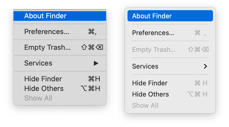
One consolation for button lovers is that buttons are suddenly somehow everywhere else in the interface. Here’s a menu from Big Sur, from Finder specifically. Aesthetically? Not terribly different from prior macOS versions. But the button-itis of macOS extends here too: all of these text items are represented as buttons — that is to say, the bar that used to indicate you were about to make a choice is now represented by a rounded rectangle. The panel itself? Also looks like a big button now. Even the hover in the menu bar… makes it a button. If a link is designed to take someone from one place to another, and buttons are associated with actions, is Apple implying that all menu items here are actions? If they’re actions, menu items like “Bold” aren’t going to make sense.
Anyway. Why would you need to buttonize a menu? One reason may be that you wanted to transplant an iOS interface into a menu – and that’s what Control Center is. A UI train wreck.
Control Center wiggled its way into our hearts back in iOS 7 on the iPhone, and has seemingly changed with every new release. It epitomizes the “junk drawer” approach of information design, with a collection of loosely-associated things living in one spot. There’s an argument for it on iOS due to its originally-limited spatial concepts. But the Mac is big and open, with lots of “room” to provide controls. Apple literally took the iOS Control Center interface and plunked it into Big Sur. On the Mac, it suffers from a crappy visual hierarchy and a design for touch interface that doesn’t translate cleanly to a mouse-based interface. Here, have a look.
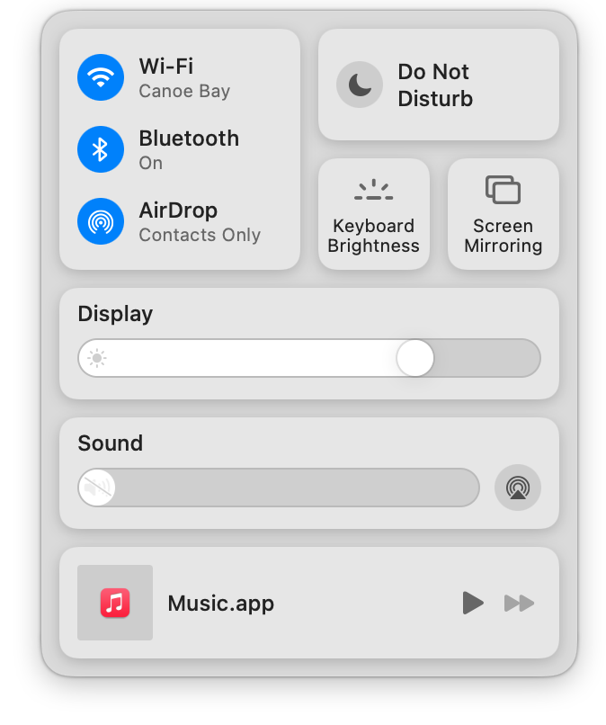
This display of controls has justification if the designer has limited space to convey information – otherwise the amount of information becomes a real design challenge.
But this design is filled with problems. Each of these controls, when hovered or clicked on, act differently. So they look somewhat consistent but don’t act that way. How do they work? What do they do? No one knows until they’re clicked on. Some morph into menus. Some are visual panels. Some require a long click. Some require a drag.
Ironically, the lack of clear affordances means this hodgepodge of controls would be better served by a menu! Nice one, Apple, nice one.
Beyond that? The redesigned dock icons and app icons… are also buttons. No joke. Those shapes you memorized and used to differentiate apps are gone now, with everything surrounded by a rounded rectangle. It’s not a new thing – Sketch and Omnigraffle started down this road a while ago – but there’s a bit of value lost there in distinct shapes. The ability to scan a dock for applications by shape is another little nod that lifts cognitive load. Imagine the Mail app icon in your mind: a rotated stamp, right? Safari is a round compass. Messages is a couple of oval speech bubbles. Now, every one of those shapes is surrounded by a rectangle. Instead of going strictly by shape, everything is a rectangle. In my own dock, only Slack, NetNewsWire, and the Trash – which is a special thing – aren’t button-ified and thus, they really stand out.

Going through changes
As designers, we always need to balance emerging trends, fashions, and aesthetics with standards built on usability. The amount of change Apple introduced here suggests they leaned strongly into aesthetics first and usability second. Big Sur makes the user do more work, figure more things out, and throw away known consistency.
That’s something we can pay attention to when creating our own interfaces and experiences. Are we throwing things away just because they don’t look good? Are we trying too hard to create relationships where there truly aren’t any? How much of this change can a person handle at once? Above all, do the systems we create make sense?
Designing an operating system is not an easy task. Apple went in a different direction here, not entirely successfully. I expect a bit of peeling back over the next few releases and I hold out hope that affordances become trendy again.