
I was recently contacted by a friend who asked, “What are the accessibility requirements for typography?” It’s a good question.
Typography is where the art of usability meets the science of readability, which is a poetic way of saying there are no direct Web Content Accessibility Guidelines (WCAG) requirements about what typeface or weight that you use, whether people would consider it legible, etc, etc.
Accessibility guidelines are specifically about ensuring the design allows people with disabilities (minor to severe), and as such they’re not designed to catch every problem that a web designer or developer can create. In other words, if you pick a font that people are having trouble reading, that’s a usability issue, not an accessibility issue.
If people are having trouble reading something you’ve written, assuming you’re not putting black text on a black background, it probably comes down to either the legibility of the typeface or the readability of the layout.
Typographic Readability and Legibility provides a detailed definition of each of these terms and what changes improve or degrade the readability and legibility of a block of text.
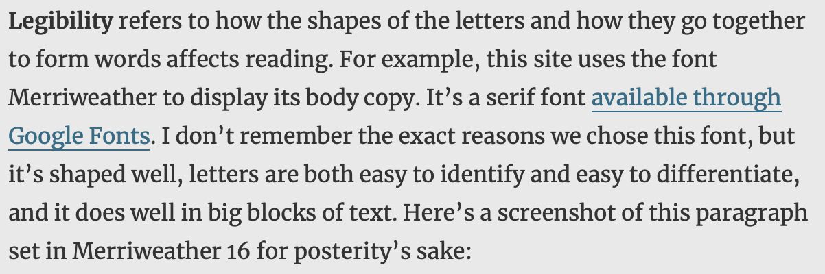
Legibility refers to how the shapes of the letters and how they go together to form words affects reading. For example, this site uses the font Merriweather to display its body copy. It’s a serif font available through Google Fonts. I don’t remember the exact reasons we chose this font, but it’s shaped well, letters are both easy to identify and easy to differentiate, and it does well in big blocks of text. Here’s a screenshot of this paragraph set in Merriweather 16 for posterity’s sake:
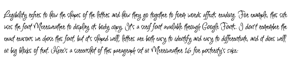
Let’s compare that to, say, Inspiration, another font on Google Fonts. Inspiration was definitely not designed to be readable at small scales or in large blocks of text. The letter forms flow all over the place including under each other. It’s like trying to read a bowl of spaghetti. Here’s a screenshot of the same Merriweather paragraph above, only rendered in Inspiration this time:
So that’s legibility in a nutshell.
Readability on the other hand, is determined by how you design the text blocks that contain the font you’ve chosen. They include adjusting the spacing and line height, the size of the text, the width of the text block, the letter spacing, contrast between the font color and the background color, and the hierarchy of the various text blocks on the page in relationship to each other.
Changing the factors that affect readability can’t make an illegible font readable. If your font looks like my aunt’s handwriting — she’s an MD — no adjustment to the sizing, contrast, etc. is going to make it legible to anyone but her. On the other hand, changing the factors that affect readability can make a legible font unreadable.
As web designers, we’re likely to choose a typeface only once every few years — if we get any options to change it at all. If you do have the opportunity to choose a typeface and you have no idea where to start, I strongly recommend reading the book or taking the online course entitled Better Web Typography for a Better Web by Matej Latin, as it did wonders for my understanding of typography. If you don’t have time for a whole book, the APA Style Manual has guidelines for picking a typeface that I mostly agree with here: https://apastyle.apa.org/style-grammar-guidelines/paper-format/accessibility/typography.
Outside of those rare instances of font-face-decision-making, legibility is going to be generally out of our control. There’s no CSS attribute that allows us to change the x-height of a typeface on the fly, at least not in 2023.
It comes as no surprise, then, that the WCAG provides guidelines to improve readability:
1.4.4 Resize Text requires that whatever typography you’re using should be able to be resized up to 200%, which means you want to use a “relative measurement” way of encoding the font size. In other words, use rems, ems, or percentages instead of pixels. Assuming your typeface is legible, this allows the user to zoom in and read if they deem it to be too small.
1.4.5 Images of Text (and 1.4.9 Images of Text No Exception) says don’t put text in images. When text is in an image, screen readers can’t access the text, voice control applications can’t access the text, the user can’t adjust the text to be easier for them to read, and essentially it just makes the text inaccessible to most people many disabilities.
1.4.8 Visual Presentation is a Level AAA guideline that requires you to make it so the user can change the foreground and background colors of the text block, limit the line length to 80 characters, refrain from justifying text, provide a line height of 1.5 times the font size, and provide the already-mentioned 200% resizing.
Most organizations don’t strive for Level AAA guidelines unless they have specific audiences who need it, so you may be tempted to toss this one aside. Before you do, pull out the line length guideline. 80 characters has been found to be the easiest and speediest line length for the vast majority of people to read. Shorter than 47 characters tends to cause people to jump lines incorrectly because they’re being required to do it so often. Longer than 100 characters can cause people to jump lines incorrectly because they lose track of what line they started on. Even if you don’t attempt to reach 1.4.8, make it a point in your organization to limit your line lengths. Your users will thank you.
1.4.10 Reflow says that your text block has got to fit on a 320×256 CSS pixel space without scrolling both horizontally and vertically, unless it’s a two-dimensional layout (i.e. a table or chart), in which case it can scroll both directions. Nobody wants to scroll their (English, LTR) text horizontally in the first place, but if for some reason they need to, they really don’t want to have to scroll up-down as well. This is as much a guideline to prevent you from pissing off your entire user base as it is one to help people with motor control issues.
Some rough math that someone did a while ago figured out that 320×256 is actually about the same as 400% zoom so if you’re building responsively, zooming to 400% is an easy quick-check on the responsive layout.
1.4.12 Text Spacing specifies a line height of 1.5 times the font size, paragraph breaks of 2 times the font size, tracking of at least 0.12 times the font size, and word spacing of at least 0.16 times the font size. The tracking and word spacing are generally set to those values by the browsers by default, but you need to set (or at least check) the line height and paragraph spacing.
The WCAG are not designed to help you make voice and tone decisions, and essentially, that’s what the choice of a typeface primarily impacts. They are, however, designed to help you take that choice of typeface and make it readable for the largest number of people possible. The guidelines will also increase reading speed by removing obstacles, and decrease the number of reading errors that people with cognitive disabilities can make.
Choose your typeface wisely, and apply the guidelines effectively, and you’ll provide your users a better reading experience.