
Here are the design things that have annoyed me today.
The email from my grocery store that says my order is both pickup and delivery.
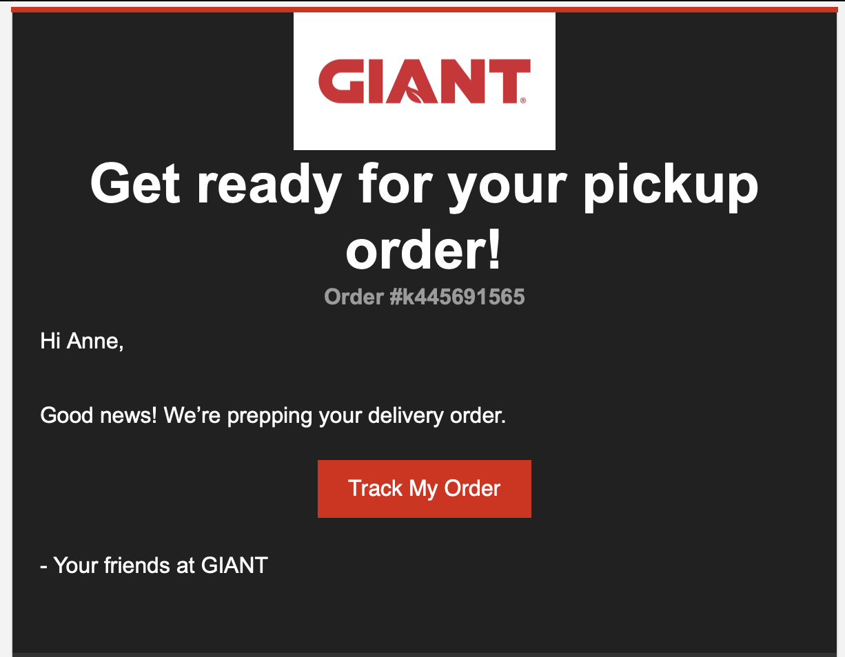
Every time I get one of these delivery confirmations, I have a heart attack that I’ve accidentally scheduled pickup. It’s clearly a template reuse problem somewhere, but since the grocery store doesn’t offer a “hey I want to send a tech support issue” option on their website, I’ve resorted to putting feedback in their feedback system and whining about it here. Y’all, check all your email configurations.
The sites that open everything in a new tab
When I need to schedule a blood test, I go out to Quest Diagnostics (sorry y’all, I’m naming names today) and accept all cookies. I have to accept or deny cookies because the cookie dialog is modal, but hey, it’s one click so I roll with it.
Then I hit the login link, which opens a new tab to a different subdomain of the quest domain, which asks me to accept all cookies in another modal. Okay…. I mean I just did and I just wanted to schedule an appointment but fine I’ll do the thing…
Then I hit the “schedule appointment” link, which opens in a new tab with another new subdomain, and asks me to accept all cookies again.
Only then am I actually able to schedule an appointment on a scheduler that, if I’m annoyed enough some other day, will get its own post.
Now I am not the kind of person who gets all fussed about making people click too many times, usually. But as Luke Wroblewski and Jared Spool have both pointed out, it’s not about how many clicks something takes, it’s about the value the user feels they’re getting from those clicks. Make me click five times to get to what I need, but each click helps me decide if I’m going the right way and gets me closer to my goal? No problem. Make me click to accept cookies three times because you’ve put your content on three different subdomains?
 Not only is it annoying, by the way, it’s also really bad for accessibility, as a11y tips: External links and new tabs by Sean Elliott explains a lot more succinctly than I can. Don’t open new tabs. If your legal team says you have to do a modal dialog for accepting cookies fine but make them find a way to do it once-and-done. Nobody’s got time for two extra tabs in their life.
The feedback button that doesn’t button
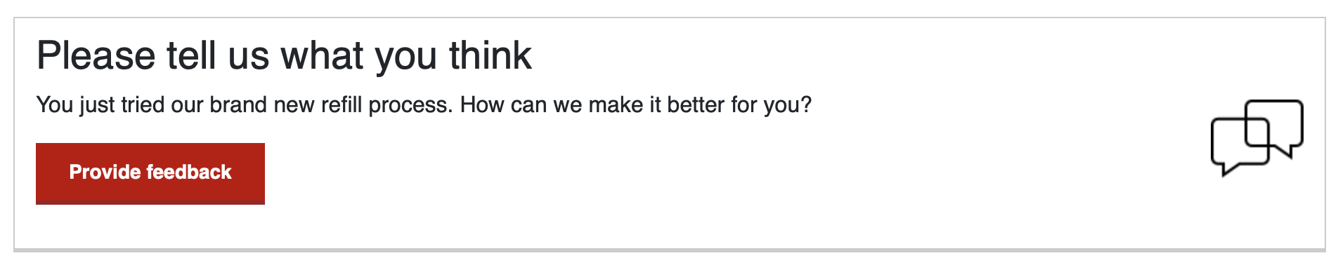
I filled a prescription using a new CVS refill process. They invited me to provide feedback on it.
I had feedback to give. (Mostly, it was “hey, I’ve got like six prescriptions that all start with the same two letters, you’ve gotta give me more than that if you want me to be confident I just filled the right thing” because yeah, there’s protecting my privacy and then there’s not giving me enough information to make good choices. I’d rather log in than guess what I’m refilling.)
I did not, in fact, provide them with any feedback today.
The button doesn’t do anything. Not on the latest version of Safari, with or without the pop-up blocker enabled, anyway. There are some nice console errors in my inspect window, which is great news if I were their functional QA tester. As I am, in fact, their end user, not so great.
Feedback paths are not usually considered part of the “happy path” and thus probably aren’t getting tested as thoroughly as the happy paths are. I understand why — if the happy paths are working, the feedback paths shouldn’t be needed.
But on the other hand, if the feedback path is the only way to tell a company that the happy path isn’t very happy, or if you’re going to stick the feedback path all up in the end user’s face, you’ve got to test it as well as the happy path or you look like you don’t know what you’re doing. Even for “niche” browsers like Safari. Even with pop-up blockers turned on. Even if it takes extra time.
The fact that this is a one-day list
All these negative user experiences happened to me today. They’re probably not even all the usability, accessibility, and functionality hurdles I hit. They’re just the ones that really annoyed me.
I’m not affiliated with any of the teams that produced these particular glitches, but I rarely meet people who ship crap on purpose, so I can only guess that they were doing their level best to get good work out the door. And yet, each of these experiences were notably awful enough that the end user (hi!) decided they were worth blogging about.
There’s a lot more I have to say about eroding quality standards, Six Sigma and Kaizen being abandoned for warped versions of Lean and JTBD, the overloading of developers and firing of QA folks that happened with Shift Left, and how companies used to strive for “it just works” and “don’t be evil” but don’t seem to be as interested in anymore, but right now it comes down to one goal:
Fight to do better.