I’m playing this game on my phone called Clusterduck where you try to get ducks to lay eggs to make other ducks.
And it got me thinking about cognitive load.
Cognitive load refers to the amount of working memory your brain needs to use to do whatever it’s doing. In UX, we often refer to tasks that increase in complexity or time or outside resources as “increasing the user’s cognitive load” and, generally, that’s a bad thing.
It can be hard to explain to folks what we mean by cognitive load. So let’s start with ducks.
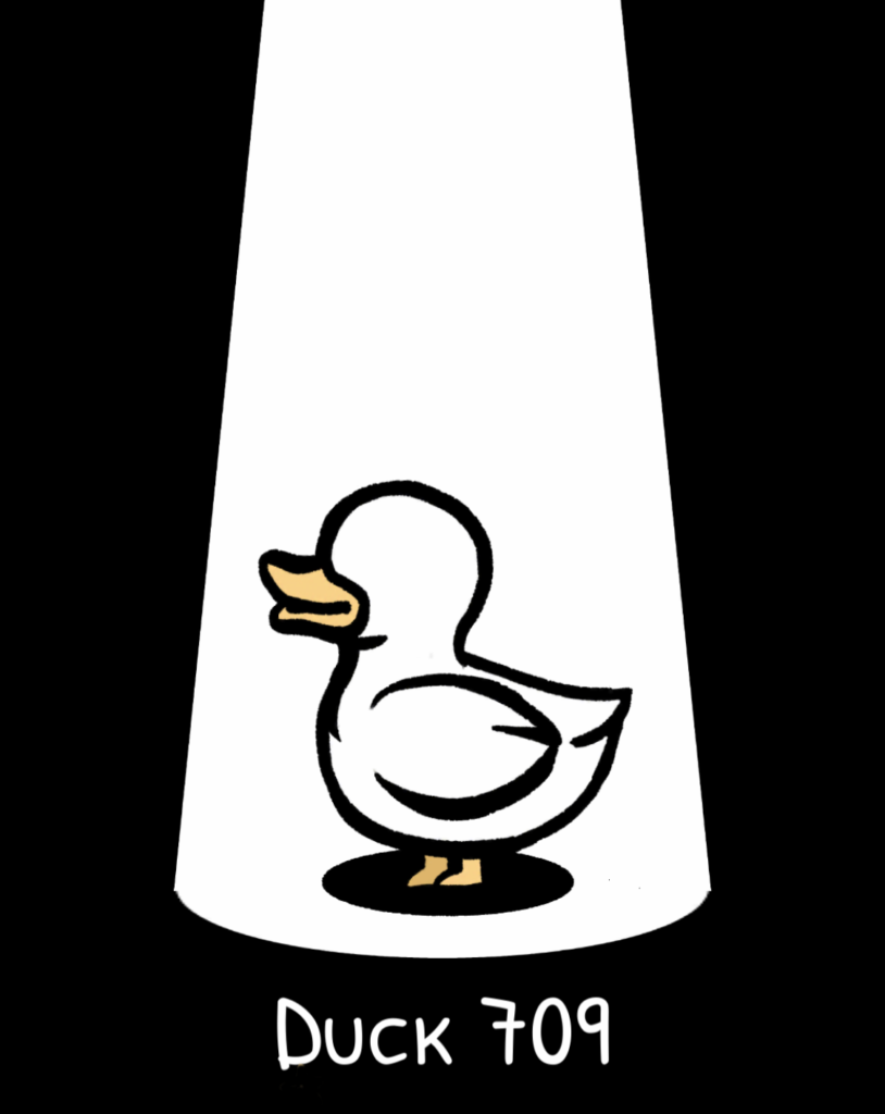
When I say “duck”, you probably picture something like this duck:
Duck 709, as seen here in profile, has a round white head and a yellow bill. Its wing is a white oval shape with a slight cut-in to show that the feathers may not lay perfectly flat. Its body is, to over-simplify, duck-shaped, generally oval, but with a small flipped up set of feathers for a tail.
This is a cartoon-level illustration of the concept of a duck. Pretty much any American (at least, I can’t judge for other cultures) would know this is a duck because it’s obviously a bird, it’s white, it has a short neck (unlike a goose or a swan), and it’s got a duck bill and duck feet.
If I show you this duck and say “duck”, you’re going to agree. You don’t have to think about whether that’s a duck, and it doesn’t add cognitive load to your brain’s current workload. It’s a duck. In fact, this is a duck you might even be able to draw yourself.
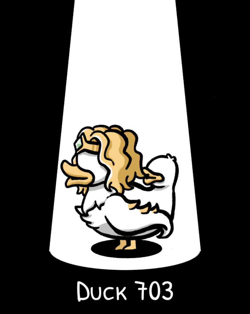
Now let’s say I say “duck” but show you duck number 703, you may have a different reaction.
Duck 703, as seen here in profile, is also a cartoon-level illustration of, well, someone’s concept of a duck. Duck 703 still appears to have a white head and body like a duck. It has an orange beak like a duck. It has the same feet as Duck 709 did.
Duck 703 also has golden hair that reaches shoulder length, and what appears to be a gold tiara with a light green jewel embedded in it.
Okay, so it’s a duck with a bit of anthropomorphic personification, that’s not too unusual in comics or tv, so we can roll with it…
Duck 703 doesn’t have what I would necessarily call wings, though. The visible wing is a long curly tentacle with three gold spikes on its top edge. Not only does this challenge our definition of duck, it also challenges our definition of humanoid, so the tentacle is both not-duck and not-duck-dressed-as-a-human. It’s a new thing altogether.
Whereas a standard duck is probably not seen as a threat, parts of our ancient brain wake up at the sight of a tentacle to let us know that tentacles are often associated with otherness, creepiness, or horror. This duck is now making us wonder if we’re a safe distance away.
Duck 703 also has a duck head as a duck butt. That’s right, instead of sporting a tail, this duck sports another duck head looking at the back of the main head. (At least if it was turned around it’d be better security.)
No duck with two heads has naturally evolved in our current world. If the tentacle wasn’t alarming, a duck with two heads and a tentacle certainly is. We’re not just talking about tentacle otherness horror, now we’re starting to think about nuclear radiation horror stories, uncanny valley duck shapes, and just what happens if that poor thing needs to vomit.
This duck, as they say, is a lot.
That feeling of “I don’t know that I could have told you what I was expecting when you said duck but this blonde-haired tentacle duck with a duck head on its but was definitely not it” is cognitive load. It’s a brain suddenly thrown into overdrive to identify and process something that doesn’t align with our intrinsic expectations, or forced to handle a complex or incomplete load.
Now, let’s swap out “duck” for “address form”.
From a very young age, we (Americans) are taught “name, address, city, state, and ZIP code”. Depending on where we live we might learn additional pieces, like company name is always after person’s name, or apartment number can be at the end of the street address line or in the next line down. But “name, address, city, state, and ZIP code” become intrinsic knowledge to us at an early age.
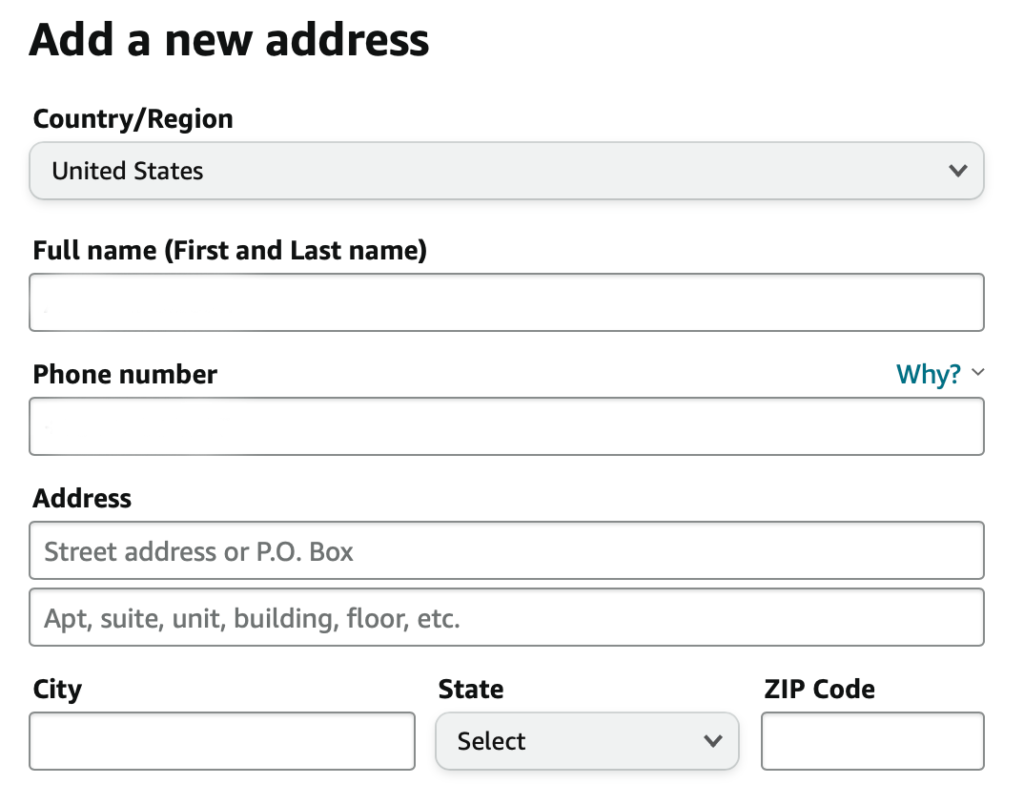
Here’s Amazon’s (US) address form:
The form requests, in order, the country, full name, phone number, street address, 2nd address line (apartment, suite, etc.), city, state, and ZIP code of a location in the United States.
The phone number placement on this form is a bit odd, I’ll admit. But we’re here about the mailing address.
The formatting for a mailing address matches the US Postal Service (USPS) delivery address requirements, in the order that the USPS requires it. They even go so far as to put the city, state, and ZIP all on one line the way the USPS requires it when written out. It’s easy for us to fill out, because it’s what we learned. It’s easy for us to confirm it’s correct, because the data’s in the order we expect.
This address is your typical duck. Anyone who lives in the US is going to recognize what to do and where to put things to get their package to its destination.
Here’s the address form for a site called Hayneedle:
The form requests, in order, the email address, country, first name, last name, street address, 2nd address line (apartment, suite, etc.), optional company name, zip code, city, then state, followed by phone number.
Placing the ZIP code on a US address form ahead of other fields might, from a logic standpoint, seem like it’s right. Once the user picks the ZIP, we can prefill the state and potentially a short list of cities. But what looks like easier work for our user — fewer choices to make — is actually harder, because it breaks expectations and makes them think about something they don’t normally need to think about. “Name, address, city, state, ZIP”, suddenly becomes “Name, address, what the hell is the company doing here? Now wait a minute everything’s out of order.”
I know this, because ten years ago I tried to build this same “helpful” zip code formatting pattern and our users hated it. Hate hate hate.
If I had been teaching a bunch of people the relationship between city, state, and ZIP code, or if I’d been providing a tool to find a city and state based on a ZIP code, that design might have worked. Those are tasks for which my users didn’t have a memorized formula in their head.
But reordering the fields in an address when all they wanted to do was finish shipping something, or make sure they could get their bank statements? It caused a massive amount of cognitive load in a place where they expect to experience no cognitive load.
They know their address. They know how it’s formatted. They know what city they live in. They don’t need me to prefill the city for them based on the ZIP code. They would actually rather tab though and manually type the city than choose it from a select menu.
What I thought was a useful duck turned out to have tentacles.
See, if we increase a user’s cognitive load a little, they may not notice. It’s still a duck.
As we continue to increase the load, through avoidable or unavoidable complexity, they tend to grow more frustrated, especially if they expected the task to be simple or it’s something they do everywhere. Is it still a duck?
Left unchecked and untested, it’s easy to design something that we think will lower cognitive load, but increases it instead. Once we put things in an unexpected order one too many times, or asks questions our users aren’t prepared to answer, they’re just going to walk away.
Call it frustration or call it survival instinct, nobody’s hanging around to see what two headed tentacle duck is going to do next.


