
I work with a lot of folks who are new to information architecture, and I’ve answered a lot of “but where do the controls go?” questions lately. There is a definite sense of directionality to interfaces, and understanding the expected direction that the user moves through the page helps you determine how to control the display or change to the content on the page. It will also help you understand why a poorly-placed control causes confusion or frustration in your users.
The rule:
The controls to display or interact with a piece of content should be above and/or to the left of whatever they’re controlling.
Caveats and preconditions:
First, everything in this article applies for left to right (LTR) languages. If you’re designing in a right to left (RTL) language, an up-down language, or a down-up language, your mileage may vary, but flipping the rule is probably a good start.
Second, this pattern requires two things: containers you want to manipulate, and controls to manipulate them. Containers may refer to:
- Tabsets
- Cards
- Accordions
- Forms (particularly forms with subsections or embedded tables)
- Tables
- Charts and sets of charts
In this case we’re also going to take specific types of encapsulated containers out of the pattern, including:
- Carousels
- Video / video controls
- Audio / audio controls
- Search boxes
We’ll explain why in the Exceptions section.
These lists are not all-inclusive.
The design principles
Let’s start with the obvious: left-to-right (LTR) languages are read left to right. So at the highest level of generalities, readers are more likely to notice the thing to the top left first and the bottom right last. When a user is scanning a page to get a sense of place, we call this specific pattern F-Shaped Scanning because of the roughly f-shaped eye-tracking patterns it produces.
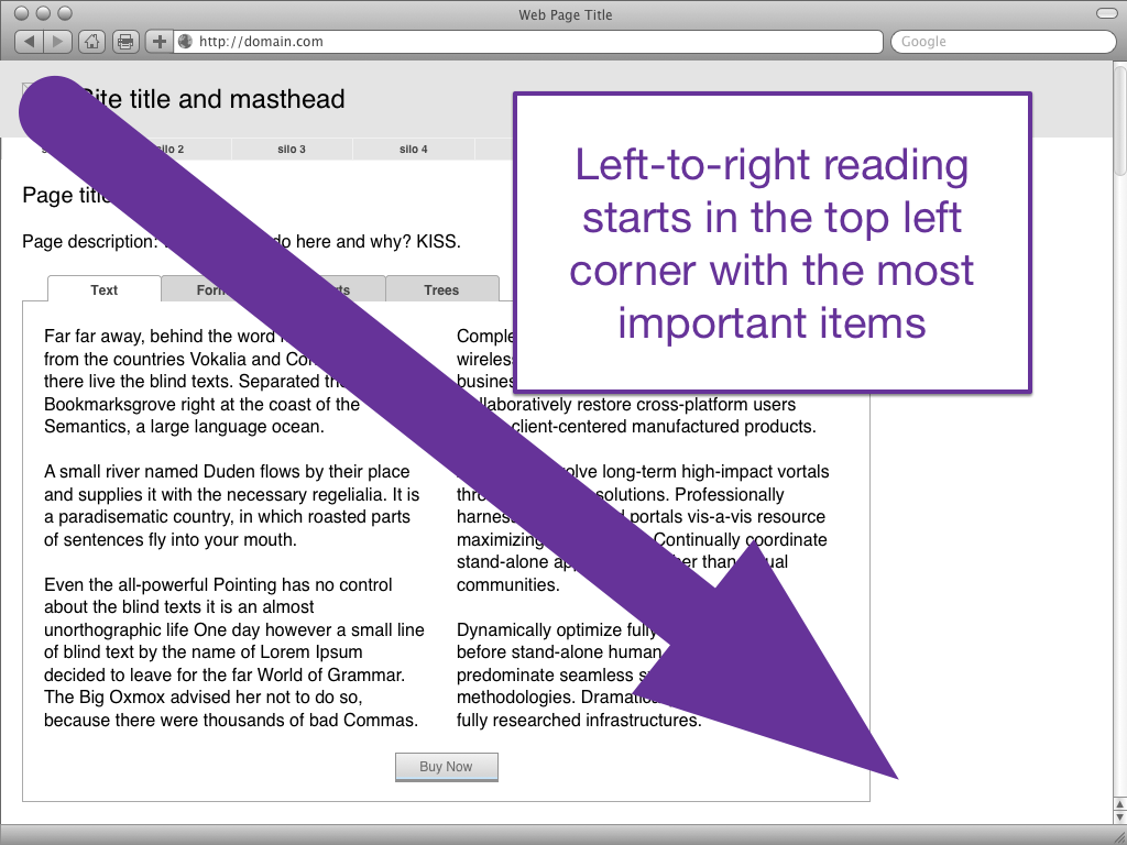
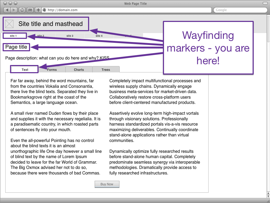
A sense of place is critical for a user to acquire; knowing where they are, what the state of the place is, and what they can do allows them to move forward (or backward) toward their intended goals. Because “Where the hell am I?” is the first question anyone has in any situation, and because people read left-to-right, we answer the questions “where the hell am I?” by putting the wayfinding tools (the site title, logo, and global navigation) as far up and to the left as we can get.
Consider this the functional equivalent of the “Welcome to Pennsylvania!” sign you get when you cross a state border. Even assuming you knew you were going to Pennsylvania, it’s good to know when you’ve crossed the border, and if you didn’t know you were visiting the Keystone State today it’s really important to find out you have.
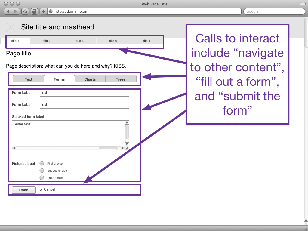
Almost as important as answering “Where am I?” is answering “What can I do here?” You may have also heard this referred to this in terms of questions like “Can the user perceive the purpose of the page?” or “Does the user identify the call to action?”
(To answer “What can I do here?” we also have to answer “And what state am I in right now?” Most of the visual components that we use present information display both state and affordance simultaneously through a visual language, but if we’re presenting information through auditory means via a screen reader or speech-controlled interface, we have to specify both.)
In general, it’s best to present interaction controls either in conjunction with the wayfinding points or directly after them.
So for example, a tabset is both wayfinding (answering “Which content set am I on?”) and interaction (answering “How can I switch to other related content?”).
A call to action to “buy it now!” on the other hand, should be to the right (or below) of the name of the product because nobody wants someone shouting “BUY THIS THING!” when they don’t know what the thing they’re being asked to buy is yet.
You may have noticed that the direction with which we read and the containers that we digest convey more than just wayfinding and interaction, however. They also convey a sense of time. For example, as the reader you assume that if I were reading this paragraph out loud to you, I would read it after the content above this paragraph, and before the content below this paragraph. Events lower on the page are perceived as taking place after events higher on the page, even though somewhere in our brains we know that the entire page is present all at a single moment.
The reason that we put the wayfinding above or to the left of interactions is because we want to know “where am I?” before we know “what can I do?”, and in a left-to-right language, earlier events get put to the top or the left of later elements.
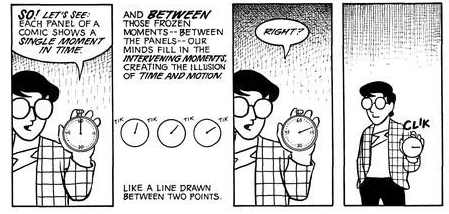
The time component is true of any reading, but is most obvious in serial art or comics. In Understanding Comics, Scott McCloud explains (emphasis his):
In learning to read comics we all learned to perceive time spatially, for in the world of comics, time and space are one and the same… so as readers, we’re left with only a vague sense that as our eyes are moving though space they’re also moving through time — we just don’t know by how much!
Obviously, if a perception of time is present in straight written words and also in something as visually-oriented as comics, we can assume it also applies to our less-visual-than-comics, more-visual-than-a-novel websites.
When using a web interface, users hate moving backwards in time.
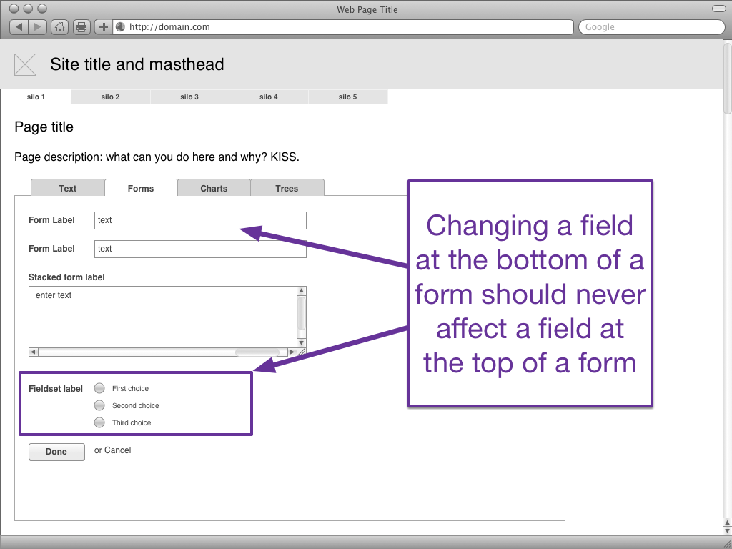
Think about the last time you filled out a long form on the web. Maybe it was shipping information. Maybe it was a mortgage. Whatever it was, I’m fairly confident that if the form designers required you to get information from the top of the form to continue something at the bottom of the form, it made you grouchy. We expect that if we’ve provided something at the top of an experience, it’s remembered during the time it takes us to get to the bottom.
The most frequent information architecture mistake I see in form design is form fields that don’t respect the perceived time directionality of the form. For example, I was recently shown a form where checking a box in row 6 would change a value in row 2. When you’re filling out that form, and you’ve reached row 6, row 2 is in the past. You’re neither going to expect to have to recheck your past nor look for changes — especially if you’re on a small screen and row 2 is no longer visible!
On the other hand, if row 2 affects the values (or fields) available row 6, well, you haven’t even gotten to row 6 yet… it’s in the future.
Or to put it another way, “If X then Y” has to run in the order “first ask X then ask Y”. Even if you can’t quite grok that for visual interfaces, think of the impacts for users who are listening to the screen… if you update something that’s already been read, it’s like interrupting yourself to say “nope, changed my mind”, and then you have to tell the user about the whole form all over again or risk confusing them.
In addition to wayfinding, interaction-finding, and the perception of time, our controls need to be visually associated with the things they affect.
The Gestalt Principle of Proximity states that things that are grouped together appear to be related. That means that if you want a control to be associated with a container, they have to be near each other. The further apart they are the less they look connected.
Fitts’s Law strengthens this principle by pointing out that the further apart two things are the bigger you have to make the second one to make it quickly usable.
The Law of Uniform Connectedness helps us strengthen the connections between controls and the things they effect by stating that elements that are visually connected are perceived as more related than elements with no connections… which is a fancy way of saying “draw a line between two things or put a box around them, and they look like they work together.”
A popular mistake is putting a control at the top of a page which doesn’t affect anything except at the bottom of the page. Another popular mistake is putting a control inside a child container that actually controls the parent.
So here’s a quick test: if you can draw a box around the thing being changed and the control, and everything in the box is being controlled by the control, then they’re probably (but not always) associated correctly.
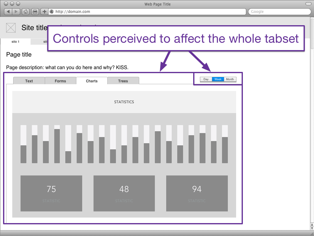
I see this mistake most often with tabsets and charts, so here’s an example.
If we put the controls above and to the right of the tabset’s content body, it’s perceived to control not just the current tab’s information but also the information on the other tabs.
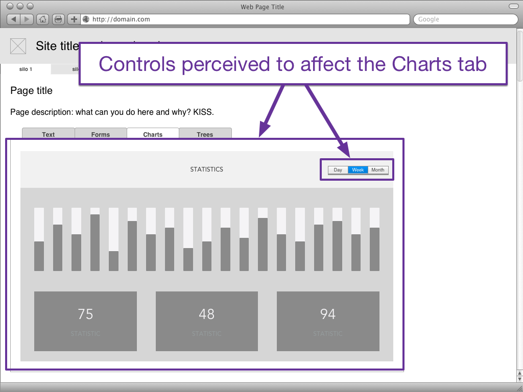
If we put the controls within the body of the Charts tab, but outside of the body of any of the charts on the page, the controls are perceived to control all of the charts on the page. For heaven’s sake, don’t put in exceptions! Nothing drives a user crazy like having three charts that will switch between day, week, and month with a single control and one chart that’s like “nope, I’m not even time-related, I need different controls”.
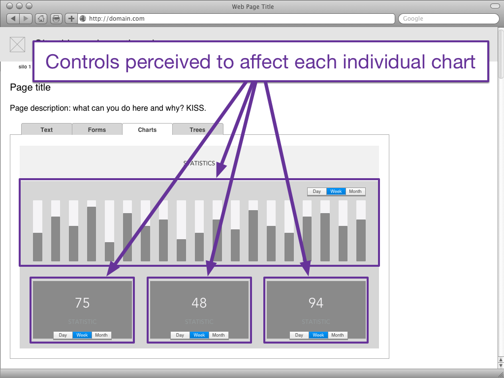
So what if we do have four charts that require at least two different controls? At that point the best thing we can do is give each chart its own control, so that the user can see explicitly what controls affect which charts. Oh, and if you have to group your charts into two sub-containers for “affected by time” and, say “affected by amount spent” or something, each of those containers only needs one control… as long as all its children use the same scale.
Exceptions
One exception to this rule occurs when you can use the Principle of Proximity and containerize the controls to be very obviously related to the thing to their direct left or directly above them. Remember when we mentioned that we weren’t going to talk about video players? That’s because the controls for a video player are generally below the video player, but there’s such a strong containership thanks to the Principle of Proximity and the Principle of Uniform Connectedness that we can get away with it.
Containers with encapsulated controls such as video players, audio players, and carousels tend to display mostly visual or visual/auditory content (as compared to written or mixed types), have specialized controls such as play/pause which are different from most of our other use cases, and don’t change the content of anything other than their own container. (Also, fuck carousels.)

Another exception can be found in micro interactions for form fields. Search fields, select menus, and similar elements may have controls or affordances at the right or bottom, but they are so tightly visually coupled with their content that they’re viewed by the user as a single element. That isn’t to say that with some creative destruction you can’t break their usability through CSS styling, but at least you’ll have to put some effort into it.
(Don’t.)
In conclusion…
Web pages have directionality. Assuming you’re working in a LTR language, you should ensure that you’re answering wayfinding questions to the top or left and interactivity questions directly after that, also to the top or left of the content container you’re affecting.
Users don’t like to go backwards in time, so make sure that your conditional logic never asks a user to move back up or to the left of the page because of something they completed further down or to the right.
Users also don’t understand when controls are far away from the things they’re controlling, or are perceived to control a larger set of things than they actually affect, so follow the Principle of Proximity and put your controls closest to the border of the container they’re affecting.
Finally Gestalt principles, especially around proximity and uniform connectedness, can help you strengthen relationships between controls and content when you need to break the rules, but avoid breaking the rules whenever you can, so that your sites will make more sense.