A few years ago, we replaced the back deck in our backyard. Instead of stairs leading to a damaged brick patio, I requested an ADA-compliant ramp that runs alongside the house, terminating just at the garage door.
The contractor was puzzled. “Why an ADA-compliant ramp?”
The obvious reason is because if I ever land myself in a wheelchair, or my husband does, it’d be nice if we can still get in the house.
The less obvious reason is because I am too lazy to go do the research myself on what a safe, usable, effective ramp consists of. How long should it be? What’s its maximum slope and rise? What’s the minimum width? The Americans with Disabilities Act research have already done all of that work so that neither I nor my contractor have to. We just need to comply with it.
The reason I gave the contractor was, “We collect pinball machines. If it’s safe for transporting a fragile yet heavy human being, it’s probably also safe for transporting pinball machines.”
That’s also true. In fact, my ADA-compliant ramp has safely transported:
- Pinball machines
- a barbecue grill
- a treadmill
- an old fridge going out and a new fridge going in
- big boxes of Christmas presents going out to the car
- a Jack Russell Terrier who threw his back out and couldn’t climb the steps
That last one was the most surprising. I have frequently thought about what would happen if someone close to me needed a wheelchair in my house, but I hadn’t really considered the idea that one of my dogs could become disabled. But here we are — two of my jacks are 11 years old, one has a bad back and the other is starting to go blind. The ramp is safer for both of them. (The third jack is a year old and barrels up the ramp like it’s the runway on an aircraft carrier.)
Movers, especially the folks installing things like refrigerators, have cheered out loud when they learned I had a ramp.
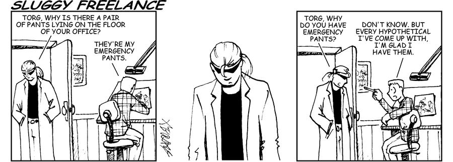
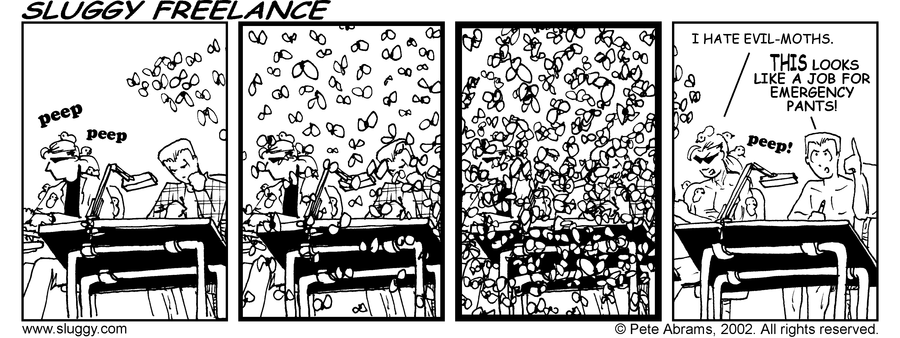
As Torg says in the Sluggy Freelance strip at the top of this column, “For every hypothetical I’ve come up with, I’m glad I’ve had them.”
So when it comes to designing for the web, using the WCAG 2.1 guidelines isn’t just about ensuring that someone who has a disability can use my website, it’s also about ensuring that everyone can use my website without me spending hours upon hours of research making design decisions.
Take Success Criterion 1.1.1 Non-Text Content for example. On the surface, it’s there to make it so that someone using a screen reader or experiencing some other vision-related issue can still access the information on the page.
Alt tags. Got it. Alt tags have been required as part of HTML since virtually the beginning, and they identify the content of an image when either
- you can’t see the image and you’re using a screen reader or
- your browser can’t render the image and you still need to know what it was.
But when we look closer at Success Criterion 1.1.1 we find that it’s not just alt tags. It’s also ensuring that icons for navigation, like the Jabra Headphones app here, have a translate-the-designer option:

If there wasn’t a text label on that menu option i would never guess that “big dot with little dot at the top left corner” had any meaning at all.
Success Criterion 1.1.1 does more than that — it also covers all of the “but what about?” scenarios that we as designers and developers can get bogged down in.
- Do we need alt text? Yes.
- But what about when it’s the hamburger menu? Also yes.
- But what about when we’re trying to convey a sensory experience? Still yes.
- But what about for a CAPTCHA? I know you’re going to be just shocked, but yes.
Much like building an ADA-compliant ramp meant I didn’t need to research and prove to myself or my contractor what the right rise, width, and length were, building a WCAG-compliant webpage means I don’t need to spend my time researching whether CAPTCHA requires a text alternative because the people who wrote the WCAG guidelines, many of whom have lived experience as disabled people and know what the pitfalls are, have already done that research for me and provided me all the references and guidance I need.
And just like with my ramp, accessible web design implemented correctly has saved me in a number of situations:
- slow-loading pages can still display alternative content for images
- icons I wouldn’t normally recognize have labels
- Hardware problems like broken screens are easier when the apps have text alternatives VoiceOver can understand
- Designers put less crap on the screen when they’re required to explain it with labels
- Our brains are better wired to understand words and pictures when they’re put together.
That last one was the most surprising, until we think of all the media we take in that consist of both words and pictures. Video — from television to Youtube, from advertisements to features — is frequently a combination of words and pictures (and audio tracks). Magazines and newspapers are rarely walls of text, and the infographic has become a staple for presenting complex content. And serial art, whether it’s in the form of graphic novels, superhero comics, or editorials, makes storytelling both a visual and a language-based medium. Scott McCloud describes it this way:
Pictures are received information. We need no formal education to “get the message.” The message is instantaneous. Writing is perceived information. It takes time and specialized knowledge to decode the abstract symbols of language. When pictures are more abstracted from “reality” they require greater levels of perception, more like words. When words are bolder, more direct, they require lower levels of perception and are received faster, more like pictures.
Is it any wonder, then, that an icon paired with a label is more powerful a medium for information scent or message presentation than an icon or a label alone?
It’s always a good practice for web designers understand why the WCAG guidelines work, just as it’s valuable for us to understand why our design principles and heuristics work.
At the same time, I’ve seen a lot of designers who walked around thinking of WCAG guidelines as strictly about designing for people who need accessibility. Which, yes. And also, if you need a source for robust, heavily-tested guidelines for building anything on the web, without spending a lot of time doing your own research to “justify” the decision to add a label to an icon, the WCAG guidelines are an incredibly powerful source of design heuristics.
And in every hypothetical I’ve come up with, I’m glad I have them.


