3 Things I Didn’t Expect About Working Remote

A year ago, I took on working remote for the first time — not just being a remote designer, but a remote design manager.

I figured after a year I needed to write the prerequisite “here’s what I learned” piece. Here’s the thing, though — there’s not a lot I can tell you that every other “here’s what working remote is like” article does. I mean, they all essentially say the same things. Communicate well. Check in on Slack or Microsoft Teams or whatever. Get out of the house when you can. For leading a team, always forge connections and never leave anyone out (and on mixed local/remote teams you must act as remote as you possibly can.)

Scott Berkun wrote a great book on remote working. Veronica Erb wrote a great piece on removing obstacles from remote work for your team. Absolutely go read those. They’re smart and insightful takes. If I wrote a standard “year of remote working” piece I’d just rehash what they said.

So let me talk about three things that I didn’t expect and was surprised by in taking this remote gig.

You need to communicate better than you do now to work remote — even if you’ve worked remote before.
I am a notorious over-communicator. I can be TMI at times. You’d think that working on a team with a designer in Mexico and a product team on both sides of the Atlantic I would have no trouble with keeping everyone up to date. Nope. I was utter shit at it for the first few months.

Take a design critique. You look at a design, think of the good things to say, pull at the things that trouble you, give direction to the designer as to what they could do next. In real-time, in a conference room, you start with “hmm,” mainly because you’re buying time to process everything shown to you. You might point at something, wave your arms, whatever. Point is, you look engaged.

“Hmm” doesn’t come through well on Slack, it turns out. You spend some seconds thinking of what to say while the designer on the other end is freaking out that you are not responding. (Or worse, Dylan is typing OMG what is taking him so long?)

And then when I finally responded, I found I wasn’t giving actionable feedback; I’m used to having a conversation that led to feedback. “OK, let’s think this through” is much harder to do in the cold text of a Slack message, or even a phone call, than it is in the room where you can reassure the presenter that you are listening, feeding back, processing.

I made two adjustments to my communications. One, I started repeating back exactly what I thought I’d heard to make sure I clearly understood what they were talking about. It’s an old trick from debate team I’d forgotten — summarize the opponent’s view and make sure you clearly understand their argument before you start taking it apart. By doing this, I was able to avoid misunderstandings that could turn simple Slack conversations into spun-out two hour phone conferences.

Two, I got much clearer in defining action vs. thought. I have a LOT of thoughts. But like a tweed-wearing college professor, I could sometimes spend more time on the thinking and less time on the acting, or even the “what would I do” statements. I had a young design organization that treated everything I said as Gospel, and I needed to disabuse them of doing that, but at the same time I needed to clearly guide, not pontificate. I got more to the point, succinct, and learned to guide better in what I said. I framed actual feedback as “here is what I think you should do” and gave them concrete actions they could take.

You have more time than you think, and it can scare you.
Working remote meant I could work from anywhere, but most of the time it meant working from my basement office. My commute went from 40 minutes of Seattle’s frustrating traffic to 60 seconds of “commuting” via the kitchen and stairs.

It turns out, though, you do a lot more than that when you go into an office. After 40 minutes of commuting, you need 10-20 minutes to calm down from the stress, get some coffee, and deal with the morning email. For the rest of the day, you’re shuttling between meetings, getting into hallway conversations, going out for lunch, dealing with people dropping by your desk… and you still have 40 minutes (or more) of commuting in front of you.

Of those 8-9 hours you’re in the office, you’re probably only really working on design uninterrupted for 4 of them. Sometimes less.

The lack of a commute upsets that behavior. No need to spend 20 minutes trying to calm down and caffeinate. No hallway conversations. No people just dropping by your desk. No need to go across the building to a meeting, no need to kick a meeting running long out of the conference room because you have it scheduled.

The 4 hours you once had at your desk turn into 6, sometimes 7. And if you’re like me, it freaks you out, because OMG I have dead time! My need to be in overdrive all the time can’t cope with it.

Eventually, you do relax into it, but does it take time. In the meantime, for a driven person, especially someone who is coming out of the go-go startup world, you are going to freak out.

Early on I made lists of things to do. Now, I just accept that I have more time to do things that used to require hair trigger decision making, and it’s helped me be better at the systems thinking I’m good at. It means more reflection and less “always on” time. It means trusting that my design and leadership skills don’t require me to be “always on.”

Office politics aren’t that much different.
You would think they would be, but they’re really not. The fights over refilling the coffee pot turn into fights over Github pull requests. People try to outtalk and outshout each other on virtual meetings just as much as in-person meetings. And all the bad, discriminatory behaviors that rear their heads in an office — sexism, racism, homophobia, etc. — are just as prevalent remotely.

I still have to encourage women to speak up and amplify their ideas. I still have to shut down demeaning language (or, sadly, must let it go right past in the name of comity.) I still have to go “hey dude, not cool” to toxic behaviors. None of that changes.

People aren’t magically better when the work moves remote. They’re also not worse, either. People who are problematic in real life turn out to be problematic online. Nothing changes other than the communication methods.

Leadership means you have to remember that you need to be the same person even as your role changes and your context. In a virtual world, that comes through even stronger than in real life because there is so little communication to go by.

In the end, working remote is a wholly different beast from working in an office. And it’s also very similar. It forces you to communicate clearer, managing your time better, and listening more closely for the things you’d normally pick up on in an office. And yet, it’s still about working together, getting work done, and driving your team towards getting better each day.

Accessibility guidelines as heuristics, or the need for a ramp and emergency pants

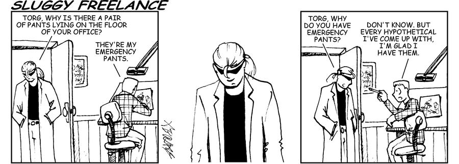
Sluggy Freelance comic strip. Panel 1: Riff asks Torg why is there a pair of pants lying on the floor of your office? Torg replies They’re my emergency pants. Panel 2: Riff stares at pants. Panel 3: Riff asks, Torg, why do you have emergency pants? Torg replies Don’t know. But every hypothetical I’ve come up with, I’m glad I have them.

A few years ago, we replaced the back deck in our backyard. Instead of stairs leading to a damaged brick patio, I requested an ADA-compliant ramp that runs alongside the house, terminating just at the garage door.

The contractor was puzzled. “Why an ADA-compliant ramp?”

The obvious reason is because if I ever land myself in a wheelchair, or my husband does, it’d be nice if we can still get in the house.

The less obvious reason is because I am too lazy to go do the research myself on what a safe, usable, effective ramp consists of. How long should it be? What’s its maximum slope and rise? What’s the minimum width? The Americans with Disabilities Act research have already done all of that work so that neither I nor my contractor have to. We just need to comply with it.

The reason I gave the contractor was, “We collect pinball machines. If it’s safe for transporting a fragile yet heavy human being, it’s probably also safe for transporting pinball machines.”

That’s also true. In fact, my ADA-compliant ramp has safely transported:

  • Pinball machines
  • a barbecue grill
  • a treadmill
  • an old fridge going out and a new fridge going in
  • big boxes of Christmas presents going out to the car
  • a Jack Russell Terrier who threw his back out and couldn’t climb the steps

That last one was the most surprising. I have frequently thought about what would happen if someone close to me needed a wheelchair in my house, but I hadn’t really considered the idea that one of my dogs could become disabled. But here we are — two of my jacks are 11 years old, one has a bad back and the other is starting to go blind. The ramp is safer for both of them. (The third jack is a year old and barrels up the ramp like it’s the runway on an aircraft carrier.)

Movers, especially the folks installing things like refrigerators, have cheered out loud when they learned I had a ramp.

As Torg says in the Sluggy Freelance strip at the top of this column, “For every hypothetical I’ve come up with, I’m glad I’ve had them.”

So when it comes to designing for the web, using the WCAG 2.1 guidelines isn’t just about ensuring that someone who has a disability can use my website, it’s also about ensuring that everyone can use my website without me spending hours upon hours of research making design decisions.

Take Success Criterion 1.1.1 Non-Text Content for example. On the surface, it’s there to make it so that someone using a screen reader or experiencing some other vision-related issue can still access the information on the page.

Alt tags. Got it. Alt tags have been required as part of HTML since virtually the beginning, and they identify the content of an image when either

  1. you can’t see the image and you’re using a screen reader or
  2. your browser can’t render the image and you still need to know what it was.

But when we look closer at Success Criterion 1.1.1 we find that it’s not just alt tags. It’s also ensuring that icons for navigation, like the Jabra Headphones app here, have a translate-the-designer option:

The toolbar at the bottom of the Jabra Elite app. The moments icon is a big dot and a little dot. The discover icon is a lightbulb. The about icon is a circle with an i in it. Two out of three ain't bad.

If there wasn’t a text label on that menu option i would never guess that “big dot with little dot at the top left corner” had any meaning at all.

Success Criterion 1.1.1 does more than that — it also covers all of the “but what about?” scenarios that we as designers and developers can get bogged down in.

  • Do we need alt text? Yes.
  • But what about when it’s the hamburger menu?  Also yes.
  • But what about when we’re trying to convey a sensory experience? Still yes.
  • But what about for a CAPTCHA? I know you’re going to be just shocked, but yes.

Much like building an ADA-compliant ramp meant I didn’t need to research and prove to myself or my contractor what the right rise, width, and length were, building a WCAG-compliant webpage means I don’t need to spend my time researching whether CAPTCHA requires a text alternative because the people who wrote the WCAG guidelines, many of whom have lived experience as disabled people and know what the pitfalls are, have already done that research for me and provided me all the references and guidance I need.

And just like with my ramp, accessible web design implemented correctly has saved me in a number of situations:

  • slow-loading pages can still display alternative content for images
  • icons I wouldn’t normally recognize have labels
  • Hardware problems like broken screens are easier when the apps have text alternatives VoiceOver can understand
  • Designers put less crap on the screen when they’re required to explain it with labels
  • Our brains are better wired to understand words and pictures when they’re put together.

That last one was the most surprising, until we think of all the media we take in that consist of both words and pictures. Video — from television to Youtube, from advertisements to features — is frequently a combination of words and pictures (and audio tracks). Magazines and newspapers are rarely walls of text, and the infographic has become a staple for presenting complex content. And serial art, whether it’s in the form of graphic novels, superhero comics, or editorials, makes storytelling both a visual and a language-based medium. Scott McCloud describes it this way:

Pictures are received information. We need no formal education to “get the message.” The message is instantaneous. Writing is perceived information. It takes time and specialized knowledge to decode the abstract symbols of language. When pictures are more abstracted from “reality” they require greater levels of perception, more like words. When words are bolder, more direct, they require lower levels of perception and are received faster, more like pictures.

Is it any wonder, then, that an icon paired with a label is more powerful a medium for information scent or message presentation than an icon or a label alone?

It’s always a good practice for web designers  understand why the WCAG guidelines work, just as it’s valuable for us to understand why our design principles and heuristics work.

At the same time, I’ve seen a lot of designers who walked around thinking of WCAG guidelines as strictly about designing for people who need accessibility. Which, yes. And also, if you need a source for robust, heavily-tested guidelines for building anything on the web, without spending a lot of time doing your own research to “justify” the decision to add a label to an icon, the WCAG guidelines are an incredibly powerful source of design heuristics.

And in every hypothetical I’ve come up with, I’m glad I have them.

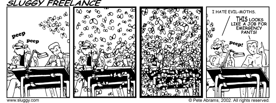
Sluggy Freelance comic strip. In Panel 1, Riff and Torg are sitting at a drafting table working, fully clothed. In Panels 2 and 3, moths start to fill the panel until our view is completely obscured. In panel 4, the boys are revealed to now be completely naked (and fortunately partially obscured by the drafting table.) Riff says I hate evil moths. Torg replies THIS looks like a job for emergency pants!

A deck of accessibility issues

Back in February, I wrote about the events that brought about the Alphabet of Accessibility post on The Pastry Box, and I hinted I might have a deck of cards to accompany it soon.

I opened the mail today and discovered that my prototype deck arrived. The Alphabet of Accessibility Deck is a real thing you can purchase with actual money from over at The Gamecrafter.

A box for the accessibility deck, with the deck, with letter z on top

I’m a little overwhelmed. When I wrote the original alphabet back in 2014, I certainly didn’t expect it would ever become a talk, much less a talk, a deck of cards, and a half-formed workshop.

But here we are, dragging the world forward kicking and screaming into the Century of the Anchovy, as Terry Pratchett would put it. And you can buy the deck and share it with your teams or your organizations or whatever you’d like.

Many thanks to Dylan Wilbanks, Jeff Eaton, Sarah Hoffman, Elaine Nelson, and Greg Dunlap (as well as many others!) for encouragement, sanity checks, and pointing me to The Gamecrafter. And all of my friends and family, who will continue to remain nameless, for their love, support, and well-earned right to complain about the things we still don’t get right when we design.