All my life I’ve been a terrible fidget, and I’m easily distracted by visual stimuli. So in college I doodled and wrote stories in my journal instead of taking notes. As an adult, I’ve found that I tend to drift off into work if I use my laptop too much. But knitting keeps my hands busy while allowing me to listen and talk.
Over the last half-decade, I’ve worked out these rules for knitting in meetings. If you’re a knitter, or if you’ve considered learning to knit, I hope you find them helpful.
Read the Room.
Some meetings are just Not Good for knitting. Some meetings are Very Good for knitting. Best for knitting: all-hands kinds of events where you are basically an audience member. Worst for knitting: you need to be typing stuff or there are particularly high-stakes attendees.
Sitting in an auditorium for an all-hands event? Time to bust out a hat!
Explain Yourself to New People.
If it’s a meeting that’s good for knitting, and you’ll be interacting with other people in the meeting, the other people should know that you aren’t being rude. When new people show up, I always say that I knit because it helps me listen better. (FWIW, knitting has quite a few health benefits!) Now that I’ve been at this job a few years, and other people have heard me talk about it, sometimes they say it for me.
Knitting is a good hobby for other tedious activities, like flying. Plus seeking out yarn stores is a fun thing to do when traveling!
Select the Right Project.
If you have the right project, knitting in a meeting can be remarkably unobtrusive. That’s the goal: give me something to do with my hands so I’m not distracted without distracting anyone else.
A sock in progress. This pattern features a simple four-row repeat.
Characteristics of a good project
Size: larger projects just take up a lot of space and call attention to the work. Go for something on the small side.
Complexity: if you’re constantly looking at the pattern, you’re distracted from the meeting. Same thing for lots of counting. I do sometimes work on projects that require some row counting, but a simple hashmark on a piece of paper or text document doesn’t take too much focus.
Apparent Complexity: some projects look harder than they are. Lots of cables; sock heels; toe grafting. (Naw, for reals: these are all remarkably easy to do!) But they look tricky to someone who doesn’t know knitting. So unless you can be totally unobtrusive, stay away from these features.
Frequent Stopping Points: this is a small thing, but projects with short rows or entirely in the round mean that you’re not trying to calculate time to finish a row against time to the end of the meeting!
So what sorts of projects are those? Well, here’s literally everything I’ve ever knit in a meeting. In general, scarves, cowls, beanies (or toques, depending on your Canadian-ness), socks (except for toes and heels), and mitts are all excellent choices.
Recommended patterns
These all meet the meeting project requirements, have good free patterns, and make great finished objects!
Now you’re ready to pick out some yarn, grab the correct needles, and sit down in your next meeting prepared to keep your hands busy and your mind on the work.
Knitting is just fidgeting with string, but then you also have socks or a hat or whatever.
Postscript: Learn to Knit!
If you’re thinking about learning how to knit, I got started with these resources from Lion Brand Yarn Company. I’ve also written a blog post about why knitting is cool with more resources for learning how.
About this time last year, a buzz formed around a gallery website that featured unconventional website designs that bucked the trend of slick, UI-centric layouts common around the web today. The gallery, Brutalist Websites, features screenshots of websites with a “ruggedness and lack of concern to look comfortable or easy.” Hype around the trend seems to have peaked around the publication of a Washington Post article—currently featured at the top of the gallery—but has largely fallen off the popular radar since then.
A selection from Brutalist Websites.
I’ve written and spoken a bit about drawing connections between art and the web before, and so may come as no surprise that I also harbor a few thoughts on this subject. As we near the first anniversary of that Washington Post article, I’d like to contribute my own ideas on this movement, how it does or does not relate back to architectural brutalism, and how it could become a more coherent movement (if it’s not already too late).
Ugly is Not the Goal
“The hottest trend in Web design is making intentionally ugly, difficult sites”—that’s the headline from The Washington Post’s The Intersect, a blog that examines internet culture. The article begins bluntly; “There’s an interesting trend in web design these days: Making websites that look, well… bad.” This introduction to the trend misses the mark.
In this day and age, it’s probably not a surprising conclusion that the article’s headline is disingenuous: that the hot trend is to intentionally make websites that look “bad” or “ugly”. Inflammatory headlines make for good clickbait, after all. But if the main point is to paint web brutalism with an “ugly” brush, it does a disservice to the philosophy of the architectural movement. Brutalist buildings have less in common with brutality (savagery and violence) than they do with raw concrete (in the original French, béton brut).
Contrary, even, to Brutalist Websites, brutalism is not merely an aesthetic that set out to be rugged, uncomfortable, or uneasy as is dictated in the gallery’s description. If roughness and discomfort are truly the name of the game, why not call it grunge, which design-wise, these sites have more in common with? This ’90s trend was intentionally dirty and chaotic and one that graphic designer Steven Heller famously called the “the cult of ugly.” Furthermore, these sites owe their basic nature to the ’90s DIY web spurred on by hosts like Geocities and Angelfire. But I’ll get more into that in a bit.
There are many reasons why web designers chose to go the route of brutalism (whether or not they were even aware of the style). You can see this in the brief interviews attached to many of the works on Brutalist Websites. Here are a few:
Fictive Kin: “Simplicity is our jam.”
Malte Müller: “This simple and rational approach to problem-solving is what interests us about brutalism in architecture. We would like to see it replicated in the digital realm.”
Daniel Dittmar: “I suppose I have it out of convenience, as it was easy to make. (To be honest I didn’t even know it was called [web brutalism].)”
Tom Cavill: “There’s beauty in utility—I like the idea of a framework-less, semantic site that loads instantly and has no animation.”
Simplicity, rationality, convenience, utility. These designers’ goals don’t include ugliness, discomfort, or uneasiness.
Neither did the works of architectural brutalism. In fact, the movement’s best works sought to serve the needs and aspirations of a growing postwar generation. Indeed, history has been unkind to the aesthetic, in part because it turns out monolithic concrete can feel isolating and intimidating. But it’s also due to the fickle whims of fashion. Even so, the table is starting to turn as more of these buildings are tagged for demolition and we feel the increasing loss of their presence. Culturally, we’re finally getting the temporal distance needed to look back and fairly judge which works are timeless and which are relics bound to a bygone era.
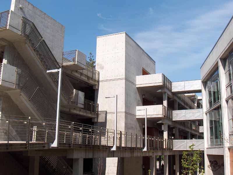
The Seminar II building at The Evergreen State College is an example of brutalist architecture. Photo from Wikipedia.
Bringing this to a point: to be ugly, rough, or uncomfortable may be an aesthetic choice of brutalism, but it isn’t the ethos. Pascal Deville, creator of Brutalist Websites admits as much in the Washington Post article, where he concludes that there’s a need for “a new definition of this kind of website.” I agree. A true movement needs a philosophy, a manifesto perhaps. How far can you really go when your defining statement is lifted straight out of a Wikipedia article? Roughness may be one feature by which we might identify some works of brutalism, but that doesn’t give the movement a vision or purpose. Punk was a movement that embraced roughness. Pop surrealism values discomfort. What separates web brutalism from other movements with similar values?
“At least it’s an ethos.”
The Values of Brutalist Architecture
Digging, once again, into the architectural movement, there are, in fact, many other values that brutalist spaces generally demonstrate:
Repeated, modular elements.
Raw and unpretentious materials.
An inside-out unabashedness, whereby the infrastructure—water pipes and air ducts—is revealed, instead of hidden behind a facade or tucked away in maintenance tunnels.
Altogether, this is where we start to see the value of a true brutalist ethos.
Before I dig further into the brutalist ideals, I also want to mention the takedown, “The Problem With Brutalist Websites”, by Kill Screen writer David Rudin, which was also published last year. It’s a smart article, and it talks at length about how web brutalism as defined by Brutalist Websites (and the WaPo article) doesn’t seem to offer much coherence in its gallery beyond the ugly or austere monikers, which we can now see is disingenuous. The article criticizes the gallery based on the ways that it is not directly relevant to the architectural movement. However, it stops there without offering a viable way forward. The article focuses on what these websites are not, but never seeks to discover what they might have in common.
There is value to Deville’s gallery, however, and there are commonalities that we can start to build upon.
Honesty of Materials
Etymologically, the key fragment in brutalism is brut, the French word for raw. You can take that word in a negative or painful way, like a raw nerve, or a knee skinned raw on concrete, which appears to be the way brutalism’s detractors (and Brutalist Websites) interpret it. Or, as the architectural community intends, it can mean unpretentious materials and unprocessed construction. Brutalism was unashamed of its materials of choice (primarily concrete, but also glass and wood) and made no effort to obscure them with facades or make them appear to be something they are not. For example, brutalists would not imprint and then paint a brick pattern into concrete to make it look like a brick wall. If a building is made of concrete, let it be concrete.
This idea of “raw materials” is key to interpreting to the brutalist web aesthetic, and we can again see this in the interviews of the designers.
Take Ben Pieratt, for example. He says of his work: “I’ve learned that lists do best when they’re presented as lists, so I try and stick to that as much as possible. I’ve presented lists as something other than a linear stack before, and all it does is add confusion that the viewer has to sort through before they understand what they’re looking at. Was it Frank Lloyd Wright who said we should strive to be true to the materials? Like don’t paint over brick. Whoever it was, I’m stealing this thinking from them.”
“Beautifully fucking illustrated.”
Furthermore, the people who designed the website are often the same people who developed it, so in visiting these spaces, you are experiencing the individual push and pull between a designer’s sensibility and a developer’s practicality. You’re witnessing the individual’s integration of disciplines divided across the time available. In other words, sometimes there just aren’t enough resources for one person to consider every angle of a website from both technical and aesthetic points of view. It’s in these cases where it becomes strategic to rely on the available defaults.
Members of the web’s old guard have been flying a common banner more and more: “Creating on the web sure is getting complex.” You can add me to their ranks. Every time I start a new project today, I feel compelled to implement a growing stack of cobbled together software compilers, task runners, and frameworks required to do the job “right”. And, honestly, that can be frustrating when all I want to do is put some content online. I just don’t feel the need to spend my evenings hunting down broken dependencies whenever I want to update my blog. Gianluca Monaco puts it this way in his Brutalist Websites interview for F*CK: “Working as interaction designer means dealing always with the same principles that I sometimes see as limitations: good design, responsiveness, storytelling, experience, interaction and so on. And after doing that the whole day, you just want to say F*CK to all this.”
I’m not saying the modern workflow is the wrong way to make websites. I’m only saying that, buried underneath that heap of tools, the web still comes out as HTML, CSS, and JS. And that output is still imminently writable by hand, and relatively readable even by non-technical humans. This is how websites used to be made. They were simple, they were quick, and they were raw. And they still can be today.
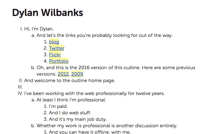
Take a look at the website of Dylan Wilbanks, co-founder of The Interconnected.
“SXSW 2009. I had a talk there. In the middle of a Saturday AM session, I went, ‘Oh crap, I don’t have a site!’ I had my personal laptop, but no web IDEs or tools. But. I did have Notepad. So, I started outlining what I needed to put on the site. Along the way the outline became an ordered list. As I was under-caffeinated, I just sorta rolled with my strange sense of humor. About 30 minutes in, I pushed it to the live server and there it sat. I had a site, hand-coded from an outline, out of necessity. I wish I had a story that wasn’t, ‘Oh crap, I need a website!’ in the middle of a conference talk, but there we are.”
I believe there is more than one human being in the world who might still find that rawness attractive. A person who might dig into that source code. Who might create a new web page based around their discoveries. Who will add their voice to our global community. Brutalist Websites showcases some of those kinds of people. They’re people who may not have the knowledge to develop, the time to maintain, or the resources to offload those concerns to an expert. Yet they’re still creating works that are beautiful, interesting, and valuable.
I have baptized myself in the church of Jeremy Keith, a developer who beats the drum of progressive enhancement. This gospel asks developers to start with a simple base layer, as close to the basics as you can get, and then add enhancements that make the experience better for more capable technology. I’m all about building websites in this manner. But, while enhancement can create beautiful or clever experiences, it is still only an option. Not every website in the world needs to be enhanced. It’s okay if some things on the web don’t have extensive JS frameworks that make the web more app-like, or exclusive typefaces that make it more print-like, or autoplay videos that make it more TV-like. Anthony Tran remarks on one of his own projects for the Walker Art Center, Superscript: “Publishing online ranges from pre-built platforms with uniform templates and one-click submission buttons to articles that have custom layouts that take months or years to implement. The aesthetic of the Superscript website is intentionally retro, stripped down and typographically emphatic, to pay homage to text as the only necessity in publishing.”
Therefore, I think that the defining feature of web brutalism isn’t its perceived roughness, or god forbid its ugliness, but instead its willingness to expose the raw materials of the web. The defining feature of web brutalism is its willingness to be itself. To be of the web. To embrace the web’s grain. To not pretend to be apps or magazines or paintings. It shows us the value of the parts of the web we’ve lost to over-engineered spaces. Let concrete be concrete. Let the web be the web.