A few nights ago I saw Don’t Breathe, which was a scary, home-invasion movie that I enjoyed quite a bit.
But this post is not about the movie that I paid for. This post is about one of the trailers that played before that movie, for the new Resident Evil movie.
If you haven’t seen any of the five previous Resident Evil movies, let me assure you, you are not missing out on high art. They do provide a certain level of unabashed fun that seems to get better as the series progresses. They’re the kind of pulpy movies that I like to call let’s-make-a-movie movies where you can imagine two people sitting at a diner, trying to find an outlet for their absurd ideas. Think John Carpenter and Kurt Russel’s movies, or Vin Diesel’s Pitch Black series. In this case it’s actress Milla Jovovich and director Paul W. S. Anderson.
Within twelve seconds of the trailer starting, I knew I was going to be jazzed about what was coming up. Twelve seconds. In fact, I was only half-paying attention to the screen in front of me (my date was at my side) and I had no idea that it was a Resident Evil movie until later in the trailer, but I knew I was in for a ride. What happened in those twelve seconds? Watch along with me, and I’ll narrate, below.
What We See
- Fade from black.
- Guns N’ Roses’s “Paradise City” plays.
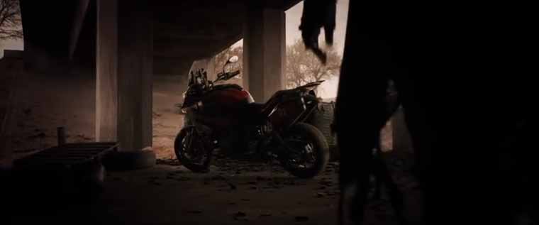
- We see a motorcycle of the crotch-rocket variety.
- A woman in a black coat walks up to the motorcycle and starts the ignition.
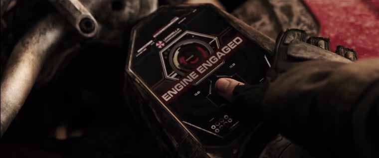
- A computer interface indicates “ENGINE ENGAGED”.
- She removes her thumb and we can see it uses Touch-ID–style fingerprint recognition.
The computer interface has a subtle cue I didn’t catch (an Umbrella Corporation logo), but otherwise at this point, I have absolutely no idea that this is a Resident Evil movie. Furthermore, I hate Guns N’ Roses, I especially hate “Paradise City”, I think crotch rockets are kinda douchey, and I didn’t even realize the figure mounting the motorcycle was a woman. (Like I said, I was only half-paying attention.)

Yet for some reason I was jazzed about this movie. After only twelve seconds! I even said to my girlfriend: “I don’t know why, but I think this is going to be a fun movie.” It was enough to keep me glued to the screen for the following twelve seconds, which are far less revealing, until I saw the hanging corpses and the sign that explicitly drops familiar names like “Racoon City” and “Umbrella Corporation”. I was sold after that, but those initial twelve seconds stayed with me all through Don’t Breathe until I finally had a chance to talk it out with my date.
What It Signifies
Looking back at it with perhaps a little too much analysis, here’s what I think.
- “Paradise City” is an obnoxious song, but to pull it off these days, you have to embrace a certain ironic, plebeian corniness. In other words, it’s dumb, but it’s fun if you don’t think about it too much. Dumb fun almost always equals action movie.
- The fashion, though shrouded and nearly cropped out of the frame altogether, revealed just enough attention to detail that I picked up on its intent to be fashionable: half her coat is shredded, but it’s a flattering cut and you can sense that it’s made from good materials. Plus, fingerless gloves. When fashion has a place in an action movie, you know you’re going to see people kicking ass and looking good while doing it. You’re not going to take it too seriously.
- The ridiculous computer interface with the fingerprint ignition sealed the deal, giving off a Marvelly, science fictiony, Iron Man-y vibe.
I’m so impressed by what those twelve seconds managed to communicate. It took you, dear reader, way longer than that to read my analysis, but it all flashed through my head at the speed of intuition. As a designer, I spend a lot of time sweating the tiny details of my work. Sometimes I wonder if I’m making a mountain out of a molehill. After all, as the cynics cry, most people will never truly understand what I put into it. Is it really worth the hour of development time to shave off 300 milliseconds of load time?

This trailer reinforced to me that, yes, paying heed to the corners and textures and typefaces does matter. Though they can be subtle, your considerations signal your intention to the viewer or to the user. They may not notice it or, if they did, even be able to deconstruct it as I did tonight, but the care and the craft will come through.
There was just one thing that I found disappointing about the whole trailer. It was the subheading reveal at the end. It has nothing to do with typography or the visual effects, just that it calls the movie “The Final Chapter”. Bummer.

