Someone used the phrase “I’ve had enough cheese” at dinner tonight and I’m still confused. Is there such thing?
Here are some design issues annoying me today.
Punting responsibility to the user
Found on my hotel room bathroom’s door:
When a designer comes across a legal, ethical, or compliance constraint, there are two ways to handle that constraint:
- Handle it for the user, so that the user doesn’t have to, and thus increase the probability that the user will be safe and secure.
- Make it the user’s problem.
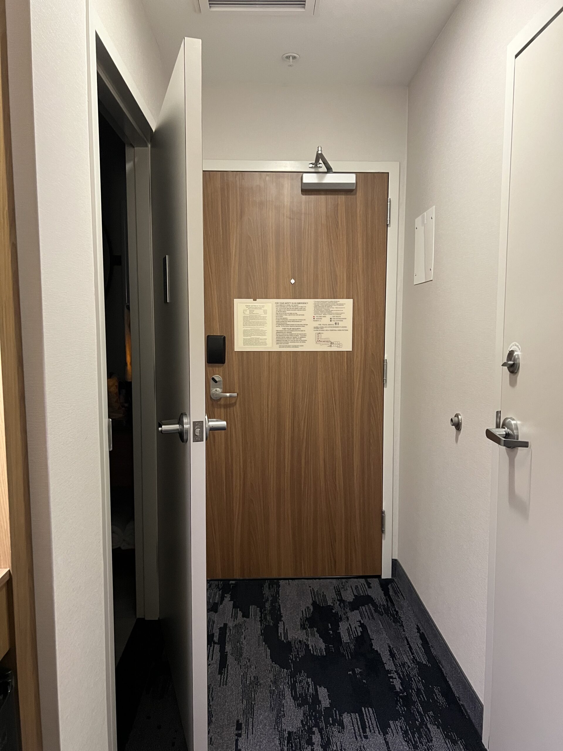
Here’s a different view of that same door:
The architects who designed the rooms for this hotel clearly decided that ensuring a safe entrance and exit out of the hotel room while also complying with state law was too much… something.
They could have designed the bathroom door to open out a different wall. (There is another wall available.)
Instead, they punted the problem to you, the hotel room user. Now it’s your job to keep the bathroom door closed.
This is a generally easy task if there’s one guest in the room. When your entire wedding party is on the same floor of the hotel and everyone’s hustling from room to room trying to get ready and you accidentally walk in on a groomsman because he forgot to lock the door, not so much.
As the user, you want that door open to signal that the room is available, and closed to signal that it’s in use.
As the user, you also want the door closed — at least in this hotel — because you don’t want to have to pull the bathroom door toward you against a throng of people trying to shove their way toward the exit door in the case of an actual emergency[1]see also: the Boyertown Opera House fire.
Our responsibility (and the law[2]Responsibility null and void for unethical laws) is to help our users stay out of trouble, not push the problem downhill and pretend we don’t know the consequences.
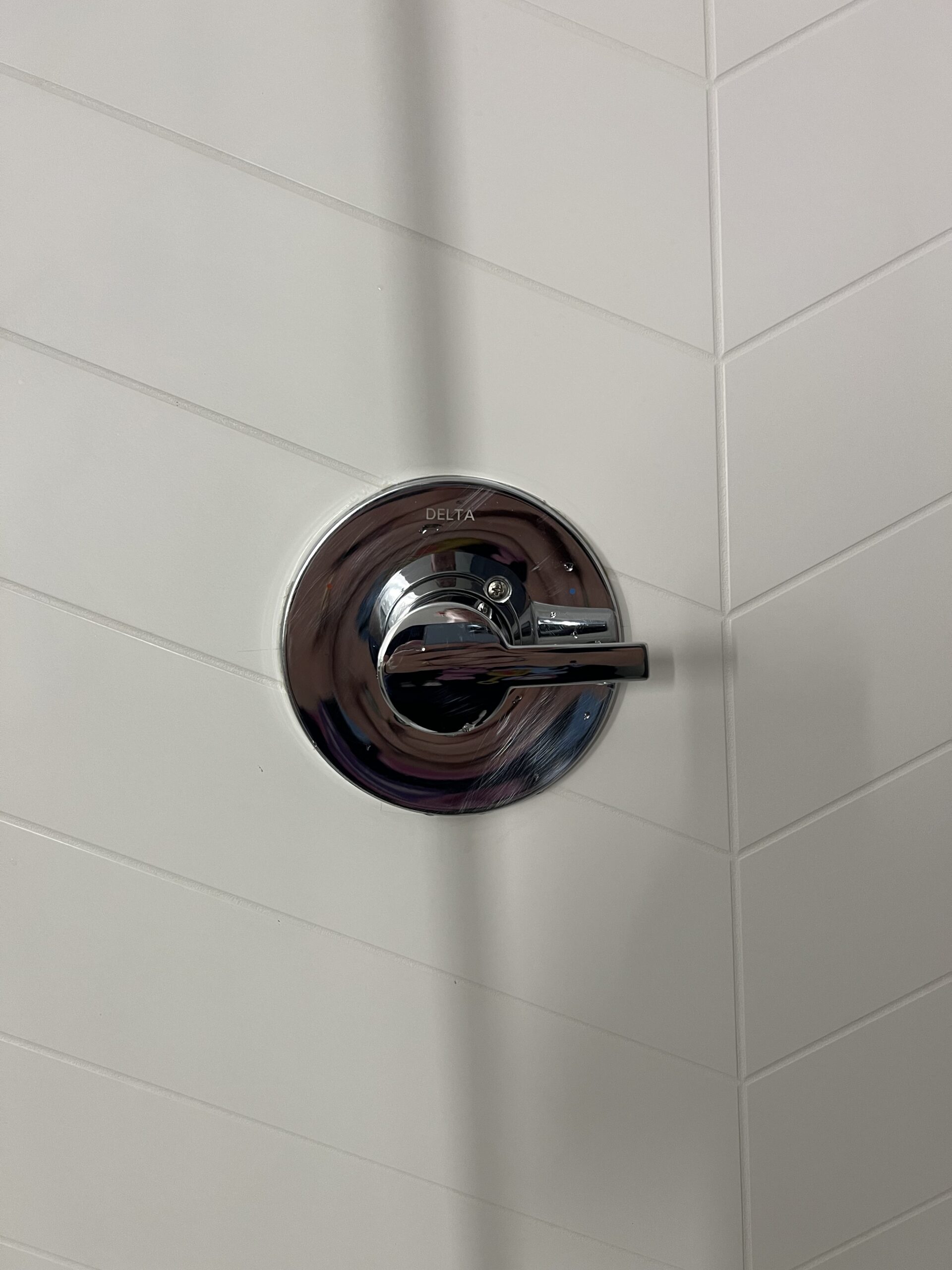
Don’t make me squint


Here’s a fun fact if you’re an American: there are entire parts of the world where mixer taps aren’t a thing. You want to wash your hands in the sink? You stopper the sink, run some hot water out of the hot tap, some cold out of the cold tap, and wash your hands in the water in the sink.
Similarly, in some places, you have a hot control for the shower’s hot water and a cold control for the shower’s cold water.
Heck, I once lived in a place where the hot and cold water lines had been reversed going into a faucet’s controls, not because of culture, but because someone screwed up and the landlord didn’t feel like fixing it.
“Turn the handle to the left for hotter water and to the right for colder water” is not necessarily something that a person knows from experience.
Since the controls don’t have what Don Normal would call intuitive affordances, it makes sense that the designers added labels.
To make effective labels, we need to make them big enough to see. We must ensure that nothing is identified by color alone. If we do use color (in addition to shape, etc.), we make sure the two options are strongly contrasting.
And did I mention we make them big enough to see?
When we’re creating a usable experience, we’re not creating “shower controls”. We’re creating a nice comfortable stress-free shower.
No user wants to play guessing games while standing in their birthday suits at the end of a 10 hour flight.
Marriott, we’ve talked about this

Me, packing: shampoo, conditioner, body wash….
My friend, listening: you know they have those things at the hotel. you don’t have to pack them.
Me, still packing: ha! Those bottles are traps designed to make you late for a meeting while you try to get body wash out of your hair.
Don’t do these things on the web, and don’t do them in the hotel.
The most frustrating thing about these avoidable usability and accessibility issues is that these are the things that I find at a good hotel. One where the room doesn’t smell, the bed is comfortable, the water’s hot, and the water pressure’s high. One where the toilet doesn’t run all night, I haven’t seen any vermin, and I can’t hear the couple in the next room over boinking all night.
On the web, our customers don’t put up with it. They go somewhere else. They go somewhere that the affordances are clear and the iconography doubly so. They go to places where they can meet their goals friction-free, where usability is invisibly present.
We can always do better.
Notes
| ↑1 | see also: the Boyertown Opera House fire |
|---|---|
| ↑2 | Responsibility null and void for unethical laws |


