If you search for the latest in web design trends in 2017, you’ll see a lot of pretty reasonable sounding articles all putting together roughly the same list:
- Animation is starting to be used correctly and tastefully
- Mobile-first design is becoming more of a norm
- Hero images still haven’t gone away and are getting “trendier”
- Single-page (i.e. “embrace the scroll”) design
- Grid-based layouts
- Personalization (though no one could agree what it meant)
Surprisingly, they all missed one, and it’s a big one. In fact, I’d argue that it’s almost as big as Hollywood’s obsession with orange and teal. I call it “Black is the New Black” and it’s the proliferation of dark grey or black text on a white or light grey background as navigational elements.
Let’s take a look at the global header and global navigation for some of the top websites in the United States as reported by Alexa:
1. Google
2. Youtube
4. Amazon
9. eBay
10. Netflix
All of these brand and navigational experiences have a few things in common:
- They use almost no color in the global navigational elements
- The chosen element’s state of being chosen is illustrated through a change in font weight or border
- The navigation bar is almost indistinguishable from the brand channel (where the brand tells you who they are, and often where the search elements hang out) or the utility bar (where top-level utilities like “messages” or “log in / log out” are located.
It’s not surprising that designers would want to understate their global navigation; I think we can all agree that we don’t want the global navigation to have a stronger visual hierarchy than the content of the page. Picking a limited but accessible color palette such as a white background with dark grey text or a dark grey background with white text accomplishes these goals.
And in the era of “flat design” it’s not too much of a surprise that the navigation menu looks neither like a row of file folder tabs nor like a row of gradient-decorated buttons. There’s something very sleek (or maybe naked?) about a row of links floating in space.
But there are also problems.
It’s breeding like bunnies
(Incidentally, I raised rabbits as a kid and it’s harder to get them to do that than you’d think, but I’m going with the metaphor anyway.)
The examples above concentrate on strictly the global navigation, but that’s not the only place Black is the New Black is showing up.
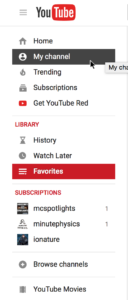
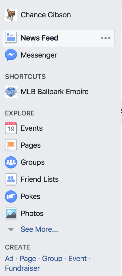
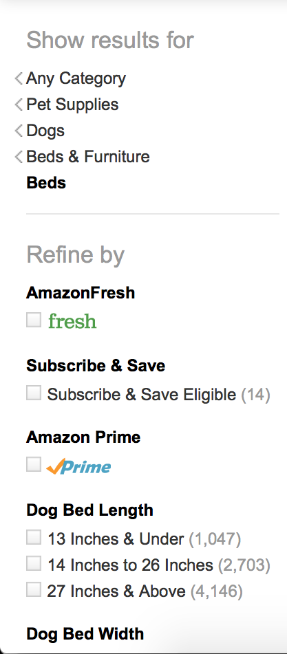
Youtube, Facebook, and Amazon are all using black heavily in their local (left-nav) navigation bars:
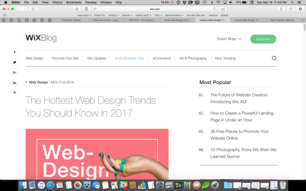
Wix is using black on their Most Popular list as well as their global navigation.
Alexa is using white-on-dark-blue for their global navigation and black-on-white for their in-page navigation.
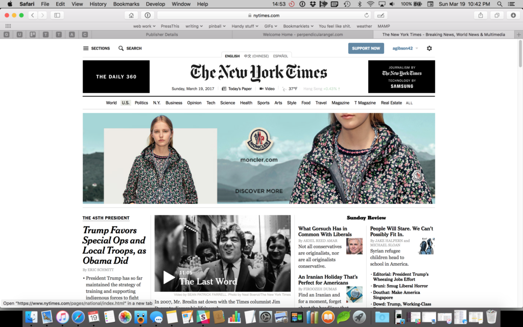
And then there’s the New York Times:
There is nothing on this page written in text, clickable or not clickable, that isn’t black on white.
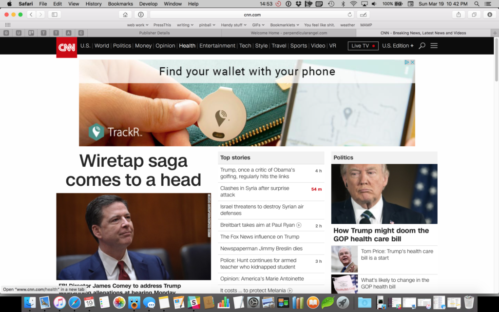
Okay, okay, so maybe she’s called the Grey Lady for a reason and it’s a purposeful decision to cast away usability just to look like the newspaper. But CNN was never a newspaper, and they followed suit:
If we had only been seeing this trend in the global navigation, we could’ve argued that people know global navigation is interactive because almost all websites place their global navigation in the same place, and it’s a learned behavior. As the trend spreads from global navigation to local navigation to in-page navigation to plain old links, the amount of cognitive load the user needs to use to determine what’s interactive goes up significantly.
It’s difficult to tell the state of an element
For most of these examples, the primary global navigation is a tabset metaphor: you’re looking at one set of data under a specific category. If you didn’t come in the front door (thank you Google) or you have forgotten how you got to where you are, the global tabs provide you with a sense of environment and direction: here’s where you are, here’s where you can go.
So if the navigational elements don’t look like they have a specific state set, it can be confusing for the user to orient themselves. Amazon’s design is probably the most difficult to use. Neither the global navigation nor the subnavigation change regardless of which category you’re viewing. Where are you on Amazon’s site? Who knows? Just search again and hope you get somewhere useful.
There’s also the question of number of states. For global navigation on externally-facing websites we generally only see two states: active (which means you could select it) and selected (which means you already did). On internally-facing websites or applications, though, we frequently have a third choice for disabled tabs.
Why would you display a navigational element a user couldn’t access? One reason may be because you’re in tech support and you can see other people’s accounts but not modify them — you may still need to tell Mr. Smith where the Private Data tab is located even if you can’t view it.
Internal employees providing wayfinding for other users, whether they’re internal or external users, is the most frequent use of disabled navigation elements, but I’ve seen others in the wild. Sometimes to gain access to secure content, the user has to take other steps first, which could even include plugging in a dongle or drive. Sometimes authentication is required. Sometimes it’s a vendor product and it’s just what you got stuck with.
At any rate, if the user needs to know the tab exists but can’t use it, it has to have a disabled state. And therein lies a problem: if the selected state is grey and the active state is a different grey, what color is the disabled state (which is traditionally grey)? One could argue to introduce a third lighter grey, but then one has to be careful to make the disabled grey different enough from the active grey to look disabled while also not making it so light that it no longer fails color contrast testing for accessibility.
(Incidentally, I did have someone argue once that disabled items don’t need to be readable. Hogwash. Either you need to know what’s disabled, in which case they need to be readable, or you don’t need to see them at all.)
Let’s say that we find a suitable grey or font weight or something that differentiates disabled from active or selected. Great! Now we just need to solve the problem two more times, for the hover state and the focus state.
There is only so far that we can stretch font weights and underlines and borders if we limit ourselves to a greyscale navigation system.
It matches the body copy
In almost all of the cases cited above, the body copy for the site was the same color or nearly the same color as the navigational elements. If everything’s the same color and weight and nearly the same size, what’s clickable and what isn’t?
I’ve heard many a designer over the years claim that a user will explore a page and click on things to see if they do anything, but my experience in usability testing points otherwise. People don’t click things that don’t look clickable. As Jakob Nielsen says, “Life is too short to click on things you don’t understand.”
“Just click it to find out” on an iPad using a cellular connection on a train is not exactly the speediest way to explore a website.
I’ve hear designers and developers also justify decisions like this by “the cursor will change when they hover over it”, which may be true if the user is using a mouse, but fails miserably for my iPad. Hover states are not guaranteed and can’t be used as a primary affordance.
Finally, I’ve heard the case that users are smart enough to understand that something is an article title or breadcrumb or link just by what it says and will click because they understand what they’re looking at. That works fine for experienced web users, but for young people, those with cognitive disabilities or reading difficulties, or people who are reading in a foreign language, the affordance of a change of color or other indicator that something is a link may be the same affordance that helps them understand the words are an article title.
Affordances are important
Clean simple designs are important to ensuring that our users put the bulk of their thinking on the content we’re presenting and not the navigational framework around it.
At the same time, there are critical reasons to make interactive elements stand out from their non-interactive brethren: mostly that we want our users to interact with them.
We want the choice to click on something to always be successful. We want the user to trust the interface. We want to communicate state, not only by the context clues of the surrounding content, but by the visual and structural display of the content itself.
To that end, not everyone’s global header has to be black text on a white background (or vice versa). It’s not only okay to be different, but when designed well, it will give us a more effective design than those following Black is the New Black will be able to boast.
Navigation elements should always clearly communicate their state.
Links should look different from body copy, even if the link is to the side of the page or above or below the body copy.
Text should have significant enough contrast from its background and its neighbors to both read it and understand the affordances it carries.
Most importantly, there’s more than three colors in the world, and we should not be afraid to use them, especially when it results in a product that’s easier for our users to understand.


