Earlier this year, the folks at Lavacon asked me to submit a talk for their Portland conference. I’d heard good things about LavaCon, but I also knew they were primarily focused on technical communication, documentation writing, and content strategy. What could a UX designer, who works in a content-adjacent field but is rarely in the guts of technical communication, offer them?
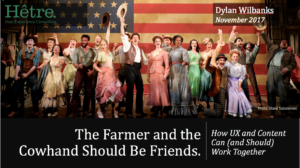
“The Farmer And the Cowman Should Be Friends” from Oklahoma! popped into my head. I guess I’d always wanted to call a talk that. (Eventually, when I wrote the talk, I discovered picking a title first is a bad idea — you end up spending hours trying to hammer so many square pegs into round holes story-wise.) I figured a talk on how content and design should work together would be the right sweet spot.
In July I went to Design & Content in Vancouver. The diversity of the speakers and topics struck me — so many non-white, non-male voices. And it got me thinking about my presentation. Could I make it… well, look more like the real world and less like the lilywhite way we present in our slide decks?
Because here’s the thing: Oklahoma! is an incredibly white musical. Yes, performances are more diverse now — there’ve even been all-black casts — but the play itself is remarkably unlike the place and time it was set in. Canonically the musical is set just outside of Claremore, in Indian Territory, on land pried away from the Cherokee less than three generations after they’d been marched west in the Trail of Tears. But other than a passing mention of a Native healer, not one Native American appears in the cast. Northeastern Oklahoma was also home to all-black towns — Redbird is less than 40 miles away from Claremore. Again, not one African-American appears.
This is arguably the finest example of an American art form (the musical), and it is a white man’s story that ignores the multicolored nature of the land it is set in.
In design, our slide decks have a lot of white people in them. We barely notice. Our speakers are mostly white men. We sometimes notice. But the world is multicolored and multigendered, and we’re not representing that reality in an industry that is so focused on the people who use what we design and make.
But… could you make a deck that had a lot of non-white faces? Stock photos are filled with white faces. Our stereotypes make us choose certain images — the white Marlboro man cowboy, the coverall-wearing farmer on a tractor. Our users often look well airbrushed and scrubbed.
Could you make a presentation without a plethora of white faces? And would it still work? I decided to try.
Initially I tried to set the bar super-high — no white people at all. That slammed into the obvious problem: I needed to show pictures of Oklahoma! to underpin the talk theme, and cast photos are very, very white. I would need to back off and come up with some ground rules.
After exploring my resources, I settled on three rules for this deck:
- No white men in solo shots, only in group shots with people-of-color
- Wherever possible, use people of color in solo shots
- Use best judgment for balancing story with image
In the end, it was harder… and easier than I expected.
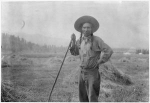
I typically build my slides from pictures with Creative Commons licensing and public domain images, both for cost (free) and the sort of images they provide (lacking the sterility that often comes with stock photography). My primary resource is Flickr (which has a Creative Commons search filter), but I’ve found good results from Google Image Search (which also has some copyright filtering), archive.org (poor filtering so proceed with caution), Wikimedia Commons, and US government archives.
It took a while to find pictures of non-white farmers and cowboys. You’d think the search engines would be better at this; I had to use a lot of Google-fu to massage the right results. But eventually, thanks to the feds’ love for hiring photographers back in the day, I was able to find what I was looking for.
While I had good resources for what I call my “scene-setting” or “hero” photos, I still wanted to use stock images as well for corporate or work scenes. Talisha Payton pointed me at this Medium article and the Women of Color in Tech collection on Flickr, both of which came through with great shots to use in my slide deck.

There were three moments in the deck construction when I had to stop and think about the rules I’d set for this.
The first moment was when I wanted to show the look of a writer and a designer frustrated by an ask. I could use pictures of people of color, but that didn’t feel quite right. I worried about imaging and stereotyping. Ultimately I used images of a white woman and a child giving the “whut” look. Perhaps also stereotypical, but I felt better about using them than using a person of color making the same look.

Second moment: I wanted to talk about “working together at the start, not the end of the planning process.” The best image seemed to be a runner coming out of the blocks, so I sourced an image of a running off Wikimedia.

When I was reviewing the deck on the first practice pass, I discovered I’d broken my “solo white man” rule. So I chucked it out and substituted a different image to emphasize the “working together” part. I never really noticed the difference, and the audience’s response was unchanged.

Last momet: I wanted to make a point about embracing the eccentricities of designers and writers — our weird hobbies and geekdoms — and celebrating them. “Some people juggle geese” (from Firefly) felt like a nice geek callout to use, so I threw it on a picture of Wash. Alan Tudyk. Pretty damn white guy.

I didn’t catch it until after I’d given the talk. In the end, I think the point I was trying to make and the callout that came with it held, even if it seemed like no one in the room got the reference.
When I gave the talk, not one person commented on the dearth of white people or the plethora of non-white folk. Not one. The audience loved the talk and responded well to the topic. But no one thanked me for showing pictures of people of color. No one called me a “social justice warrior.” It was just another presentation.
So, my takeaways: Constraining yourself to non-white stock images for your slide presentations is hard. At the same time, I think the constraints made the talk better. I had to think more about the points I wanted to make and how to best make them. The limitation ended up being freeing as well; I could push on images of a colorful Oklahoma instead of a lilywhite Oklahoma! I had a different palette, so I tried to use it every way I could.
Would I do it again? This was a talk where it made perfect sense to push people of color in contrast to one of white culture’s touchstone works of art. I’m not sure this makes sense for every talk I’ve done. However, this exercise makes me want to include more women and people of color in my decks; the resources are there, and representation does matter (even if I’m the only one who noticed.) So I’ll probably do it again. But I’ll try to mix in some white guys every once in a while.
I mean, who knows when I’ll need to show mediocrity in a presentation.
