Telling computers what to do has always been a job for specialists — almost by definition it is an act of translation, of adaptation, of understanding two worlds and bridging the gap between them.
Some academic computer science folks spend inordinate amounts of time on the computer-side of that divide, figuring out better algorithms and more efficient mechanisms for what happens behind the curtain. But the vast majority of computer programmers and developers and even tinkerers spend much more time straddling the divide. Their work is understanding human needs and processes and tasks and mental models, then translating them into the inputs and decisions and outputs that a computer will wend its way through to accomplish specific tasks.
Even when the system a programmer interacts with is so complex, so poorly documented, so hermetically sealed that it feels non-deterministic, there is a baseline understand that it is the artifact of other humans’ past decisions. Jokes about secret incantations being necessary to make the system work are jokes about knowledge of mechanisms lost to time, not a description of real Words Of Power. Not a description of true communication between human and machine.
LLMs twist that normal understanding around, in ways I don’t believe our popular or professional cultures have mental models or vocabularies for. The questions we ask these conversational tools, the commands we give them, the outputs we receive from them, are not translated to and from a precise, deterministic language. What we get from them is fuzzy and organic-feeling and startling. (Under the hood, of course, it is very much that precise and deterministic stuff — still code, still math, that is — but our interface to it is not.)
Coaxing and directing and nudging an LLM in one direction or another feels (at least, in the conversational interface most users are currently presented with) like a matter of voice and tone, an act of convincing and cajoling rather than specification and testing. Tinkerers and researchers encourage users to add “emotional language” to their queries. To “explain how important the question is.” To lie, or to promise a reward for a job well done.
To convince the machine.
Behind the scenes, as always, this collapses into complex but ultimately straightforward math. LLMs have been trained to reproduce the shape and structure of the conversations we humans have with each other, to echo the messages we use to coax and cajole and convince other humans.
“Please answer clearly, my job is on the line,” then, is not a desperate plea to another thinking, feeling being. It is a search filter once removed, narrowing a range of probable responses by mimicking past emergencies.
“You are an expert salesperson, confident in the quality of your product and skilled at listening to customers to understand their needs before recommending a solution.”
A prompt is not a persona, a character we have “convinced” the machine to slip into. It is a vector — a particular line speared through the sea of syllables and sentences, successful if it pierces the fish but otherwise meaningless. We know what’s “really” going on because we can crack open the black box and poke at its mechanisms. We can ignore the conversational conceit and use the LLM’s embedding mechanisms to turn words in those vectors, the syntactical force-lines of meaning that make its mimicry work. The work that lies behind the conversational curtain isn’t easy; very little is at scale. But it is mechanical, deterministic, and predictable. It makes sense, the way search indexes and taxes and calculus make sense.
The operative word in “magic trick” is second one. Revealing the mechanism, turning the box around to reveal the mirrors, changing the camera angle to expose the sleight of hand — those are acts of deconstruction that slice off the magic and leave the trick. The best magic tricks, then, are the ones that retain their ability to amaze even after the secret has been shared. “The box is split with a mirror, and he’s got the flower up his sleeve,” your friend says. And yet, once the lights are down you watch with your eyes and listen with your ears and it’s still magic.
For now, “AI” very much maintains its ability to amaze. To convince people to believe the magician’s assistant is floating, the cut rope was made whole, the cancer was diagnosed. And it was. Or, it looked like it. Or, it was basically the same thing, for the purposes of the demo. Like wrestling kayfabe, magic isn’t all pretend. The actual work of it is still difficult stuff; the muscles and the injuries and the business of it all is real, even if the agreement to treat it as Something A Bit More keeps everyone excited.
Month: May 2024
Hotels, you’ve heard this one before.
Someone used the phrase “I’ve had enough cheese” at dinner tonight and I’m still confused. Is there such thing?
Here are some design issues annoying me today.
Punting responsibility to the user
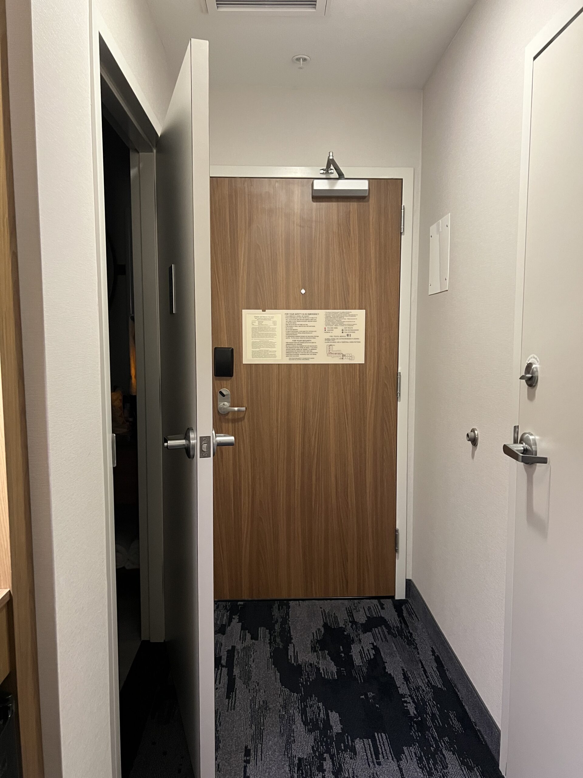
Found on my hotel room bathroom’s door:
When a designer comes across a legal, ethical, or compliance constraint, there are two ways to handle that constraint:
- Handle it for the user, so that the user doesn’t have to, and thus increase the probability that the user will be safe and secure.
- Make it the user’s problem.
Here’s a different view of that same door:
The architects who designed the rooms for this hotel clearly decided that ensuring a safe entrance and exit out of the hotel room while also complying with state law was too much… something.
They could have designed the bathroom door to open out a different wall. (There is another wall available.)
Instead, they punted the problem to you, the hotel room user. Now it’s your job to keep the bathroom door closed.
This is a generally easy task if there’s one guest in the room. When your entire wedding party is on the same floor of the hotel and everyone’s hustling from room to room trying to get ready and you accidentally walk in on a groomsman because he forgot to lock the door, not so much.
As the user, you want that door open to signal that the room is available, and closed to signal that it’s in use.
As the user, you also want the door closed — at least in this hotel — because you don’t want to have to pull the bathroom door toward you against a throng of people trying to shove their way toward the exit door in the case of an actual emergency[1]see also: the Boyertown Opera House fire.
Our responsibility (and the law[2]Responsibility null and void for unethical laws) is to help our users stay out of trouble, not push the problem downhill and pretend we don’t know the consequences.
Don’t make me squint


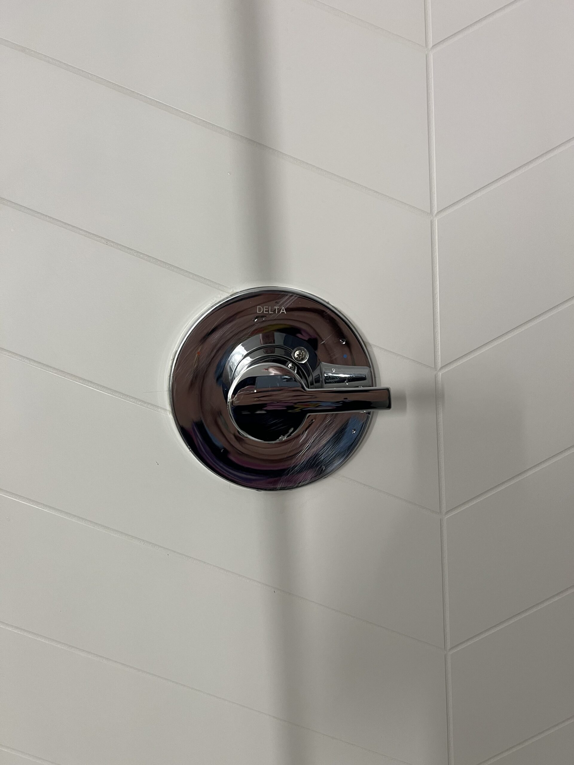
Here’s a fun fact if you’re an American: there are entire parts of the world where mixer taps aren’t a thing. You want to wash your hands in the sink? You stopper the sink, run some hot water out of the hot tap, some cold out of the cold tap, and wash your hands in the water in the sink.
Similarly, in some places, you have a hot control for the shower’s hot water and a cold control for the shower’s cold water.
Heck, I once lived in a place where the hot and cold water lines had been reversed going into a faucet’s controls, not because of culture, but because someone screwed up and the landlord didn’t feel like fixing it.
“Turn the handle to the left for hotter water and to the right for colder water” is not necessarily something that a person knows from experience.
Since the controls don’t have what Don Normal would call intuitive affordances, it makes sense that the designers added labels.
To make effective labels, we need to make them big enough to see. We must ensure that nothing is identified by color alone. If we do use color (in addition to shape, etc.), we make sure the two options are strongly contrasting.
And did I mention we make them big enough to see?
When we’re creating a usable experience, we’re not creating “shower controls”. We’re creating a nice comfortable stress-free shower.
No user wants to play guessing games while standing in their birthday suits at the end of a 10 hour flight.
Marriott, we’ve talked about this

Me, packing: shampoo, conditioner, body wash….
My friend, listening: you know they have those things at the hotel. you don’t have to pack them.
Me, still packing: ha! Those bottles are traps designed to make you late for a meeting while you try to get body wash out of your hair.
Don’t do these things on the web, and don’t do them in the hotel.
The most frustrating thing about these avoidable usability and accessibility issues is that these are the things that I find at a good hotel. One where the room doesn’t smell, the bed is comfortable, the water’s hot, and the water pressure’s high. One where the toilet doesn’t run all night, I haven’t seen any vermin, and I can’t hear the couple in the next room over boinking all night.
On the web, our customers don’t put up with it. They go somewhere else. They go somewhere that the affordances are clear and the iconography doubly so. They go to places where they can meet their goals friction-free, where usability is invisibly present.
We can always do better.
Notes
| ↑1 | see also: the Boyertown Opera House fire |
|---|---|
| ↑2 | Responsibility null and void for unethical laws |


