I was sitting in a project meeting recently discussing a design with the team, and the feedback was frustrating.
Many people looking at the page we were critiquing said, “I don’t understand why we put so much emphasis on the application contact information, when what the user’s here for is the subscription information.”
“But this is the application page,” I argued. “The subscription information was added as an afterthought — as a nice to have. It’s not the point of the page.”
The room didn’t see it that way. They, acting as users (and they all had the right mindset to act as users in this situation), wanted to know where to find their subscription information, which was important. And we’d given them a page to do it, but that page was “cluttered” with application information.
When we hear the word “clutter”, we often think of useless stuff that gets in our way when we’re trying to do something. But both on my desk and on my webpages, it’s generally true that the “clutter” isn’t truly useless, it’s just in the wrong place at the wrong time. That pile of pens blocking space to put an important stack of papers isn’t useless or I’d throw the pens out. The pens just aren’t where they belong.
But the information about applications was where it belonged. It was on the applications page. So it wasn’t clutter; arguably, the subscription information was cluttering the applications page, not the other way around.
The problem wasn’t the “clutter”, the problem was that we’d put two top-level goals on the same page. In this case, we’d put the goal of “tell me about my applications” and “tell me about my applications’ subscriptions” on the same page.
When two top-level goals are competing for a page, one or the other is always going to seem like clutter to the user. Any given page can support one and only one top-level goal. My friend Ellen King calls this “every page has a hero”.
The hero is the point of the page. Why do you have an Accounts page on your bank website? To describe the list of accounts. Why do you have a separate Account Details page? To provide all the details of a single account. It’s possible that if only one account exists, you might skip the Accounts page, but that’s because that goal is irrelevant, not because you’re serving both goals.
I walk up to someone who’s not on the project (works best at the free-food table), and say, “I’m going to show you a page and I need you to tell me what it’s about. Ready?” Generally they eye me with suspicion and then nod.
I show them the page for somewhere between one and five seconds, then hide it again.
I ask, “What’s the point of that page?”
In a perfectly-designed world, the answer is always what I think it should be.
When we had reviewed the page in a design critique (where the page had a title) everyone understood it was the applications page. Without the title, most people thought the page was about the subscriptions. Our content wasn’t aligning with our goals – or rather, our content was revealing two different heroes.
This concept — that every page has a single primary goal whose success outweighs every other goal — is integral to a good design.
If you can articulate the goal, then you can name the page, and you know how to refer to it in the navigation.
If you can name the page, your users can identify whether a page is about the goal they’re trying to meet.
Articulating the goal also helps you group the page with similar goals, or know how to order the page in a process flow.
Understanding the goal helps you prioritize it with the other content on the site. Does it support the overall’s site goal? Or is it a tertiary thing that, ultimately, could be cut?
It’s important to note that while literally every page has a hero, some pages have heroes that aren’t as easy as labeling the Applications page “Applications”. Your site homepage, for example, probably has a huge list of competing goals and capabilities. (That’s one of the reasons I recommend a capability strategy sheet, especially for menu pages). But the top goal of a home page is (generally) “show me all the things I can do here”, “show me what you’re about”, or “sell me the product”.
“Every page has a hero” also simplifies in-page content strategy, because everything on the Applications page should serve the goal of “Tell me about the applications.” Otherwise, they’re clutter.
Your Project Manager wants to add a shout-out about extra features on the accounts page? Are they extra account features? No? Then in this context they’re clutter, and they go somewhere else where they better fit the context.
(Note: your mileage may vary in convincing your PM to keep things like advertising off the page, although I think we can all agree that advertising doesn’t serve anyone’s hero ever.)
When I’m doing high-level happy-path design, I’ll often skip the step of documenting the page goal in my wireframes because we’re still at the investigating stage and it’s probably not yet important. (Invision and similar tools make it harder to add this kind of documentation somewhere obvious anyway, but that’s a rant for another day.)
When I’m doing mid-level or detailed design, though, especially if it’s with developers or business folks who are new to working with UX, I document it loudly and clearly.
First, it makes sure that I’m doing my own due diligence. If I can’t put a statement on my wireframes that says “Page goal: _______” and fill in the blank, the page is broken, and will cause me nothing but heartache until I fix it.
Page goals aren’t the only thing that make it onto the memo section of my wireframes, but they’re the most important thing.
Second, it makes sure that people down the road understand what we intended the page to do. This can both foster understanding in the sprint, and foster understanding four years later when someone is redesigning the whole site section and wants to know the history of the old design.
(And yes, I’m one of those designers that will still have my wireframes from “the last time we redesigned it” so that we don’t break things we already fixed, and so that we can revalidate the page goals.)
Speaking of fixing pages and accomplishing goals, our solution was simple: we now have two pages on the site, one for Applications where users can maintain their contact information at a per-application basis, and one for Subscriptions, where users can see what subscriptions they have on each application and modify those subscriptions. It did mean adding another top-level tab to our navigation, but in this case the site was so small that the extra tab had a negligible effect on the overall architecture.
Now when users look at the pages, they understand what each of them does and why they’d visit them.
Every page has one, and only one, hero. Know your heroes, and articulate them. Then ensure your page content serves them. You’ll save yourself a lot of architecture and design problems from that point forward.
On Monday October 8, I gave a talk at edUI Conf about accessibility, as one is wont to do. (I had a fantastic time and I strongly recommend this conference to anyone who’s working on the web for a university, library, museum, etc.)
At the end of the talk during the Q&A, an audience member explained that, like many universities, his employer had received a complaint from the Office of Civil Rights for not meeting ADA regulations on their website, and now they were struggling to get everything into accessible order. (Generally once a complaint comes in and is settled, an organization has two years to get their house in order, or they risk losing federal funding.)
The audience member went on to explain that they have thousands of pages of research and information from professors and others who had never coded any of the content to be accessible — PDFs and diagrams and complex things.
And when, they wanted to know, is it the responsibility of the person with the disability to use external tools to make this content accessible?
Now, this member isn’t here to defend themselves or correct me (obviously since this is a blog) so I want to make it clear that how I interpreted their question is not necessarily how they meant it. But I’ve been asked similar questions before with a similar direction, so I wanted to address what I heard, even if it’s not what they intended to say.
When is it the responsibility of someone with a disability to use unnamed tools to somehow make your content accessible, when your organization has not done so yourself?
Never. It is never their responsibility.
I could give you lots of reasons why, but for today let’s cover three.
There is no guarantee that someone with a disability knows any more than we do about how to access the content we provide.
Even if we knew they have the knowledge, it puts an undue burden on them to have to use that knowledge.
It shirks the whole question of the publisher’s responsibility to provide access to their content —which, after all, is the whole point of the ADA in the first place.
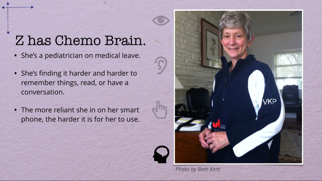
During my talk I give 26 examples of people who need accessible websites, from the profoundly disabled to the arguably not-disabled. Letter Z is this slide:
Z has Chemo Brain. She’s a pediatrician on medical leave. She’s finding it harder and harder to remember things, read, or have a conversation. The more reliant she in on her smart phone, the harder it is for her to use.
When I reach this slide I explain that Z is so many people in my life, and that’s true. I have lost count of the number of cancer patients in my circle of friends and family.
But this Z, the one in the picture, is my aunt, Virginia Proud. She was a University of Virginia graduate, a pediatrician, and a Clinical Geneticist at Children’s Hospital of King’s Daughters in Norfolk, Virginia. It would be dishonest to imply that she didn’t have her quirks, just as we all do, and I wouldn’t want to try to argue her down on something. Still, she was by all accounts a genius at solving medical problems, gentle and amazing with even the smallest of children, and an actual lifesaver.
So here was this brilliant woman in the medical field working with people who have unique and profound disabilities every day… and when she started to run into the symptoms of chemo brain, she had no idea that her iPhone had accessibility tools built in that could help her out. She’d never needed the tools herself and, well, honestly, these kinds of things generally fall to the social services side of the hospital because the doctors are quite occupied keeping their patients alive, so she’d never had an opportunity to learn from her patients.
We cannot assume that someone with a disability is an expert at being disabled.
Frankly, we can’t even assume they’ve been disabled for more than 24 hours. If I fell and broke my hand this morning you can’t exactly expect that by this afternoon I’m going to know all the ins and outs of keyboard navigating a website without a mouse.
I know this is going to come as a shock to some folks, but it turns out that when you cross the line from “not disabled” to “disabled”, a mysterious fellow in a cowl doesn’t appear on your doorstep to hand you a manual and a bunch of code words.
I assure you if becoming disabled meant joining the Dark Brotherhood from Elder Scrolls, we’d all be ensuring our websites were accessible.
Mostly, there’s crying and cursing, or in some cases resignation to what you expected was coming anyway. There is a lot of mentally processing self-identification and self-esteem and “this is a new normal”. And then a metric ton of medical paperwork, none of which says “here’s how you use a screen reader”.
There is no single repository for disability education, and at least in the United States, there’s no guarantee that either your local medical staff or your insurance company (if you have one) is going to help you out. Plus, even when there are resources available, you’re very busy learning how to function with a disability which is exactly what you need to know how to do to research learning how to function with a disability so there’s a vicious cycle thing that, until you’ve done it or seen it, is somewhat difficult to comprehend in its nastiness.
At that exact moment, our users need compassion and understanding and assistance more than anything else we can possibly offer. In that context, making sure our website are on their very best and most accessible behavior is not just aligning with the law and doing the right thing. It is also literally the least that we can do to say “Your success is important to me”.
When is okay to assume that our users are experts at being disabled and don’t need our help, compassion, or humanity?
Never. It is never okay.
Even if we could make that assumption, that still doesn’t make building an inaccessible website an acceptable option. We have to recognize that fighting with an inaccessible website is a giant time-suck of horror for people who need accessible websites. It’s embarrassing. It’s frustrating. It’s burdensome.
But because it can be difficult to recognize that burden unless you’re, say, watching usability tests, we’re going to walk through a scenario.
Let’s say I’m a college student (which I haven’t been for a very long time, so some of this stuff in this example is almost guaranteed to be dated).
And let’s say that it’s the middle of the semester and my professor has assigned me to read five research papers on his website, each of which is a PDF containing diagrams and charts, then summarize them all and email her the resulting document.
If I’m not disabled, I have to:
Find the professor’s assignment in the university’s courseware site of choice using its search engine.
Open the PDFs in one of the many free PDF applications available
Read it
Write my paper, and submit it through the courseware.
That’s not a lot of work compared to, say, differential equations. For the purposes of this exercise, we’ll assume that takes me about an hour because I am a fast reader and a brilliant writer.
If I have a profound visual disability and the website is accessible, I have to:
Find the professor’s assignment in the university’s courseware site.
Listen to the search results on my screen reader until I find the one I want. This might take longer than someone with no vision issues can scan the page does, but I have my screen reader set to 200% speed and I can quickly flip between links using the key commands, so it’s not as long as it would be for someone who doesn’t know what they’re doing.
Visit the professor’s courseware page. The site is all text and the HTML is semantic, plus my professor used headings properly, so I can use shortcut keys on my screen reader to bypass the sections of the site I don’t care about and jump right to the syllabus.
Download the PDFs. Because they’re direct links to the PDFs, I use my screenreader’s download quick link to download them, and they’re on my desktop.
Launch the PDFs. For each one of them, I need to listen to the content, including the descriptions of the charts and diagrams. I might need to listen a few times because that’s a lot to keep in my head at once. But because they’re properly formatted, that’s not any harder than it would be to listen to a website.
Write my paper and submit it to my professor. This is easier than the rest of the work. Microsoft’s software is accessible because Microsoft likes to make money and I have money and they would like my money. And since the courseware site is accessible, submitting the form isn’t a major burden either.
So just by having a disability, the circumstances of my existence mean that I have to do more work than someone who doesn’t have a disability does. That’s a burden, but not one that anyone—including me—is responsible for having inflicted on me. In the words of Charlie Manuel, what it is is what it is. It takes me an hour and a half to do the assignment just because I spend more time re-listening to things to ensure that I’m understanding them and getting them right.
If I have a profound visual disability and the website is not accessible, I have to:
Find the professor’s assignment in the courseware site.
But wait, the courseware search engine and the university’s website search engine don’t work with my screen reader – it’ll search but it won’t read me the results – so that’s out. Maybe if I’m lucky and I planned ahead I already bookmarked the site, but on the other hand maybe the professor gave out one URL on the first day and then moved all her stuff the second week of class.
Assuming I wasn’t stumped at the step above, I navigate to the courseware page. Because the professor (or the courseware company) didn’t care about accessibility, there are no H1/H2/H3 headings to differentiate content, and no “skip” links for things like repetitive navigation. I have to listen to the entire site on my screen reader to find the section I want. Even at 200% speed for listening to the site it takes me four to five times as long to find what I need as it would if I could’ve skipped to an H2 header named for the day’s assignment.
Download the PDFs. Maybe this works and maybe it doesn’t? Maybe the links are embedded as Javascripts instead of as anchor tags and they just don’t work at all for keyboard access. Maybe the PDFs are embedded in iframes in a dialog box I can’t open. Or maybe I can open the first one but I’m then in a keyboard trap and I can’t close this dialog to open the next one without closing my entire browser. Suffice it to say it takes me a really long time to get those PDFs to my desktop.
Launch the PDFs. But it turns out a lot of professors’ PDFs aren’t really content – they’re giant images. And they’re not tagged correctly. So if there is text, my screen reader jumps randomly from one paragraph to another. And if there’s no text, there’s almost definitely no description of what the picture-of-text says. In other words, this is a pile of garbage for me. Fortunately, it only takes me a minute to decide this is garbage.
Contact someone—the professor, a classmate, or the University’s Access Services office—who can help me get the content in a form I can actually use. On one hand, this is exactly what the Access Services office exists to do. On the other hand, I have to plan far enough ahead to get in touch with them if there are issues I need help with—the office isn’t open evenings or weekends. And no matter how well the Access Services office runs, any time I have to turn to them for help I feel dependent and frustrated because I should be able to do this myself.
Finally, do my assignment and submit it to my professor. By now I’m anxious and stressed and frustrated, so it’s not necessarily my best work. If I had this much trouble getting to the work in the first place there’s no guarantee that the submission process will be smooth. And I’m probably mad at the professor and the university for the horrible experience, so I’ve got an antagonistic relationship with her and she doesn’t even know it yet.
And this is just one class and one assignment’s worth of work?
The assignment that took someone without disabilities an hour and someone with disabilities and support two hours can take someone with disabilities and no support four or five hours (if they succeed at all), plus the anxiety and the stress and the psychological burdens and the social burdens of asking for help. And it’s not because the person with the disability is incapable – it’s because the website is incapable.
This is what we mean by undue burden. There is no good, ethical, moral, or even financial reason why a university (or business or organization) would want to put their disabled students (or customers or clients) through literally hours more bullshit and frustration to do the exact same thing that someone without a disability can do. We have set these people up to fail. And oh hey, it’s illegal.
So when someone says to me as the audience member this week did, “Can’t it just be their responsibility?” what I hear is “I’ve been handed a steaming pile of bull dung which we’ve been passing off as an accessible website, and it’s going to be thousands of hours to remediate this because we didn’t follow the law the first time. Isn’t it easier for us to just blame the user?”
When is it the disabled person’s responsibility to fix your shit for you?
Never. It is never their responsibility.
The root cause of the audience member’s issue had absolutely nothing to do with the personal responsibility of the people who consume their content and everything to do with the institutional responsibility of the people who produce the content.
The root cause of the audience member’s issue was that the university knew they should be building accessible websites and accessible PDFs, they knew that there were real consequences to not-building accessible content, and they didn’t do it.
If you have content and applications that weren’t made accessible when they were launched, you don’t have an accessibility problem. You have a technical debt / UX debt / content debt problem.
You have infrastructure work that was supposed to be done at launch and it wasn’t, but it didn’t go away. It accrued interest. That has nothing to do with accessibility and everything to do with resources, headcount, and prioritization.
You might argue that “accessibility wasn’t a thing then” and depending on timing, you’d be right. But if you argued that “security and privacy wasn’t a thing then” about the sudden revelation that all your students’ personal information was being routed to China, nobody would nod and say “oh well sure then continue with your insecure website, no worries.” They’d say “yeah well times have changed my friend so get on it.” Accessibility is infrastructure and infrastructure must be maintained.
When is it the responsibility of people with disabilities to pay down our technical debt by being constantly frustrated and unable to use our products?
Never. It is never their responsibility.
Now, if you happen to be the person who was handed thousands of inaccessible PDFs and pages, or the job of wrangling a vendor into improving their product, please know I feel for you. I too have stared into the gaping void of three thousand sites created by people who didn’t know a lick of HTML and certainly knew nothing about accessibility, because I have worked on a corporate intranet powered by SharePoint. I too have spent hours wondering if I could even begin to make a dent while simultaneously being told that it was my responsibility to fix the whole thing.
So I want you to know that you have choices.
You could start remediating as much of your content as you can as quickly as you can based on usage and responsibility. You’d also start training your fellow content creators, figure out a plan for remediating the content, and ensure that new content is accessible. This is probably going to require you get training. It is going to require conversations with Legal and possibly the OCR about what “making progress” looks like, whether some or all of the content should be removed, and what the impacts of those decisions are on both the users and the organization.
It will also require some hard conversations with the people above you about accessibility, the Office of Civil Rights, and funding, because you are going to need more people to help you out.
One speaker today pointed out that conversations like “Hey, how much do you like that federal funding we get? Because if you don’t fund us to remediate this OCR complaint we won’t be getting that any more” can have a profound and immediate impact on prioritization.
And in taking these steps you could make your students and users more successful in using your website—which you explicitly built so that students and users could be successful. Let’s not forget that the whole purpose of all of these resources is to serve something to someone who needs that thing. When we fail to do that, regardless of the reasons we can give, we’ve failed to build a functioning website.
That’s your first option.
But if paying down your technical debt and increasing your website’s usability and aligning with the current federal laws isn’t your cup of tea, you could blame the user for being disabled and making your life hard. You could put the burden of use on the student. You could close your eyes to the impact of your decisions—the very real impact that determines whether they are successful students.
That might feel satisfying for a little while.
And it’s a natural reaction to being overwhelmed, burned out, or otherwise mistreated to point to someone else and say “make it their problem, not mine.”
But really, if that’s the path you’re going to take, that’s a red flag for your career. And if you can’t reverse feeling like that, you should quit working on the web before someone forces you out. Because that’s antithetical to everything we’ve set out to do by publishing websites in the first place.
Many thanks to editor extraordinaire Elaine Nelson for her advice and guidance with this article.
When we were much younger people, my cousin ran into some engine problems with her car. I asked where she was going for repairs, and she said, “Oh, I’ll probably take it to the Sturdy Girls.”
The Sturdy Girls, it turned out, were a group of friends that had all, for one reason or another, learned skills we often associate with men: fixing cars, plumbing, light construction, electronics, computers. That isn’t to say that they lacked other skills; cooking, knitting, sewing, fashion, and other more “domestic” skills also thrived within the group. Neither a business nor a cooperative, it was a nickname for a circle of folks who knew how to help each other out, and believed in doing so.
The women who repaired my cousin’s car traded her the mechanical work for help identifying plants in the garden (my cousin’s a biologist). Both women learned valuable skills. What one of the Sturdy Girls lacked in knowledge another one could provide. As a group they could count on each other, and as individuals they could each hold their own.
According to Merriam-Webster, something is sturdy if it is “firmly built or constituted”. A sturdy item stays where we put it. It’s stable; it holds weight. It doesn’t tip or collapse unless a significant force is put upon it. It inspires or maintains confidence.
Note that it’s different from being strong. A sturdy building may be able to withstand collapse should a car drive through its side, but the fact that a car just drove through its side tells us that its walls weren’t exactly strong. Strength can certainly aid sturdiness, but it’s not necessarily required.
A sturdy stool is one with at least three equal-length legs, so that no matter where the user positions their center of gravity over the stool, the stool doesn’t shift or collapse. Chairs and tables generally have four legs, but the same principle applies.
On the other hand, if any of these items have legs of different length, or legs that aren’t attached securely to their base, or they are resting on uneven or shifting ground, then sturdiness decreases rapidly.
I’m thinking about sturdiness a lot lately.
I’m thinking about how it pertains to the websites we build. Web standards and Progressive enhancement, service workers and progressive web apps, even accessibility and inclusive design, they’re all present because we want our applications to stand up against anything we can throw at them, and work for anyone under any conditions.
I’m thinking about how it pertains to the careers we shape, and the difference between compartmentalists, specialists, and generalists in UX Design. We used to look for “T-shaped” designers and now we look for what I call “full stack” designers. I’m thinking about the never-ending debate over whether designers should code. They’re all about whether we fill the gaps that the businesses we work for need to have filled, and whether we can do so confidently.
I’m thinking about how it pertains to the teams we build, though I have a lot more learning and thinking to do around that.
I’m thinking about how we choose which businesses we’ll work for, and how sturdiness affects those decisions. As an East Coast kid, I side-eye some of the offers I hear the West Coasters talking about; stock options instead of bonuses, shares of the ownership instead of salary. At the same time I side-eye the local businesses who churn through designers like a metal shredder at a recycling plant. Is there a difference between steady work and sturdy work? Can a job be both sturdy and high risk/reward?
I’m thinking this is going to require more than one essay.
If you’re thinking about these things too, or you’re thinking you might want to hear me thinking more about some aspect of them, drop me a tweet, because it’d be good to know.