Once more into the UX harassment breach

Our sewer overflowed. Over the last half century the iron pipe from the house came out of alignment with our deteriorating concrete sewer line, creating a backup that flooded our basement bathroom with… sewage. At 7pm on a Saturday night.

I’d known this was a possibility for a long time, but I wasn’t ready for this moment. And it came in my first year of starting my own business.

Could I have prevented this from happening? No, not without spending that money to rip out the line years ago (which I didn’t have). This was a catastrophe. But I could have been ready. This was always a possibility. After all, my house produced sewage, and it had to go somewhere. I could have been ready with savings. I could have been ready with a mop.

And I started thinking about the other sewage overflows in the world right now — with sexual assault, harassment, and the problems of bad people in our good industry.


A few years ago, we argued over the problem men at conferences and the need for conferences to think long and hard about codes of conduct.

There was resistance.

We cannot just cut them off, they said. They’re important to our industry. It’s trial without jury. Codes of conduct are just words. Insurance companies don’t like them. Besides, this conference is safe! I’ve never heard anything bad happening, so it must be safe!

And then came this year. Sexual harassment at Uber. Harvey Weinstein. Matt Lauer. The Molester-in-Chief. The spotlight has turned onto the problem men. And conferences, again, are under pressure around codes of conduct and dealing with the bad people in this industry.


The signs of the impending sewer disaster were there. The downstairs toilet had been acting weird for months. Stuff appeared in the toilet bowl that… no one could have put there. Things smelled wet in the basement. I couldn’t piece it all together, not until the strong sewage smell led me to splash into a wet floored bathroom with an overflowing toilet.

The signs were there. I didn’t know how to interpret them, though.


In the UX world, the signs are more visible. Women pass information around — whom to avoid, whom to never be alone with. Sometimes the information bubbles up into blog posts, but the women who post those posts are dismissed. They’re crazy, wronged, and come on, we’re talking about The Guy Who Wrote That Book And Did That Talk, he is known! Conferences shrug and keep giving the offenders a platform. Those that speak out end up blacklisted, threatened back into silence by the offenders, or at least marked as “problems” by others.

The smell is easy to ignore if you’re ignorant to where it’s coming from — or you’re worried about your ability to sell out your conference.

The next scandal in the UX world is already here, and we’re ignoring it.


So the plumbers lined my side sewer, which was crumbling from 55 years of neglect. They also replaced the old downstairs toilet (older than me). I’ve mopped, disinfected, bleached, scrubbed, and fanned the garage bathroom. I will soon need to decide if the wood paneling, which only took half an inch of water, should get ripped off completely and replaced. The end result was a horrible feeling that comes with watching a huge amount of money go down the drain. And worse still, my homeowners’ insurance didn’t cover sewer overflows.

All told, this disaster cost me well over $10,000.

I wasn’t prepared. I didn’t check the sewer before we bought 7 years ago. I ignored the wet smell until it was too late. I thought nothing of the odd scenes in the bathroom when I went in there. I lived in blissful denial of the growing problem. If anyone had asked me, I’d have said everything was perfectly fine in the house. And it wasn’t.


Are conferences prepared?

Codes of conduct are a nuisance. They make it clear to attendees that there could be problems. The mere idea that someone could be unsafe could turn someone off.

But, they’re also honest about the reality of what happens at a conference. No matter how much conference organizers try to strictly control the environment, harassment and assault happen anyway. It’s only a matter of time before the “best” conference with “no incidents” has an incident. And when that day comes, organizers need to be clear about what a victim can do, how you will proceed as an organization, and learn from the experience to make sure you can prevent it from happening again.

No amount of event insurance can buy the trust of people. Only honesty, transparency, and integrity will engender and rebuild trust.

When we sense something off about the program, what happens when we raise our hands and ask? When we see something untoward, how do conferences respond? When we see them give a platform to a known abuser or a serial harasser, how do we respond — and how do they? (I’m reminded of the various responses over the years conference organizers have given Christina Wodtke to her complaints.)

Too many of us ignore the wet smells and weird scenes. Too many of us let conferences and other events insist things are fine and no one is going to get hurt. Only in their case, when the sewage does finally back up and the floor floods with shit, it’s not a health hazard; it’s a human tragedy, and the victims are left with the pain and suffering — and the scorn.

I’ve been very clear in the past: I will not speak at events without a code of conduct. But let me go beyond that:

I will not attend events that do not take into account there are people in my industry who prey on and harass others.

If they choose to ignore the smell of shit wafting across our industry, or they try to explain it away with bromides about “we’re all adults” or how they’ve designed away the problems, they will not get my business. If you still think that, there’s an “unsinkable” boat at the bottom of the Atlantic you should check out.

You earn trust with honesty, transparency, and integrity. To ignore the predators is dishonest. To not clearly state what you consider good conduct and how people can report it is opaque. And to not act on the information you have is evil.

And if you believe that in this time of Trump, Weinstein, Lauer, and Uber you can continue to operate this way, then I wish you the best. But I do not trust that your conference is any safer for me (and others) to attend than when I had to wade through my shit-covered bathroom that Saturday night.

UX world, fix your goddamned sewer problem.

Thanksgiving

We started off the week of (American) Thanksgiving with a death in the extended family last Sunday.

Dealing with death isn’t easy at any time of year, but directly over a holiday week is much more challenging. Before we heard the news, we were already juggling the end of a pinball tournament trip, a minimum of two big meals with different family groups, and a probable bar night with cousins. With a death in the family, we added two more long days of people and events.

There are many things to be thankful for in this world, and family and friends top my list. But if I were asked to choose a runner up, this week, it would be the GPS.

I’m old enough to remember navigation without GPS. Options included:

  • Buy a map at the book store, gas station, or pharmacy, then try to find the address of the place you were going on the map (hopefully it had block numbers on the roads) and use it to navigate. Works best if there’s a second person in the car.
  • Navigate to a new place by getting instructions from your Great Aunt Matilda who will lead off with “go down a ways to where the old tree used to be…” and pray you can follow them. Or that your navigator can.
  • Drive to where someone who knows how to get somewhere is, then follow them through traffic. Hope they know what they’re doing and don’t drive faster (or slower!) than you’re comfortable.

None of these are great options especially when you consider that all of these options predated widespread use of cell phones.

This week, I drove from North Carolina home to Pennsylvania. I drove to a funeral home I’ve never been to before in a town I rarely visit. I drove to two restaurants that I knew how to reach but that most of the folks I was dining with did not. I drove to a church I haven’t visited in probably a decade. I drove home from all those locations in the dark, through traffic, in some cases with no knowledge of where the nearest gas station was or what to do if a road was closed due to an accident.

I don’t think I could have done it successfully without GPS.

Just the sheer knowledge that I can look at a screen and say “here I am in relation to [X] in the world” is an amazing privilege granted to me by people — starting with physicists and ending with application designers and developers — who will never know who I am or how grateful. Without their innovation and hard work, this week couldn’t have been as smooth. And while there are certainly unethical and immoral uses for GPS technology, the use of this technology has been way more positive than problematic.

Thank you, everyone, for GPS.

Putting some color in a conference presentation

Earlier this year, the folks at Lavacon asked me to submit a talk for their Portland conference. I’d heard good things about LavaCon, but I also knew they were primarily focused on technical communication, documentation writing, and content strategy. What could a UX designer, who works in a content-adjacent field but is rarely in the guts of technical communication, offer them?

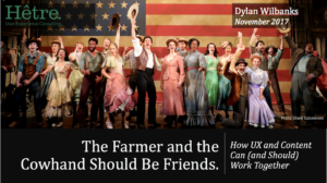
“The Farmer And the Cowman Should Be Friends” from Oklahoma! popped into my head. I guess I’d always wanted to call a talk that. (Eventually, when I wrote the talk, I discovered picking a title first is a bad idea — you end up spending hours trying to hammer so many square pegs into round holes story-wise.) I figured a talk on how content and design should work together would be the right sweet spot.

In July I went to Design & Content in Vancouver. The diversity of the speakers and topics struck me — so many non-white, non-male voices.  And it got me thinking about my presentation. Could I make it… well, look more like the real world and less like the lilywhite way we present in our slide decks?

Because here’s the thing: Oklahoma! is an incredibly white musical. Yes, performances are more diverse now — there’ve even been all-black casts — but the play itself is remarkably unlike the place and time it was set in. Canonically the musical is set just outside of Claremore, in Indian Territory, on land pried away from the Cherokee less than three generations after they’d been marched west in the Trail of Tears. But other than a passing mention of a Native healer, not one Native American appears in the cast. Northeastern Oklahoma was also home to all-black towns — Redbird is less than 40 miles away from Claremore. Again, not one African-American appears.

This is arguably the finest example of an American art form (the musical), and it is a white man’s story that ignores the multicolored nature of the land it is set in.

In design, our slide decks have a lot of white people in them. We barely notice. Our speakers are mostly white men. We sometimes notice. But the world is multicolored and multigendered, and we’re not representing that reality in an industry that is so focused on the people who use what we design and make.

But… could you make a deck that had a lot of non-white faces? Stock photos are filled with white faces. Our stereotypes make us choose certain images — the white Marlboro man cowboy, the coverall-wearing farmer on a tractor. Our users often look well airbrushed and scrubbed.

Could you make a presentation without a plethora of white faces? And would it still work? I decided to try.

Initially I tried to set the bar super-high — no white people at all. That slammed into the obvious problem: I needed to show pictures of Oklahoma! to underpin the talk theme, and cast photos are very, very white. I would need to back off and come up with some ground rules.

After exploring my resources, I settled on three rules for this deck:

  1. No white men in solo shots, only in group shots with people-of-color
  2. Wherever possible, use people of color in solo shots
  3. Use best judgment for balancing story with image

In the end, it was harder… and easier than I expected.


I typically build my slides from pictures with Creative Commons licensing and public domain images, both for cost (free) and the sort of images they provide (lacking the sterility that often comes with stock photography). My primary resource is Flickr (which has a Creative Commons search filter), but I’ve found good results from Google Image Search (which also has some copyright filtering), archive.org (poor filtering so proceed with caution), Wikimedia Commons, and US government archives.

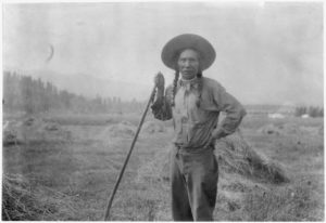
It took a while to find pictures of non-white farmers and cowboys. You’d think the search engines would be better at this; I had to use a lot of Google-fu to massage the right results. But eventually, thanks to the feds’ love for hiring photographers back in the day, I was able to find what I was looking for.

Louie Pierre, fullblood Indian farmer.

While I had good resources for what I call my “scene-setting” or “hero” photos, I still wanted to use stock images as well for corporate or work scenes. Talisha Payton pointed me at this Medium article and the Women of Color in Tech collection on Flickr, both of which came through with great shots to use in my slide deck.

Three women on computers in a discussion.
https://www.flickr.com/photos/wocintechchat/25900705292/

There were three moments in the deck construction when I had to stop and think about the rules I’d set for this.

The first moment was when I wanted to show the look of a writer and a designer frustrated by an ask. I could use pictures of people of color, but that didn’t feel quite right. I worried about imaging and stereotyping. Ultimately I used images of a white woman and a child giving the “whut” look. Perhaps also stereotypical, but I felt better about using them than using a person of color making the same look.

White girl with head in hands
https://www.flickr.com/photos/joopey/10331390786/

Second moment: I wanted to talk about “working together at the start, not the end of the planning process.” The best image seemed to be a runner coming out of the blocks, so I sourced an image of a running off Wikimedia.

Jeremy Wariner leaving the starting blocks, 2007.
https://commons.wikimedia.org/wiki/File:Start_Jeremy_Wariner_2007.jpg

When I was reviewing the deck on the first practice pass, I discovered I’d broken my “solo white man” rule. So I chucked it out and substituted a different image to emphasize the “working together” part. I never really noticed the difference, and the audience’s response was unchanged.

Women of color working around a conference table.
https://www.flickr.com/photos/wocintechchat/25392653883/

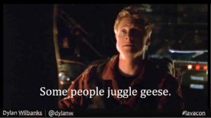
Last momet: I wanted to make a point about embracing the eccentricities of designers and writers — our weird hobbies and geekdoms — and celebrating them. “Some people juggle geese” (from Firefly) felt like a nice geek callout to use, so I threw it on a picture of Wash. Alan Tudyk. Pretty damn white guy.

Wash: "Some people juggle geese"

I didn’t catch it until after I’d given the talk. In the end, I think the point I was trying to make and the callout that came with it held, even if it seemed like no one in the room got the reference.

When I gave the talk, not one person commented on the dearth of white people or the plethora of non-white folk. Not one. The audience loved the talk and responded well to the topic. But no one thanked me for showing pictures of people of color. No one called me a “social justice warrior.” It was just another presentation.


So, my takeaways: Constraining yourself to non-white stock images for your slide presentations is hard. At the same time, I think the constraints made the talk better. I had to think more about the points I wanted to make and how to best make them. The limitation ended up being freeing as well; I could push on images of a colorful Oklahoma instead of a lilywhite Oklahoma! I had a different palette, so I tried to use it every way I could.

Would I do it again? This was a talk where it made perfect sense to push people of color in contrast to one of white culture’s touchstone works of art. I’m not sure this makes sense for every talk I’ve done. However, this exercise makes me want to include more women and people of color in my decks; the resources are there, and representation does matter (even if I’m the only one who noticed.) So I’ll probably do it again. But I’ll try to mix in some white guys every once in a while.

I mean, who knows when I’ll need to show mediocrity in a presentation.