
September 26th was a bright, if a bit brisk day in Philadelphia. The weather had finally gotten the memo that Autumn had arrived, but the bright sun made walking from 30th Street Station to the University of Pennsylvania campus more of a delight than a hindrance.
Penn is the home to the largest university museum in the United States, and on that Monday morning, the Penn Museum was the home of the third annual Forge Conference. The two-track conference is one of Philadelphia’s best User Experience and Product Design events. This year’s conference illustrated exactly why designers from as far away as Moscow, Russia arrived — and why the Mayor of Philadelphia was willing to join the conference for a post-lunch Q&A.
First, there’s the speaker line-up and the talks themselves. I wish that I was able to summarize all of them, but my cloning machine is still on the fritz and one of the biggest challenges of ForgeConf was picking which sessions to attend because they were all very good.
Amy Cueva from Mad*Pow opened the conference with an inspiring keynote about purpose-driven design that set the tone for the rest of the conference. “Design gets us from where we are to where we want to be,” she pointed out. “It isn’t enough to imagine better experiences. We have to move from thinking to doing.” Her session wasn’t just about inspiration. It was also honest discussion of why doing the right thing for the user also brings us success at the boardroom. “What is good for the people we serve is ultimately good for the business.”
The next two sessions were split between the larger Harrison Auditorium and the smaller Widener Lecture Room, which participants reached by walking through the Golden Age of King Midas exhibition. I opted to attend Amanda Stockwell of Stockwell Strategy’s presentation on incorporating the Build Measure Learn loop from the Lean Startup method into design. I would have loved to also attend Diogenes Brito’s talk on Design as a Service: Earning a Seat at the Table.
Amanda’s talk was based on the Build-Measure-Learn loop of the Lean Startup methodology’s core principles. Amanda connected the loop back to the scientific method, specifically the “experiment” phase. To build, measure, and learn, we need to develop minimum viable products that allow us to measure meaningful data that allow us to satisfy a hypothesis. Once satisfied, we can decide whether to continue down the path we’re on or pivot the product and iterate through the sequence again.
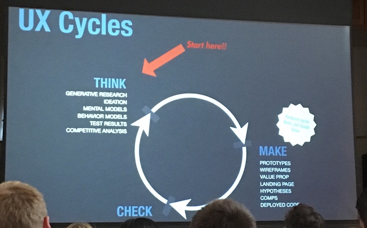
Amanda’s presentation was filled with good, concrete examples surrounding cupcakes and cats, and I learned more about Lean in that session than in any number of thinkpieces I’ve read before or since.
I stayed in the Widener Auditorium for the next session by Tom Wlodkowski of Comcast. Over in the Harrison Auditorium, Gina Pensiero and Sara Getz were speaking on Manufacturing Scarcity: Limited Content & Digital Luxury.
Normally I avoid conference sessions by speakers whose companies are also major sponsors, because I’ve already seen enough advertising pitches disguised as conference talks to hold me. Tom’s talk was different. Tom is the Vice President of Accessibility for Comcast Cable. His talk, Accessibility Equals Innovation, explained why accessible innovations are important. “One third of households in the US have a disability. 48% of people with disabilities are also heads of households. They have $200 billion in discretionary spending money.” He explained how many of the technologies that we all use today, including the typewriter, were initially invented to aid people with disabilities. But focusing on only those who identify as disabled isn’t effective. “Ninety five percent of people who can benefit by accessibility technology don’t identify as being disabled.”
Tom brought a voice remote and a set-top box emulator with him to demonstrate Comcast’s accessibility options. The voice remote allows the user to press a button and speak commands, which is handy not only for the blind, but also for those with physical disabilities, cognitive issues, or English as a second language. The set-top box can be configured to read the menus and the interface so that it can be navigated either visually or aurally. He also demonstrated the “voice description” feature that allows blind customers to experience a deeper enjoyment of television through a voice track that narrates the visual elements on the screen.
Lunch took place in the Chinese Rotunda, surrounded by antiquities in one of the oldest domed halls in the city. The break was long enough to allow us to eat with leisure, socialize, and watch the koi in the pond out front.

After lunch Keith Scandone, CEO of O3 World, held a Q&A in with Mayor Jim Kenney. Most of Mayor Kenney‘s answers were not directly about design, but they pointed to the challenges of designing and managing complicated systems like city governments. For example, decriminalizing marijuana possession helped to increase police coverage for more serious crimes, because Philadelphia was booking 4,200 people a year for minor marijuana offenses previously.
Philadelphia’s poverty level is 26%. Making practical funding calls requires strategic thinking. Hosting the Forbes 30 under 30 with a city contribution, for example, wouldn’t have been a good investment for the city, but hosting the Democratic National Convention was. Philadelphia arrested no one related to the DNC convention, and one of the protestors stopped the mayor to tell him our police force is awesome. The mayor works with the police force on community-police relations. “It starts from a place of respect,” he said. “You can’t go after people with expletives. You have to explain why you stop someone. Be polite, build a relationship.”
It was the first time I’d seen a sitting politician speak at a design conference, and it was a good choice. I came away with a better idea of the design and strategic challenges of running a city, as well as quite a bit of respect for those running it.
After the Mayor’s session, I stayed in the auditorium to hear Steve Hillenius from NASA speak about The Internet of Things In Space: Building Compelling User Experiences. In the Widener Lecture Room, C. Todd Lombardo spoke on Designing Design Process for your Organization.
Steve’s talk was about the Internet of Things (IoT) and how we haven’t really managed to progress it past the “stick chips to existing things” stage so far. As a result, most IoT devices aren’t particularly compelling or even all that useful. Further, they’re scary. No one wants to reboot their door, or their lightbulb.
NASA is tackling the Internet of Things to solve concrete problems on the International Space Station (ISS). Each mission consists of only a few astronauts, and today Mission Control controls most of the ship from the ground. But this structure isn’t scalable for Mars missions or even lower-cost ISS missions. The goal is to make the astronauts on board a ship more autonomous and less tied to voluminous paper procedures and Mission Control. “What if we could guide an astronaut to do procedures without training and the objects they were installing knew whether they were installed correctly?”
They used accelerometers, haptic, and augmented reality to develop all the objects in a procedure and be able to tell where they were located, then walk the astronaut through the installation and provide natural and convincing feedback. The project is still working through testing, but the video Steve played demonstrating the technology made me wish I could put it on my wallet and scissors today. (Yes, scissors.)
Lija Hogan spoke on UX Research = UX Innovation, with Alissa Briggs on the other side speaking on Design Leadership Means Business. Lija’s talk focused on how quality user testing allows a product development team to gather and use data, investigate systematically, and experiment aimed at discovery and interpretation. One of her examples covered the daily iterations an elementary school uses to increase their effectiveness. “This is how things went today. What are we going to do tomorrow to make it better?”
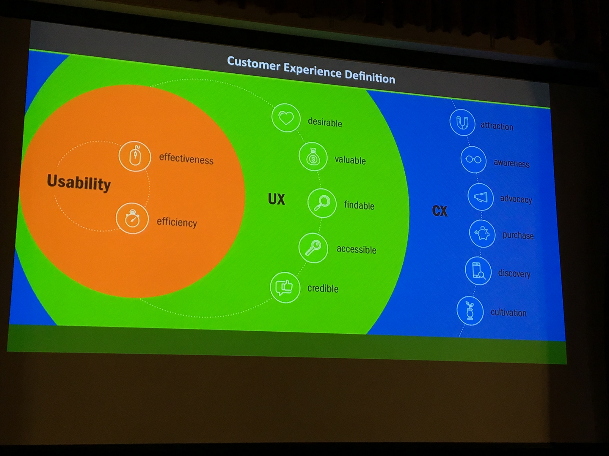
We developed the field of usability, Lija explains, to ensure that users could complete tasks. When we’d made progress there, we moved our focus to user experience – do the users even want to do the tasks, regardless of how usable the interface is? And our most recent direction is toward Customer Experience (CX) – are we advocating for our customers and cultivating our relationships with them appropriately? Basic research followed up with a strategic research program is the key to reaching the next levels of customer engagement and organizational UX maturity.
The final split session of the day, I attended Frank Yoo‘s talk on Career Growth through Deliberate Discomfort. My other choice was Clemente Miller‘s Motivational UX: The Art & Science of Digital – and Human – Behavior. Frank’s talk interested me because I’m always looking for ways to grow, and sometimes we need a little external motivation to remind us that it’s OK to be uncomfortable.
Frank quoted Jenn Chen as saying “When you’re frustrated or scared it’s just your body telling you to grow,” and that summarized the point of Frank’s talk quite well. We have to be willing to feel like fish out of water when we first start a new experience, and use that feeling to learn. “Sometimes you have to crack the door open just enough to see the opportunity you will actually want.”
We have to embrace our inner imposter and admit we may not be good at something in order to learn the skills to be great at it. “Getting up to production speed allows you to become more creative, so you can grow from tactical to strategic work.”
And we have to embrace the fact that change is always coming, both externally and internally, so sometimes we’re going to grow out of the space we’re in. “Being a veteran in your own discomfort means you’re prepared.”
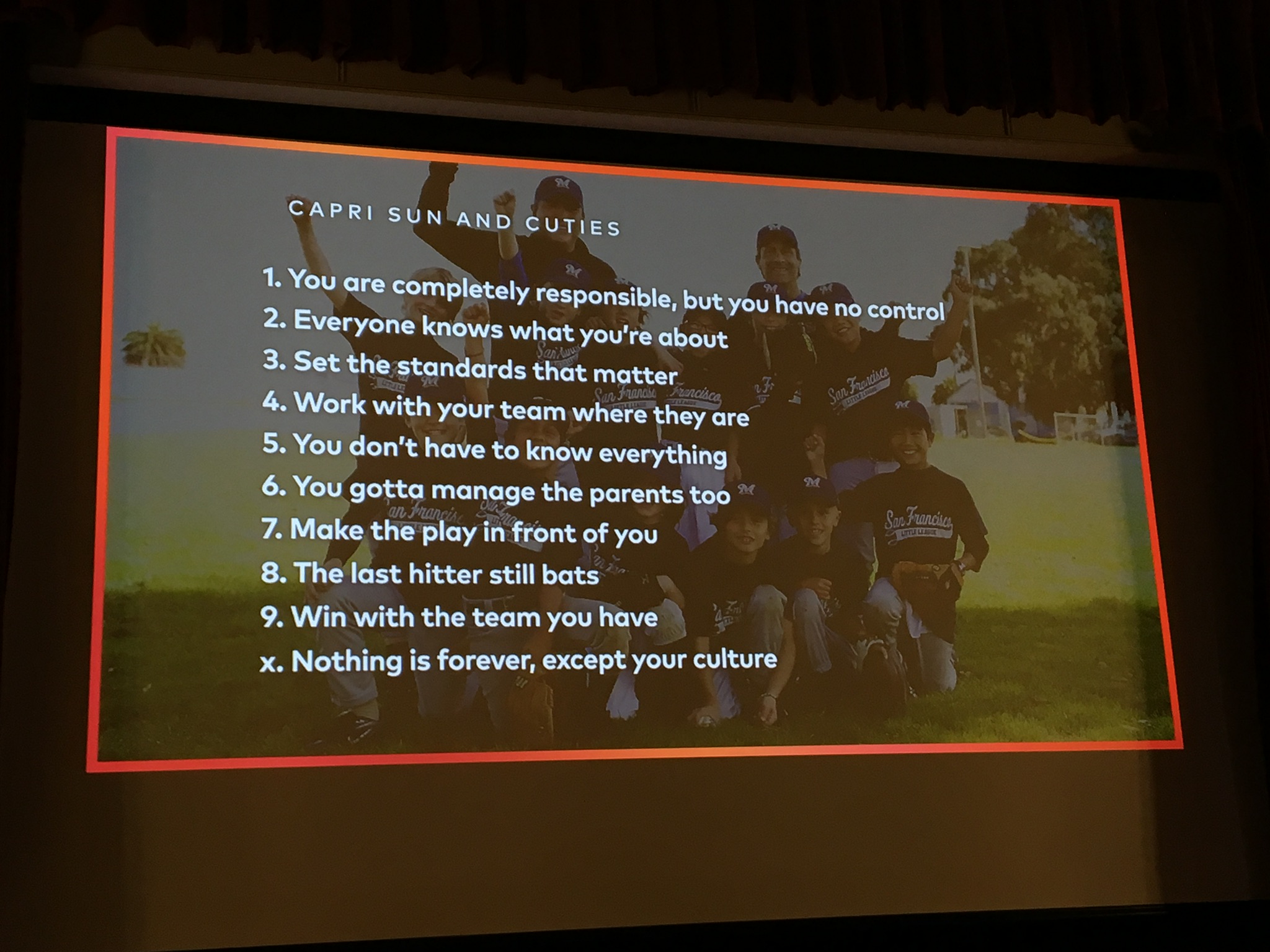
The day ended with Albert Poon‘s keynote, Everything I know about Managing Designers I’ve Learned From Coaching Youth Sports. “If you have a vision to do something big with design, you will have to lead a team,” he explained. Learning how to lead is tough, even for experienced designers that have been facilitating meetings and running projects for years. Albert’s been leading for long enough to know how poorly his first management experience went, and how learning to coach youth sports (specifically his son’s baseball team) was a great boon to his skills.
“Leaders are completely responsible, and you have no control. You’re never the one up to bat, and you’re never the one in the field.” You can’t do everyone’s job. “Any success is theirs, and any failure is yours.” As a manager, your job is to build and nurture a team so they can do great design. His keynote was structured around ten tips for becoming a better manager (one for each inning, including going to extras).
Albert’s talk was the perfect high note to end the conference on, because it wrapped together so many of the themes that we’d heard throughout the day about empathy, quality, bringing people together, and being willing to grow. “Mostly it’s listening, learning, trying, failing, and adapting.”
I felt a little bad for the folks who weren’t laughing at the baseball references – there were some pretty funny ones — but the Phillies have been pretty bad for more than half a decade so I guess we fans are in a decline again.
The quality location, compelling topics, and excellent speaker presentations were three great reasons to attend ForgeConf. The super-comfy tee and water bottle that came in our swag bags were also perks that, while they wouldn’t compel me to attend a bad conference, were icing on the cake of an excellent one. But there’s one more reason to attend ForgeConf that not every conference can match, and that’s the time that the organizers clearly put into designing the conference itself.
For example, the speakers weren’t just excellent at their craft, they were clearly chosen to represent the diversity of UX as an industry. The speaker list is almost evenly split between men and women and included a larger-than-normal-conferences number of racial or ethnic minorities. It was important to me to hear the hard-working women I know are in our industry represented by the speakers, and I’m sure it was just as important to other attendees to see people who represent them get a chance to speak.
Especially appealing was Tom Wlodkowski’s attendance as a speaker, because while awareness of accessibility is on the rise, it’s still rare to see UX folks with noticeable disabilities attending our conferences, much less speaking. Hearing about the issues Tom faces in his own voice — and the changes that he’s bringing about on behalf of all users — was as meaningful as the presentation he gave.
The ForgeConf speaker line-up was clearly curated with the knowledge that diversity of thought matters, that Representation matters. Had the staff not put the effort in to procure their speakers, all of the talks that discussed empathy would have fallen a bit flat.
The staff didn’t stop there. They also provided a Code of Conduct that aligned with their implied values of diversity and empathy. While I know some in the industry don’t see the value of a Code of Conduct, I do.
And the people! The staff were always open to questions, even complicated ones. They knew the location, understood what was going on, and were willing to answer any questions that attendees had. They were the kind of helpful and friendly and down-to-earth that earned Philadelphia the name “The city of brotherly love”.
The combination of the code of conduct, the line-up of speakers, the staff, and the quality of design that went into every step of the conference made it an event I intend to attend every year if I’m able. I’m already looking forward to the opportunity to pre-order tickets next February, and I recommend that you do the same.
Editor’s note: Conferences are a big part of how UX designers learn and develop. We would love to publish more reviews of conferences. Write for us!