The new office building’s decorators had chosen fancy floor-to-ceiling stall doors in the restrooms. The heavy wooden louvered doors looked posh, they were incredibly private, and they matched other decor elements in the building.
There’s only one problem: the building’s women couldn’t tell when the stalls were occupied.
Now here’s a thing that y’all might not know, especially if y’all use the men’s room: at least here in the Mid-Atlantic region of the United States, women do not like to knock on the stall doors. If one knocks on a stall door, a couple of things might happen:
- The door may swing open, embarrassing everyone. Stall door latches are known to be less than reliable the same way that tissue paper is known to be less than load-bearing.
- The person in the stall (if there is one) may think the knock is on a different stall and not answer. Conversely, someone in a different stall may answer. This leaves everyone confused.
- Even if the right person answers, they may be identifying themselves as the source of that post-tacos-and-beer-binge smell to their co-workers and nobody wants that, so there’s a better chance that nobody answers at all.
See, one of the big secrets of womens’ bathroom etiquette is that it’s ok to talk to your friends if you went in together, and it’s even ok to say “can someone hand some toilet paper under the door?” in a public setting, but it’s not ok to strike up a random conversation with the other members of the bathroom unless you can also make eye contact with them. (And when I mean “not ok”, I mean it in the same sense that it’s not OK to decide to use the urinal directly next to the only other guy in the men’s room, look down, and say, “So, how’s it hanging?”)
Women’s restroom culture requires the gap under the door so we can do a foot check / purse check and choose a stall without interacting with its potential inhabitants.
For whatever reason, the designers of this bathroom were unaware of the culture of the users, and made a design mistake.
The staff of this particular office building made enough of a ruckus that the facilities team decided to make a change. They swapped out all the doorknobs for knobs with “vacancy” notifiers on them.
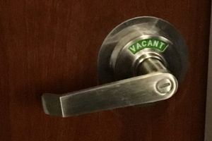
An issue was missed in the design, it was identified after rollout, and corrected in production. One would think this would be the end of the story. One would be wrong.
In order for a production issue to pass test, one needs to ensure that not only is the original issue gone, but no new issues have cropped up in their place. New issues like door locks that are difficult to lock.
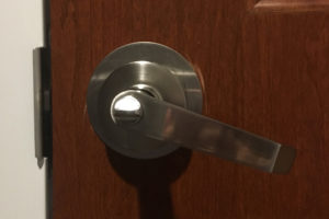
Those little turn-button locks don’t work particularly well for everyone. It can be difficult to lock or unlock the door, especially since one has to put some extra pressure at the end of the turn to ensure the vacancy indicator actually changes. It’s especially difficult if a) the user has motor issues, b) the user has their hands full with bags, jackets, phones, etc. or c) the restroom is heavily-trafficked and the door locks wear out easily.
When the door locks didn’t turn correctly, two results occurred: doors showed as vacant when they were really occupied (embarrassing) and doors locked when they slapped closed, even though the stalls were vacant (requiring someone to come unlock them, because crawling under the stall door to fix it was not an option).
Rather than ask Facilities for assistance a second time, the users did what users do: they created their own solution to the problem in the form of their own signs.
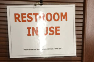
Like many of our users’ hacks, be they physical or software, this sign worked pretty well. But like many more of our users’ hacks, it didn’t work as well as if it had been designed into the system. On most stalls the signs fixed the usability problems, but some stalls were under an air vent, which led to situations like this:
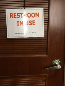
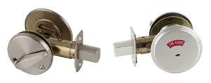
After more than a year of stall door hijinks, the problem was solved by a second upgrade. This time, every stall door kept its (accessible) lever handle, and gained a (more accessible) bolt lock, which would not show “in use” unless fully thrown, or “vacant” unless fully unlocked. As a bonus, they couldn’t accidentally lock themselves when the door slammed shut.
As designers, we can take away some lessons from our bathroom adventures:
- It’s not good enough to assume we know the culture and behavior of our users. We have to validate our assumptions, preferably before we finish building a monolithic building.
- If we don’t meet our users’ needs, they will jury-rig our designs until it’s better than what we produced, even if that means that it’s still not as good as it should be.
- Even if we think we’ve corrected a problem, we owe it to our users to start small and test before rolling a solution out to a large audience. This is especially important if accessibility issues, privacy issues, or potential embarrassment are in play.
Design is everywhere, even especially the women’s restroom. Doorknobs (like buttons or menus) can lull us into thinking they’re easy to design because they’re everywhere. But it’s precisely because they’re a ubiquitous interface that they owe our close attention: when we get them wrong, everyone knows it immediately.
