Preparing for the worst

The Friday before Labor Day in 1996, there was a 42-car pileup on I5 south of Seattle. Miraculously, only one person died. She was one of my co-workers. After two weeks in a coma, never regaining consiousness, she was removed from life support. It was shortly after my 22nd birthday.

In the weeks and months afterward, at the same time as our tiny staff was trying to cope with grief, we were also dealing with the shambles of her desk. Everything about our marketing and advertising efforts was there in unlabeled folders and cryptic Post-It notes. Everything they say about “what if you were hit by a bus” — it’s all for real when someone is killed by a semi truck.

In the twenty years since, I’ve thought about that, off and on. I naturally tend to keep all sorts of knowledge in my head instead of externalizing it. And just as I have to use my grandmother’s death as a momento mori for hoarding, Becka’s death is a reminder to get what I know into some sort of order so that others can pick it up.

This month we finally went live with a new CMS. Which is great, except that the last few months I’ve been deep into doing, and not so much into annotating. Sure, I wrote up how to do all the basic stuff, because we had to train editors, but nothing really about how any of it actually works.

Last week I finally took a few days off — to take my mother to the pre-op appointments for her knee surgery. (Another reminder of mortality? On the other hand, I learned that Mom’s in pretty darn good health at almost 73.) Of course, while I was in a waiting room with my knitting, my phone dinged. And again. Each time an odd little thing that I know how to handle but hadn’t written down or even explained out loud.

I still have so much work to do to get the new CMS to where it will really shine. I have so many people asking for improvements, tweaks, new features that are finally possible.

Becka was constantly busy, creating all the materials, trying to get press, placing ads. She was one person in a staff of less a dozen, responsible for promoting a tiny children’s museum. There was never time to get it properly organized or documented. And then there was no Becka.

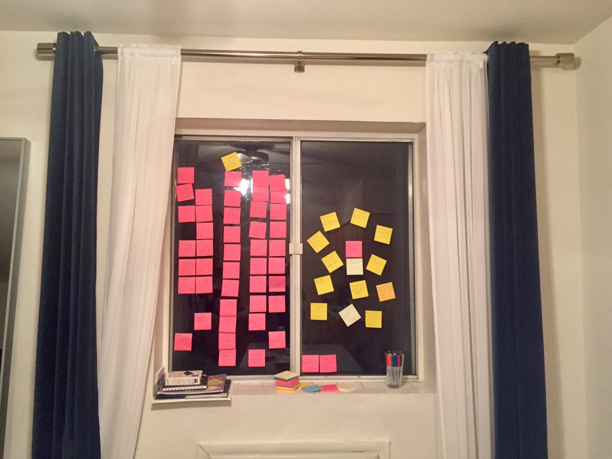
So in this dark season around the longest day of the year, I’m writing everything down. I’m making a list — lots of them, really: content types and workflows, fields and processes, all the choices and ideas that went into this thing I’ve worked on that others will need to use.

If you’re one of those folks “holding down the fort” in the weeks around Christmas and New Year’s, find a quiet moment and label your folders or write a little documentation. Share something with the people who may need it someday.

If you have kids and are anywhere near Tacoma, WA, visit The Children’s Museum of Tacoma and enjoy Becka’s Studio. You can also donate to the museum directly, through Amazon Smile, or with a Fred Meyer Reward Card. (They didn’t ask me to say any of that. The CMT was just a really important part of my transition from college to adulthood.)

Learning from the ladies’ room

The new office building’s decorators had chosen fancy floor-to-ceiling stall doors in the restrooms. The heavy wooden louvered doors looked posh, they were incredibly private, and they matched other decor elements in the building.

There’s only one problem: the building’s women couldn’t tell when the stalls were occupied.

Now here’s a thing that y’all might not know, especially if y’all use the men’s room: at least here in the Mid-Atlantic region of the United States, women do not like to knock on the stall doors. If one knocks on a stall door, a couple of things might happen:

  • The door may swing open, embarrassing everyone. Stall door latches are known to be less than reliable the same way that tissue paper is known to be less than load-bearing.
  • The person in the stall (if there is one) may think the knock is on a different stall and not answer. Conversely, someone in a different stall may answer. This leaves everyone confused.
  • Even if the right person answers, they may be identifying themselves as the source of that post-tacos-and-beer-binge smell to their co-workers and nobody wants that, so there’s a better chance that nobody answers at all.

See, one of the big secrets of womens’ bathroom etiquette is that it’s ok to talk to your friends if you went in together, and it’s even ok to say “can someone hand some toilet paper under the door?” in a public setting, but it’s not ok to strike up a random conversation with the other members of the bathroom unless you can also make eye contact with them. (And when I mean “not ok”, I mean it in the same sense that it’s not OK to decide to use the urinal directly next to the only other guy in the men’s room, look down, and say, “So, how’s it hanging?”)

Women’s restroom culture requires the gap under the door so we can do a foot check / purse check and choose a stall without interacting with its potential inhabitants.

For whatever reason, the designers of this bathroom were unaware of the culture of the users, and made a design mistake.

The staff of this particular office building made enough of a ruckus that the facilities team decided to make a change. They swapped out all the doorknobs for knobs with “vacancy” notifiers on them.

A lever-style doorknob with a sliding section that displays "Vacant" in white letters on a green background or "Occupied" in white letters on a red background depending on the position of the lock.
A lever-style doorknob with a sliding section that displays “VACANT” in white letters on a green background or “IN USE” in white letters on a red background depending on the position of the lock.

An issue was missed in the design, it was identified after rollout, and corrected in production. One would think this would be the end of the story. One would be wrong.

In order for a production issue to pass test, one needs to ensure that not only is the original issue gone, but no new issues have cropped up in their place. New issues like door locks that are difficult to lock.

A lever-style doorknob with a turn-button lock, wherein the tiny slippery button must be turned to lock the door and change the vacancy indicator.

Those little turn-button locks don’t work particularly well for everyone. It can be difficult to lock or unlock the door, especially since one has to put some extra pressure at the end of the turn to ensure the vacancy indicator actually changes. It’s especially difficult if a) the user has motor issues, b) the user has their hands full with bags, jackets, phones, etc. or c) the restroom is heavily-trafficked and the door locks wear out easily.

When the door locks didn’t turn correctly, two results occurred: doors showed as vacant when they were really occupied (embarrassing) and doors locked when they slapped closed, even though the stalls were vacant (requiring someone to come unlock them, because crawling under the stall door to fix it was not an option).

Rather than ask Facilities for assistance a second time, the users did what users do: they created their own solution to the problem in the form of their own signs.

A laminated "restroom in use" sign with a footnote that said "Please flip over this sign when restroom not in use. Thank you." (On the other side, it says the restroom is not in use, with a similar footnote.)
A laminated “restroom in use” sign with a footnote that said “Please flip over this sign when restroom not in use. Thank you.” (On the other side, it says the restroom is not in use, with a similar footnote.)

Like many of our users’ hacks, be they physical or software, this sign worked pretty well. But like many more of our users’ hacks, it didn’t work as well as if it had been designed into the system. On most stalls the signs fixed the usability problems, but some stalls were  under an air vent, which led to situations like this:

This door has both a laminated sign reading "restroom in use" and a doorknob indicator that says "vacant". No confusion there!
This door has both a laminated sign reading “restroom in use” and a doorknob indicator that says “vacant”. No confusion there!

After more than a year of stall door hijinks, the problem was solved by a second upgrade. This time, every stall door kept its (accessible) lever handle, and gained a (more accessible) bolt lock, which would not show “in use” unless fully thrown, or “vacant” unless fully unlocked. As a bonus, they couldn’t accidentally lock themselves when the door slammed shut.

The outside and inside of a Schlage brand deadbolt with “in use” indicator.

As designers, we can take away some lessons from our bathroom adventures:

  1. It’s not good enough to assume we know the culture and behavior of our users. We have to validate our assumptions, preferably before we finish building a monolithic building.
  2. If we don’t meet our users’ needs, they will jury-rig our designs until it’s better than what we produced, even if that means that it’s still not as good as it should be.
  3. Even if we think we’ve corrected a problem, we owe it to our users to start small and test before rolling a solution out to a large audience. This is especially important if accessibility issues, privacy issues, or potential embarrassment are in play.

Design is everywhere, even especially the women’s restroom. Doorknobs (like buttons or menus) can lull us into thinking they’re easy to design because they’re everywhere. But it’s precisely because they’re a ubiquitous interface that they owe our close attention: when we get them wrong, everyone knows it immediately.

Where should a junior UX designer work?

As soon as you walk into my apartment, you will see I have covered one of my windows in sticky notes. I’ll soon be applying for User Experience internships for the summer of 2017. 46 pink sticky notes cover the window.These are the companies around the country (maybe even one in Canada) that are offering UX internships that I am considering applying to. Initially, I found a lot more than 46 companies but based on some fundamental criteria I narrowed it down to those. I hope to find the following traits in my first job as a user experience professional.

The company shows a clear understanding of the difference between UI and UX.

I am not a visual designer. My strengths lie in performing solid research, digging to find underlying problems and generating logical solutions (layouts, features, interactions). You can be a great designer and never create a high fidelity design. If your job description for a UX designer mentions terms like “Photoshop” and “Illustrator” and ” Pixel Perfect”, it’s a red flag that your team may not understand that User Interface design is a subset of User Experience and what you are looking for is more of a visual designer.

Design decisions are founded in research and backed up with data.

Unfortunately, this is hard to discover through a company website or job description as most don’t mention this. However, how design decisions are made is something I’ll ask about in every interview. If the answer is anything along the lines of “whatever person X says goes” it’s a red flag. I’d probably probe further to find out what person X usually looks for. If words like “testing”, “data”, “analytics”, “research”, or at the very least “heuristics” are never mentioned, then this is likely not a place for me.

Projects start with clearly defining the problem.

Oh you have a cool idea! That’s nice! What problem will it address? Approximately how many people have this problem? No pie in the sky startups for me.

The company knows the value of UX research

Given this is my strong suit, my ideal company would have team members dedicated solely to performing research. This research and testing would happen before the project starts (defining the problem), during the project (testing our proposed solutions) and after (validating our designed solution is working).

The company and design team has an established UX team that has practiced the above values for some years and is enthusiastic about mentoring junior UX designers.

My first role in User Experience will teach me a lot. There will be a lot to learn and it’s inevitable that mistakes will be made in the process. I need to know that I can leverage the support and knowledge of a team that has a great amount of experience.

I’d rather not have to convince a company that even though some designers don’t have 7-10 years of experience that we can still add a ton of value. A new perspective and fresh set of eyes never hurt anyone. Also, it would be really discouraging to be thrown into a team only to realize there are no senior UX designers to show you the ropes or that they are less than enthusiastic about doing so.

The internship is a paid role.

This tells me that the company is serious about training future UX designers and that they expect work to be done on real projects.  Though these can be hard to find, this is definitely a must-have for me.


As an aspiring designer, I am always thinking about where I want to work for my first full time UX role. Frequently I tell myself that since I don’t have much experience, that I can’t afford to be picky. However, after reading many of the UX job postings out there, I think it will be in my best interest long term if I am at least a teeny bit picky, unless, I want to sell my soul, and give up my morals and basic user experience values.