
I was working with a student developer recently who was putting together a new site for a massive archive. She was doing the bulk of the technical heavy lifting while I sat by dallying with CSS and font sizes, and drinking a refreshing Dr. Pepper. After she finished the algorithms to migrate the data and got the site up and running, she showed me what she had. All-in-all, it looked great and was an enormous improvement over the old version of the archive. This was no small project. But now that she was wrapping up the technical side, I wanted her to take a moment to consider the visual design and content side.
While all the data had migrated successfully, pages felt a little bit awkward to skim in places, particularly near the top. There were large headings paired with small chunks of data, which required a lot of scrolling to parse. Now, pixels are cheap, but it didn’t quite flow, and it was difficult to absorb the information and orient yourself on the individual archive listings.
She set about exploring a better way of laying out the page, but she had little experience with visual design, and wasn’t quite sure where to even start. I attempted to talk about how bits of type in information design have different roles: “Think of it like HTML semantics, but applied to more specific bits of content. Kind of like XML, but in a more visual way.” Yeah, I wasn’t doing her any favors.
We both sat back in our seats and stared at the screen. The developer sighed and I self-consciously sipped at my chilled can of Dr. Pepper. That’s when I realized I was holding a good example of just what I was talking about in my hands. I spun the soda can around and pointed out the nutrition facts label.
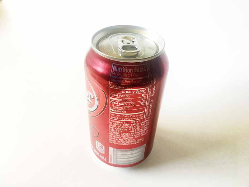
Admittedly, this label is not the most beautiful example of design, but that doesn’t matter. Upon examination, it still elicits a number of immediate questions:
- Why are some words, like “Total Fat”, “Sodium”, and “Total Carb.” bold?
- Why is “Nutrition Facts” the biggest, boldest part of the label?
- Why is the ingredient list placed outside of the box?
- Why is the percent daily value label right-justified?
- What kind of information are the bold rules separating and what are the fine rules separating?
- Why is the sugars label indented underneath total carbs?
- Why is the asterisked information about percent daily values a smaller font size?
These were deliberate decisions to differentiate the data by giving it distinct roles. We can identify labels, like total fat and sodium. “Amount Per Serving” is a section heading. “% Daily Value” is a tabular column heading for numbers. The asterisked information is a footnote. I’m not going to give you the answers to all of the questions because you should come up with your own hypotheses, as well as your own questions. We might even disagree about which bits of content deserve which roles, but that’s fine. This isn’t an exact science, it’s design.
Once you have the roles down for your bits of content, you can start to build them into your template and style them in ways that make sense for your design and brand.
Determining roles helps you break through the limits of HTML semantics and branch out into more interesting directions with your content. But you need to be specific about each role and consistent in the way you present them. That’s key. If you decide a label should be bold in one place, then labels should be made bold everywhere… unless you can justify a new role for that kind of text! That sugars label, for example. Both it and total carbs are labels, but sugars has a slightly different role, because it’s a subset of total carbs. That’s why it can justify a different treatment.
Answer these questions and any others you might have, and you’ll have a starting point for organizing information your next project. While it is not the oracle of design, the Nutrition Facts label packs a lot of information into a very small space because it is very deliberate about what roles each piece plays, it is consistent in the way it displays them, and it is everywhere.
After I discussed this with my developer, she better understood what I was asking for. She went off to work and, by the time I finished off the rest of my bubbly beverage, she had come back with something that looked quite a bit nicer, and a new design tool in her belt.