
Last post, I talked about how I hate designing filters because my projects rarely give me adequate resources to explore three things:
- Time to find out what filters users are currently using
- Research to tell me what users would like to filter on but can’t
- The number of items that could be in the unfiltered results
But there are a few tips I’ve picked up over the years that make designing filters and meeting users’ expectations easier, even if my personal confidence in my work isn’t what I’d like it to be.
- If the data displays on the search results, you should be able to filter by it. (Corollary: if the data is a filter, it should display in the search results.)
- If the data is time-based, provide time filters. (Correlary: if the data is not time-based, please do not provide time filters.)
- Filtering is only the first step; showing the results in a sorted and organized manner is the second. “Random” is not a search results or filter results sorting method.
- The shittier your information architecture and navigation are, the more your search and filter better work exactly the way the user expects.
Data that displays consistently with the filters is important because it confirms to the user that the filter is working correctly. We’ve all been on sites where the filter doesn’t work correctly.
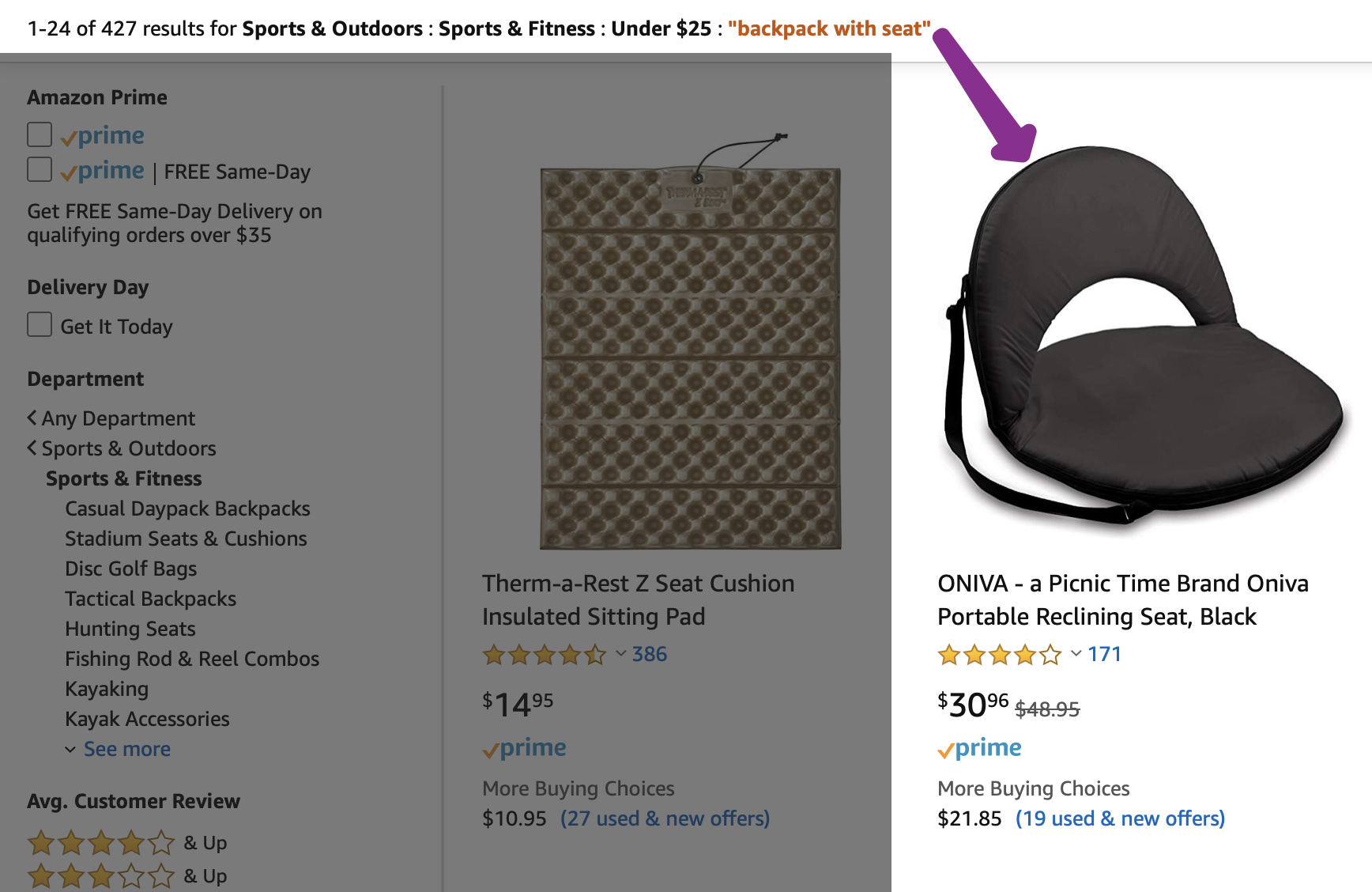
For instance, Amazon. (At one point in my comics-making life, Amazon was the source of something like 20% of the comics)
The search term (aka “text string filter”) was “backpack with seat” and and the intention was this:
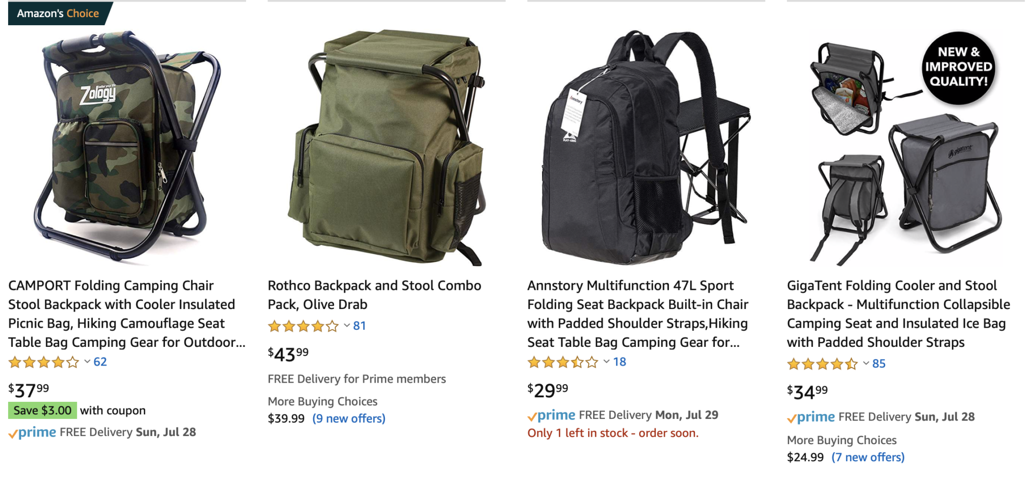
This row of results was on the first page, and these aren’t sponsored results, which we all know are flaky anyway.
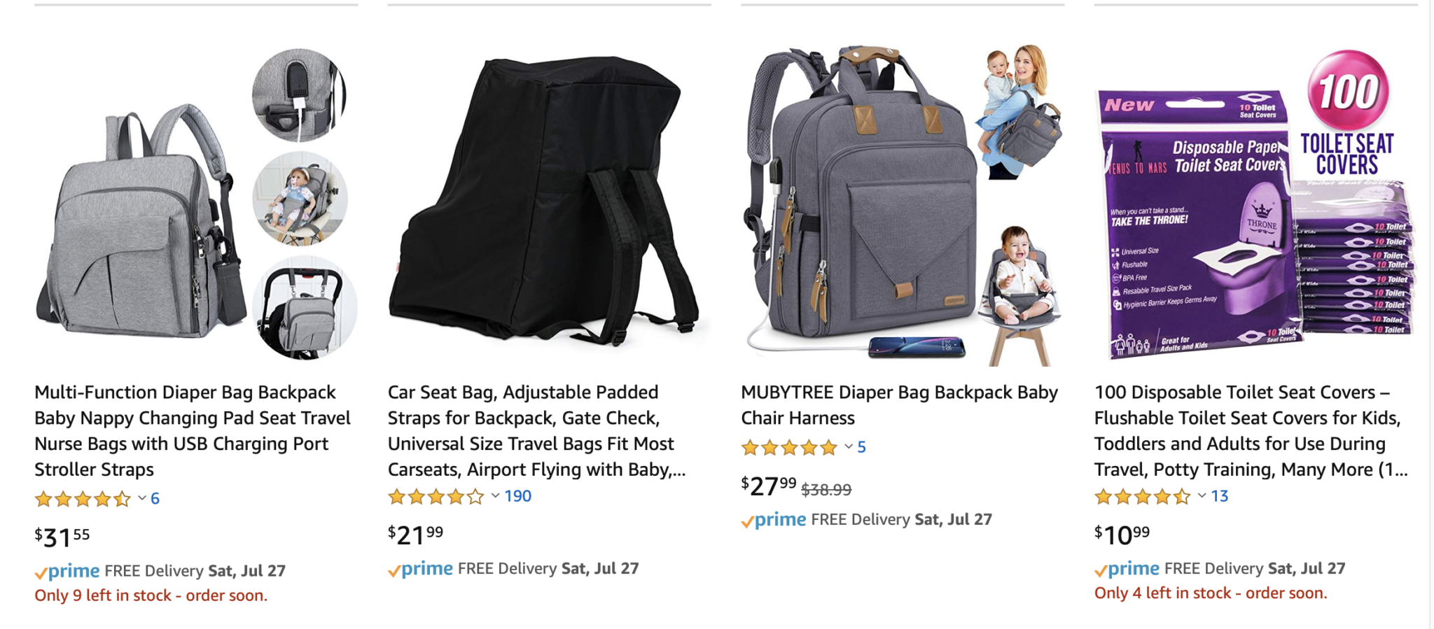
When the filtered terms show up on the search results, the user can look at the filter, look at the term, and go “yes, these are at least in line with what I asked for.” When they’re not, the user has obvious questions about the quality of your results.
So make sure the user can see your filters align with your results, so that it’s clear why something batty showed up. This also makes doing quality engineering easier on your testers. And you. And support.
The next tip is a little more subtle: use dates where dates apply, and don’t use dates where dates don’t apply.
Let’s say that we’re looking at a knowledge base for a printer.
We could be looking at a knowledge base because some news item somewhere on the internet tipped us off to a problem or a recall or something else that is time-related. In those cases, it makes sense to list the date the knowledge base item was last updated.
On the other hand, we could be looking at a knowledge base because we can’t figure out why the damn printer won’t talk to the network and we want some instructions. Instructions are generally viewed as evergreen content: content that doesn’t fall out of date like the news or the security updates, but instead is accurate for many months, years, possibly decades. [1]For a printer, probably not decades.

Content strategists and authors need to know when How To articles were last updated to support their content, because as Erin Kissane points out in The Elements of Content Strategy, good content is supported. These specific people probably want the ability to identify when a piece last got touched in a content audit. Stuff that’s old may be outdated and reviewed for accuracy.
And I know that some folks will argue that the user also wants to know when the last updates were for a particular page so that they can also decide if the article is crap, but the user lacks something the content strategist has access to: actual knowledge of whether the article is accurate. The content strategist has access to the people who can say whether the year-old device data security processes are out of date or need to be updated. The user can’t tell if they’re out of date or perfectly fine, even if they read the article.
So the only thing that sorting a knowledge base’s evergreen content does in a design is tell your user that your organization hasn’t updated the oldest articles anytime soon, and the only thing that knowledge can do for them is cast doubt on the accuracy of your content. Don’t advertise that. And don’t provide a filter for it!
Filtering is only the first step; sorting is critical too. Here’s a search for a pair of women’s jeans on Gap. The only four filters provided are category (which I’d call “style”), size, color, and price. To generate the search results below, I filtered on “skinny” and “size 16”, which got me down to a respectable 33 items. Now I’ve got a pretty good idea of the things I want in a pair of jeans: must have pockets, can’t have holes, mid-rise is more comfortable, etc.
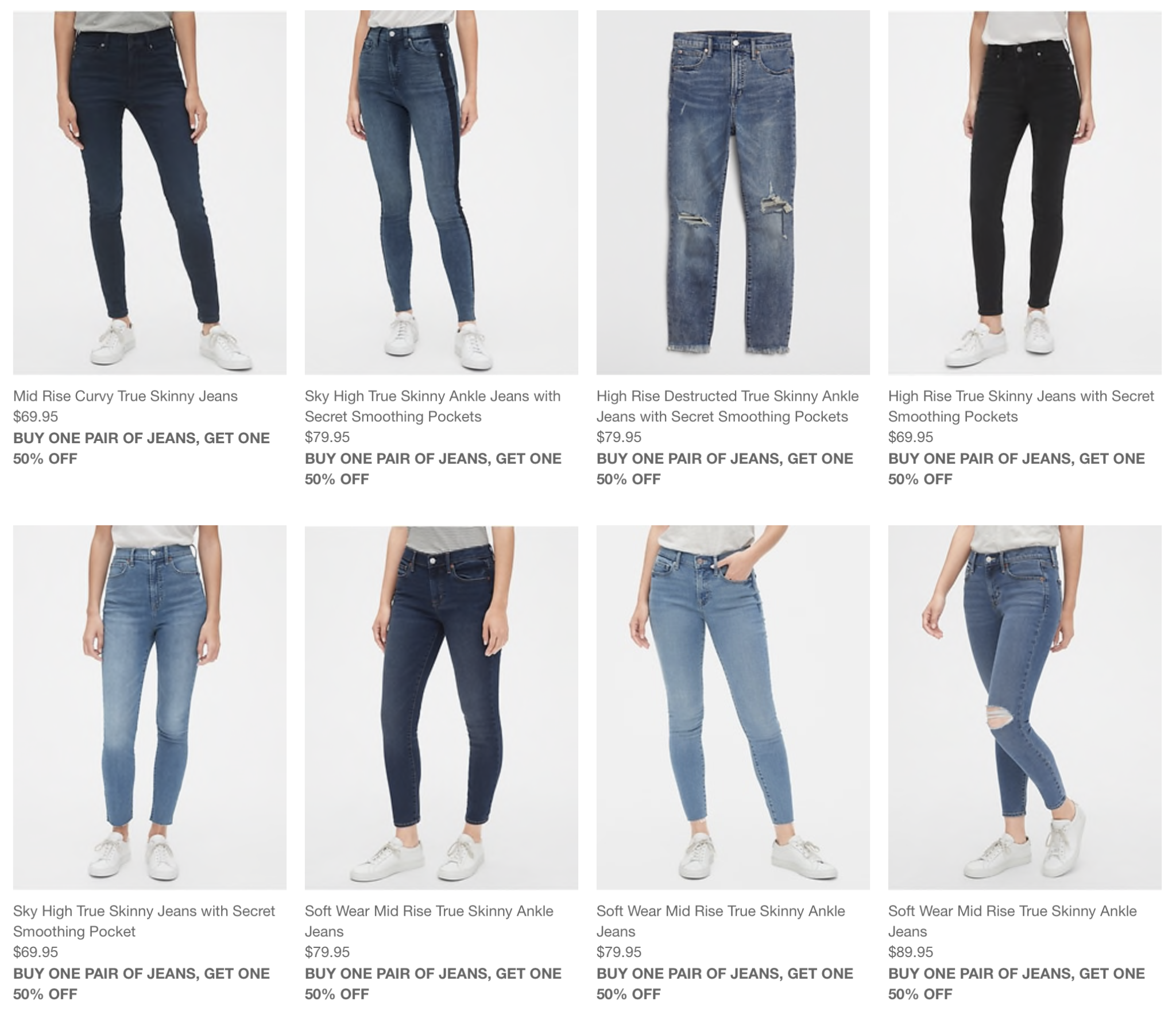
It’s bad enough that the things I actually care about like “real goddamned pockets” and “no really i need to wear these to work don’t rip them for me” aren’t filters.
But even the things I did filter on don’t appear to have set or even influenced the sorting criteria of the results. The first and second row both have mid-rise and sky high jeans, so we’re not sorting on rise. We’re not sorting on length because ankle jeans show on both rows. Holes are the same. Pockets are the same. (Pockets don’t always get mentioned either.) Sometimes two pair that appear to be identical except for color are next to each other, but not always.
This is a pain in the relaxed-fit.
It’s not enough to provide filters. You have to know how to sort once the filters are done.
Sometimes this can be inferred…. “the only filter is for items under $25” might also indicate the user would like to see them in price order. “The only filter is for customer review” probably indicates the user would like to see highest-reviewed items first.
If the user can compound their filters (and that’s when filters are the most powerful so, y’know, do that) then deciding whether the user cares more about price or the high reviews is literally guessing.
And let’s face it, a lot of our companies have specific things they want the user to sort on, like “featured items” that better meet business criteria, which we also have to take into account in our designs.
But this is one of the places I give Amazon props over Gap. Amazon definitely prefers that I sort by “Featured items” so they always default to it. But they also provide me other sorting options for when I really want the top result in a search for “outdoor dog houses” to be the $13,000 natural wood dog house with windows and a porch.
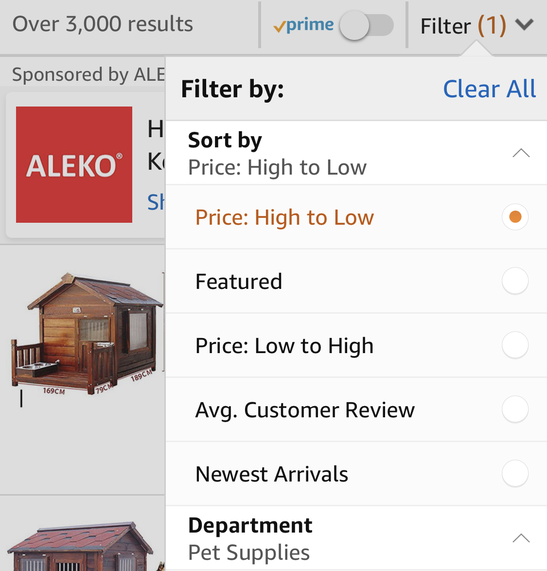
Gap, on the other hand, is either sorting by “featured” but doesn’t want users to be able to choose a different criteria, or they’re not sorting at all. And to be clear: this is easy for developers to overlook! They’re busy just making sure that the query is right and the results display and the table doesn’t blow up! Which is why it’s on my testing list.
Finally, a little bit of self-awareness about the site in which the filter and search resides is critical to understanding how much work we need to put into our filters. When we have a really strong information architecture with really strong information scent, navigating the site is easy and effective.
When we have really weak information architecture and information scent, we force users to look for alternate ways to find what they want. Weak information architecture is surprisingly easy to make, especially if technical constraints, politics, marketing, and business goals are all in conflict.

This is one of the biggest complaints that Amazon has been battling for years: its catalog is too big and its products too cross-listed for a user to get a strong information scent to a specific product. I still have no idea if I’ve managed to see all of the backpacks with seats that would have met my needs, despite spending hours between navigation, searching and filtering results.
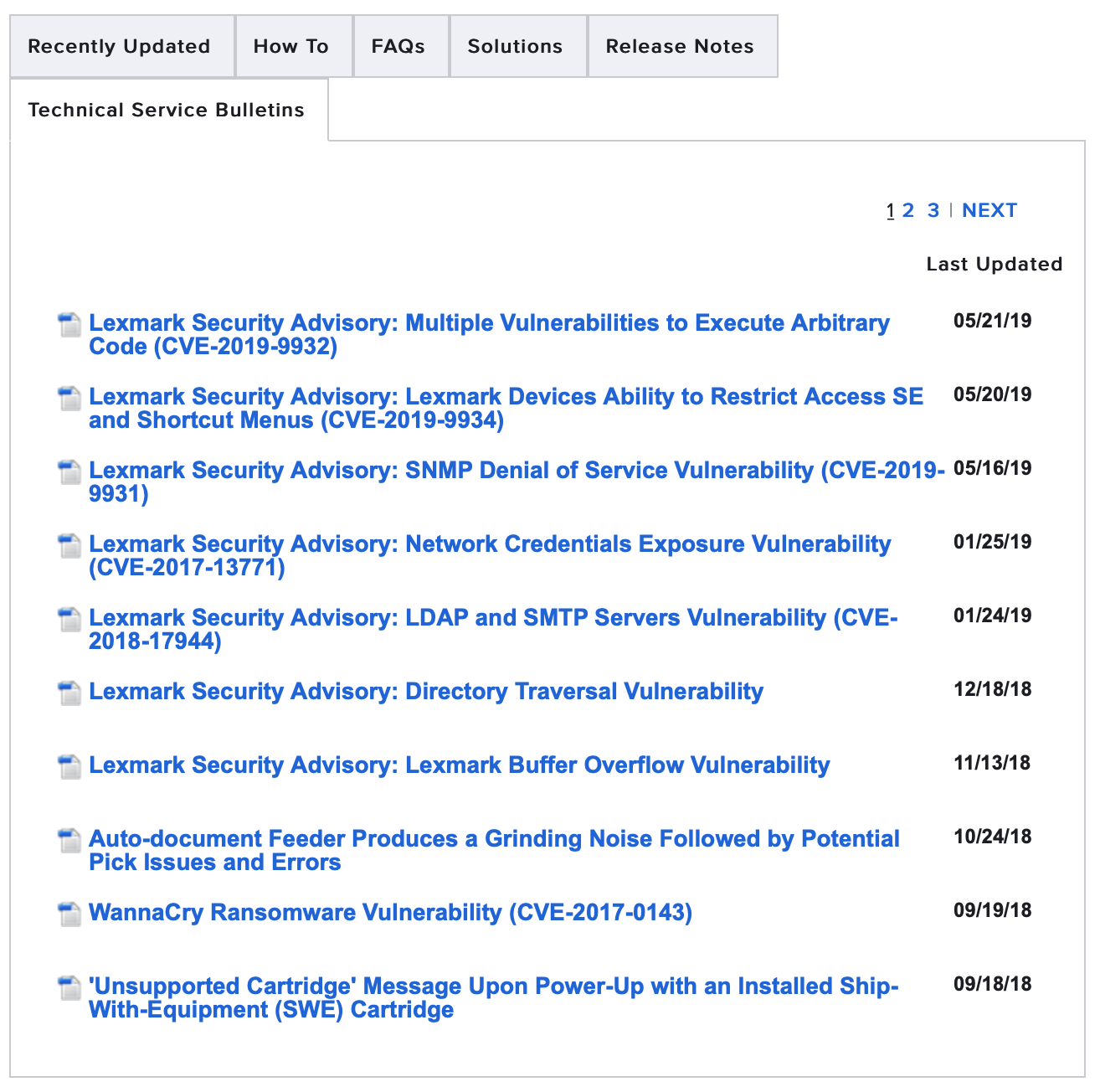
On the other hand, the IBM Knowledge Center knowledge base is absolutely loaded with information scent in the forms of a strong information architecture where every topic has one parent, a solid information scent in the form of organized topic lists, breadcrumbs, top tasks, and solid guidance that’s driven by something other than IBM’s org chart.

IBM is so confident in their information architecture that their search and filter options are severely underpowered compared to what most users experience, well, pretty much anywhere else. They have one filter set: a tabset containing documentation, videos, IBM Developer, Technotes, and RedBooks. The filters are exclusive: you can’t view two at once.The filter for Documentation in my search for “installing” has 1,717 results.

Arguably, IBM is the polar opposite of Amazon. It relies so heavily on its browsable architecture that a novice user may not be able to find anything useful in the search architecture. But presumably (since my understanding is it’s been up for a while) it’s working for IBM.
Amazon could never use their confusing information architecture with a search architecture this weak on filters.
In summary:
- If the data displays on the search results, you should be able to filter by it. (Corollary: if the data is a filter, it should display in the search results.)
- If the data is time-based, provide time filters. (Correlary: if the data is not time-based, please do not provide time filters.)
- Filtering is only the first step; showing the results in a sorted and organized manner is the second. “Random” is not a search results or filter results sorting method. (Test it!)
- The shittier your information architecture and navigation are, the more your search and filter better work exactly the way the user expects. (And if you’re really brave, you can build a great information architecture but rob your search architecture of all usefulness.)
And believe it or not, this is STILL not what I set out to write… we’ll get to that next, in Filters of nope.
Notes
| ↑1 | For a printer, probably not decades. |
|---|